Case 01 / ZEISS
Fifteen years
inside one
brand system
More than a hundred projects for ZEISS since 2010, working straight with the client rather than through an agency. Summit environments, surgical illustration, clinical education, motion, signage, vehicle wraps. It’s a German engineering brand that permits almost no decoration, which means the whole job is knowing what to leave out — and after fifteen years I’ve gotten good at that.
- Client
- ZEISS
Direct, no agency - Role
- Creative & Art Director
- Scope
- 100+ projects
Print, environment, motion - Period
- 2010 — ongoing
The relationship
ZEISS is a German optics and optoelectronics company whose ophthalmic division builds the diagnostic and surgical equipment eye surgeons use daily — imaging platforms, excimer lasers, surgical microscopes, intraocular lenses. I’ve worked with them directly since 2010, on well over a hundred projects.
A relationship that long stops being a series of briefs and becomes something closer to being the brand’s hands. The work arrives as whatever is needed that quarter — a summit environment, an anatomical illustration for a paper, a trailer wrap, a study summary, an animation. The common requirement is that any of it could be handed to a surgeon without a designer present to explain it.
Working inside a strict system
The ZEISS identity is unusually disciplined: the blue block mark, a narrow palette, a proprietary typeface, and a preference for white space over graphic incident. There is no room to solve a problem by adding a device, a texture or a colour accent. Every one of those exits is closed.
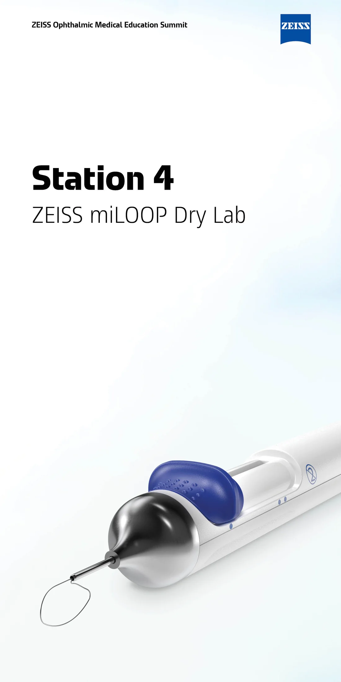
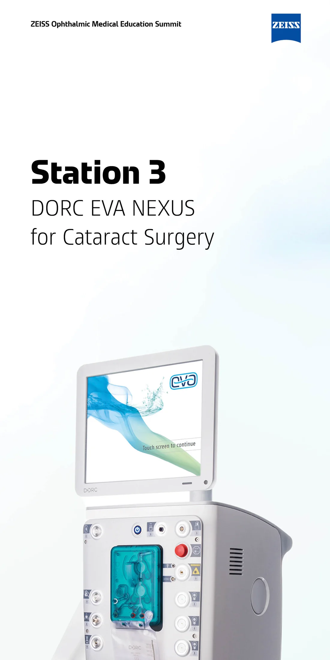
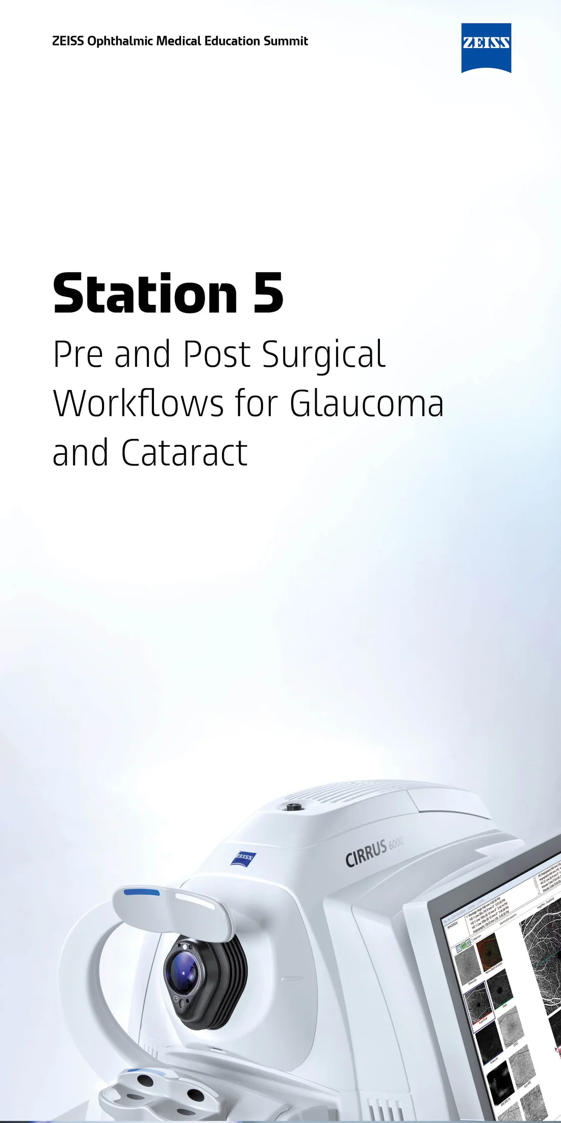
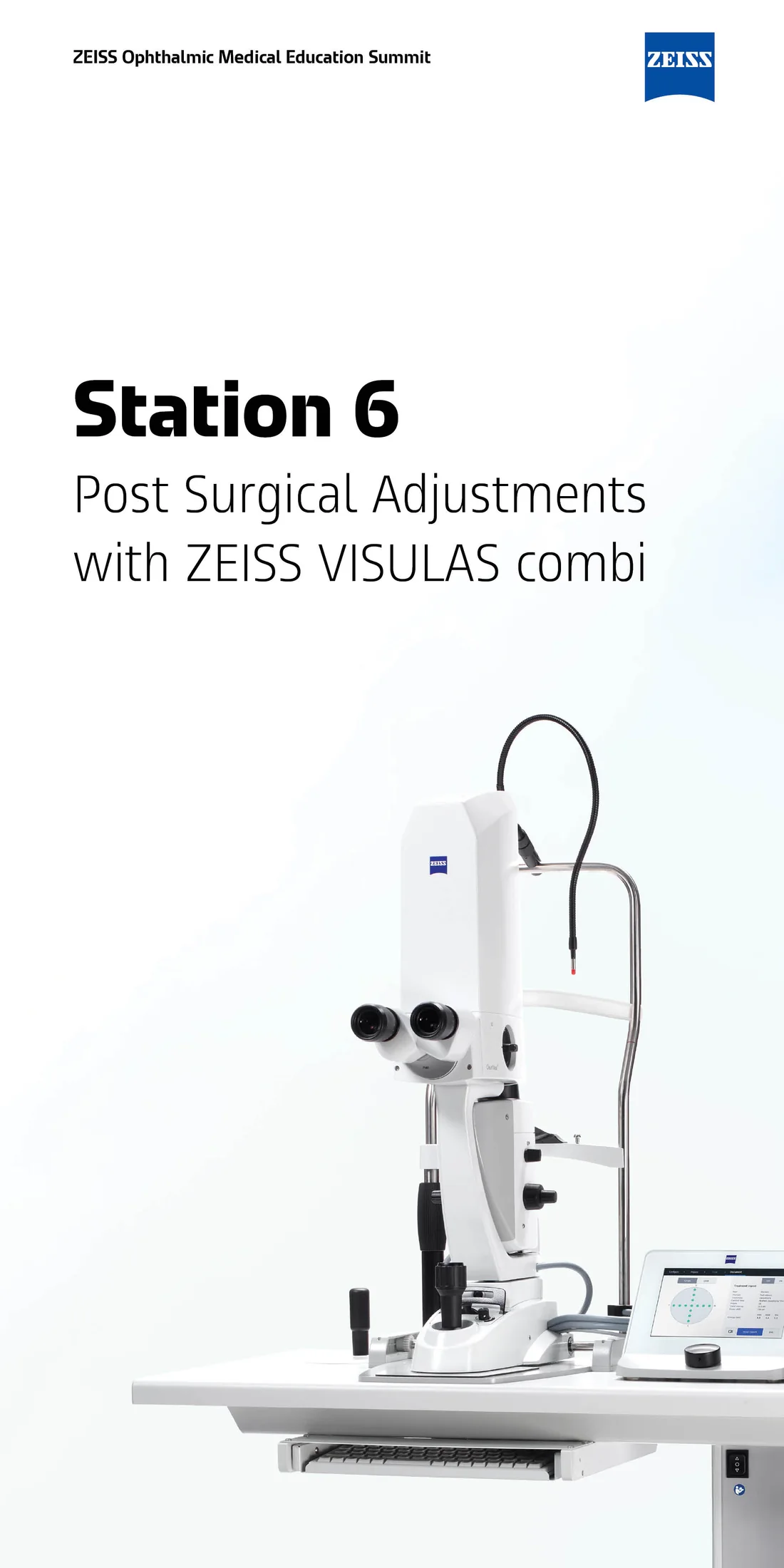
So the work happens in composition, hierarchy and restraint. On the summit station banners, the entire design decision is scale and placement: a product photographed against near-white, bled off the bottom edge, with the station number and title floating in the upper third. Nothing else. What makes them work at twelve feet is the confidence to leave two-thirds of the panel empty — which in practice is the hardest thing to get approved and the easiest to lose in revisions.
The second discipline is medical accuracy as a design constraint. An illustration of the retinal capillary plexus isn’t stylised to taste; layer order, vessel calibre and the relationship between the superficial and deep plexus are either correct or the piece is worthless to the surgeon reading it. The craft is making something anatomically defensible that still reads instantly — which usually means deciding what to omit, not what to render.
The third is regulatory reality. Everything carries a document code, a copyright line, and market-availability disclaimers, and the claims are tied to published data. That isn’t an obstacle to design so much as a fixed part of the composition — the footnote block has to be planned into the layout from the first sketch, not squeezed in at the end.
What the work covers
- Tradeshow and conference environments — station banners, booth graphics, wayfinding
- Conference programme systems: multi-day agendas, session tracks, breakout wayfinding
- Medical and anatomical illustration for clinical and educational use
- Clinical education: workflow overviews, study summaries, product ecosystem maps
- Motion — key visual animations for product and platform launches
- Vehicle and trailer wraps for mobile surgical and demonstration units
- Practice-facing collateral: referral invitations, peer-to-peer outreach
Across illustration, 3D and motion I worked as both maker and director depending on the project.
Ophthalmic Medical Education Summit
A multi-day surgeon education event at the ZEISS Innovation Center California, spanning twelve numbered sessions, five parallel breakout tracks, six hands-on stations and shuttle logistics across two venues. Two connected design problems: get people to the right room, and make each station legible from across a hall.
The station banners
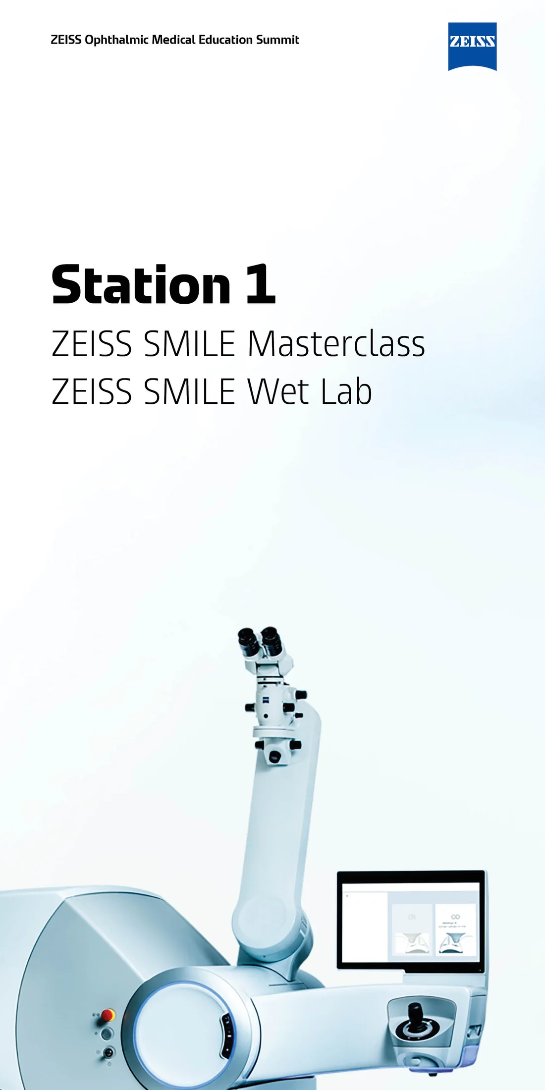
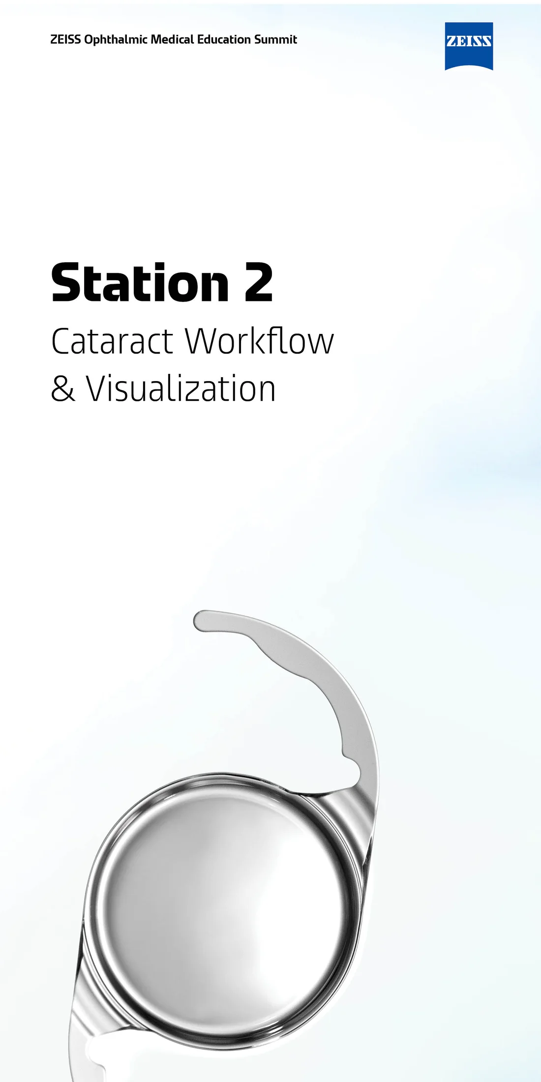
Six twelve-by-twenty-four-foot panels, one per hands-on station. Each is the same layout: eyebrow line locked to the top left, ZEISS mark to the top right, station number in bold with the session title beneath in light weight, and the equipment photographed against a barely-there blue gradient, cropped hard so it runs off the bottom of the panel.
The crop is the decision that carries them. Shown whole and centred, a surgical microscope becomes a catalogue photograph; cropped and oversized, it becomes architecture — recognisable from its silhouette alone to anyone who uses one. Surgeons navigating the floor identify their station by the shape of the machine before they read a word, which is what a wayfinding graphic actually needs to do.
The typographic contrast does the rest: Station 4 set heavy, the title set light underneath. At a distance the number resolves first and the title second, matching the order in which the information is needed. Everything below the title is deliberately empty until the product enters the frame.
The agenda system
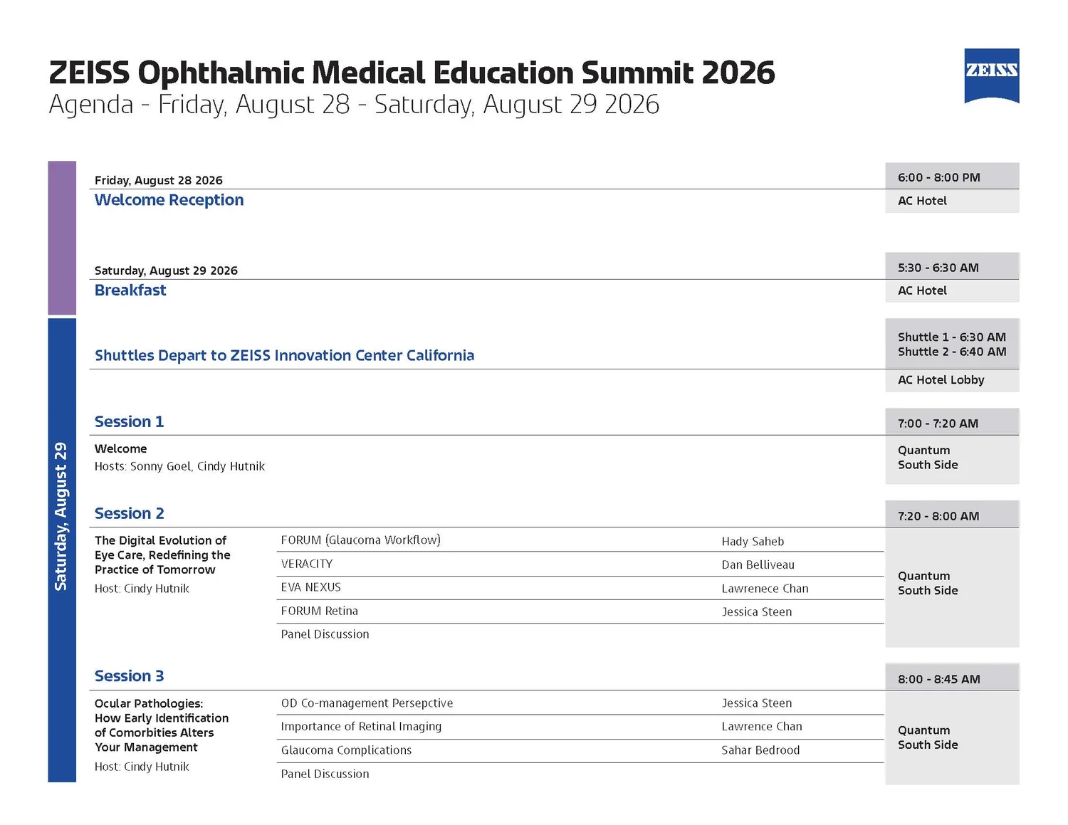
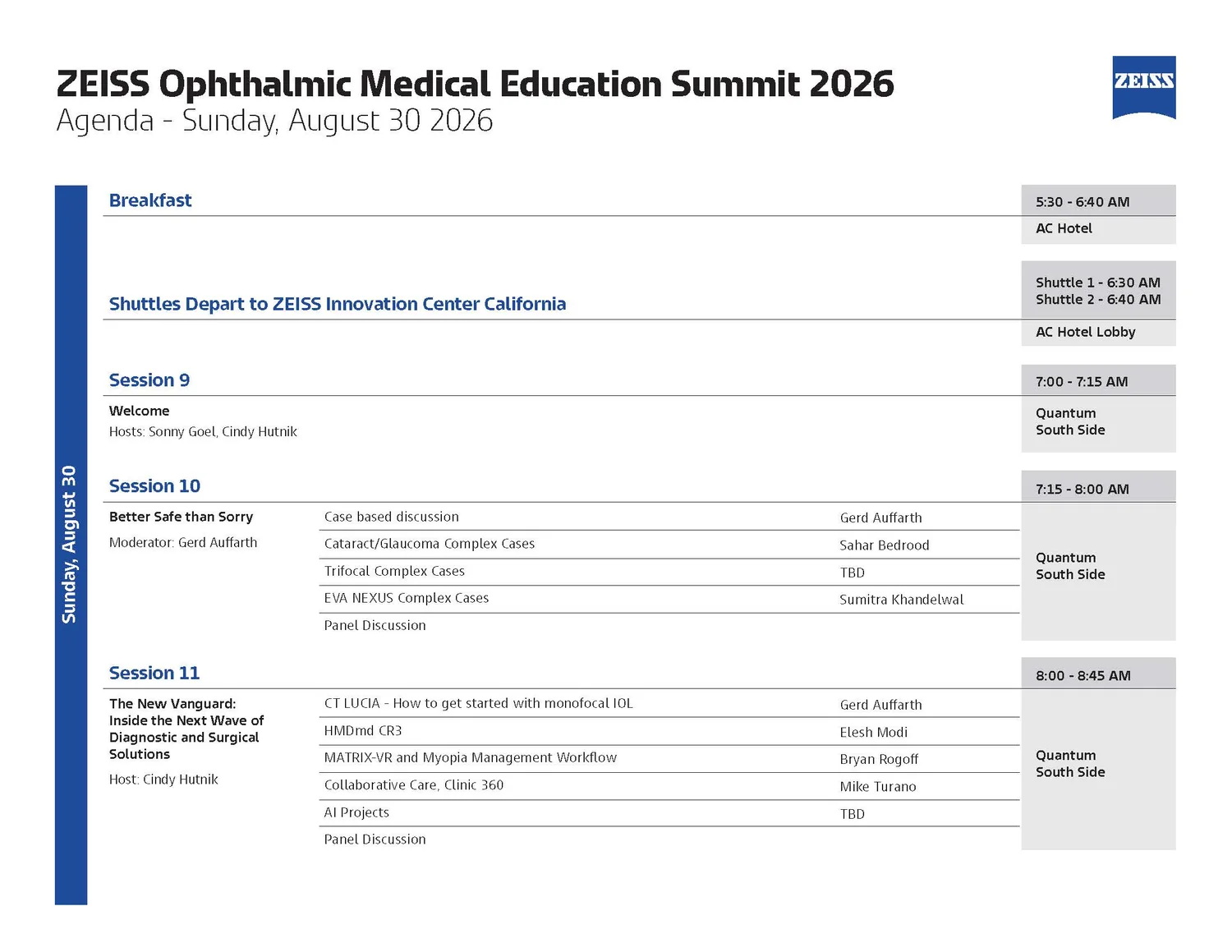
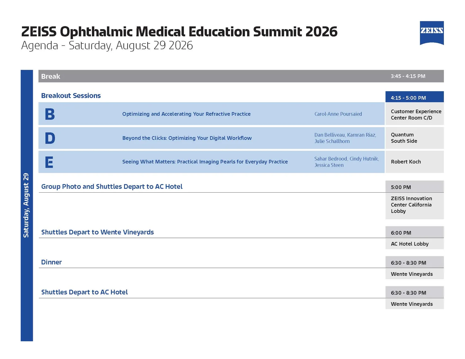
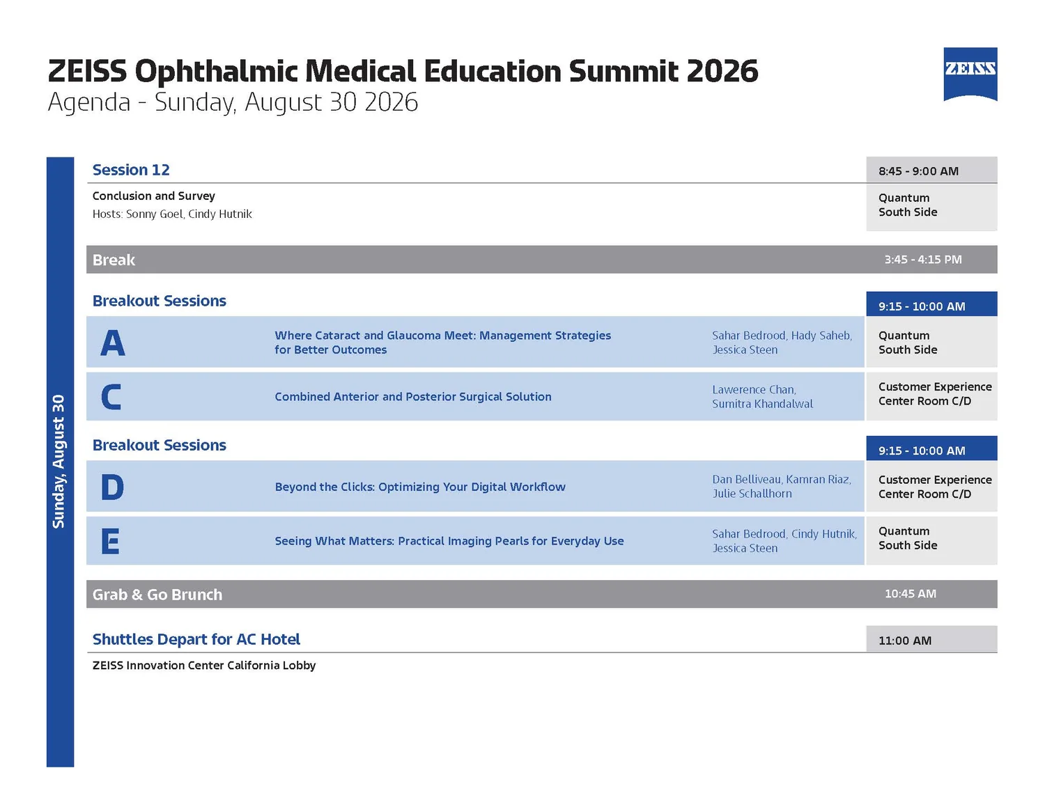
Six landscape pages covering a Friday reception through a Sunday brunch. The structural problem is that a surgeon reading this needs three different things at once: what time is it, where do I go, and is this session relevant to me — and a conventional agenda answers only the first.
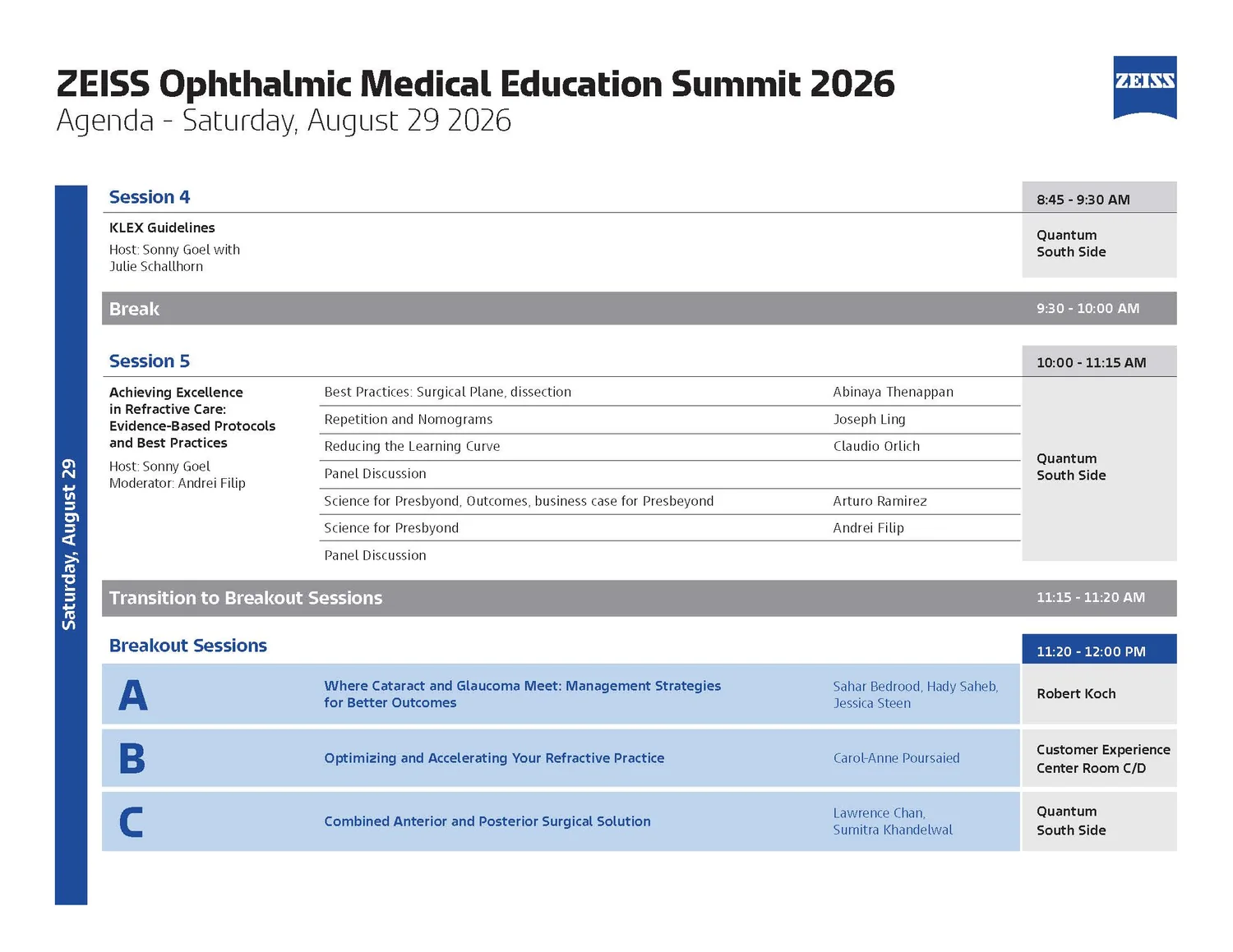
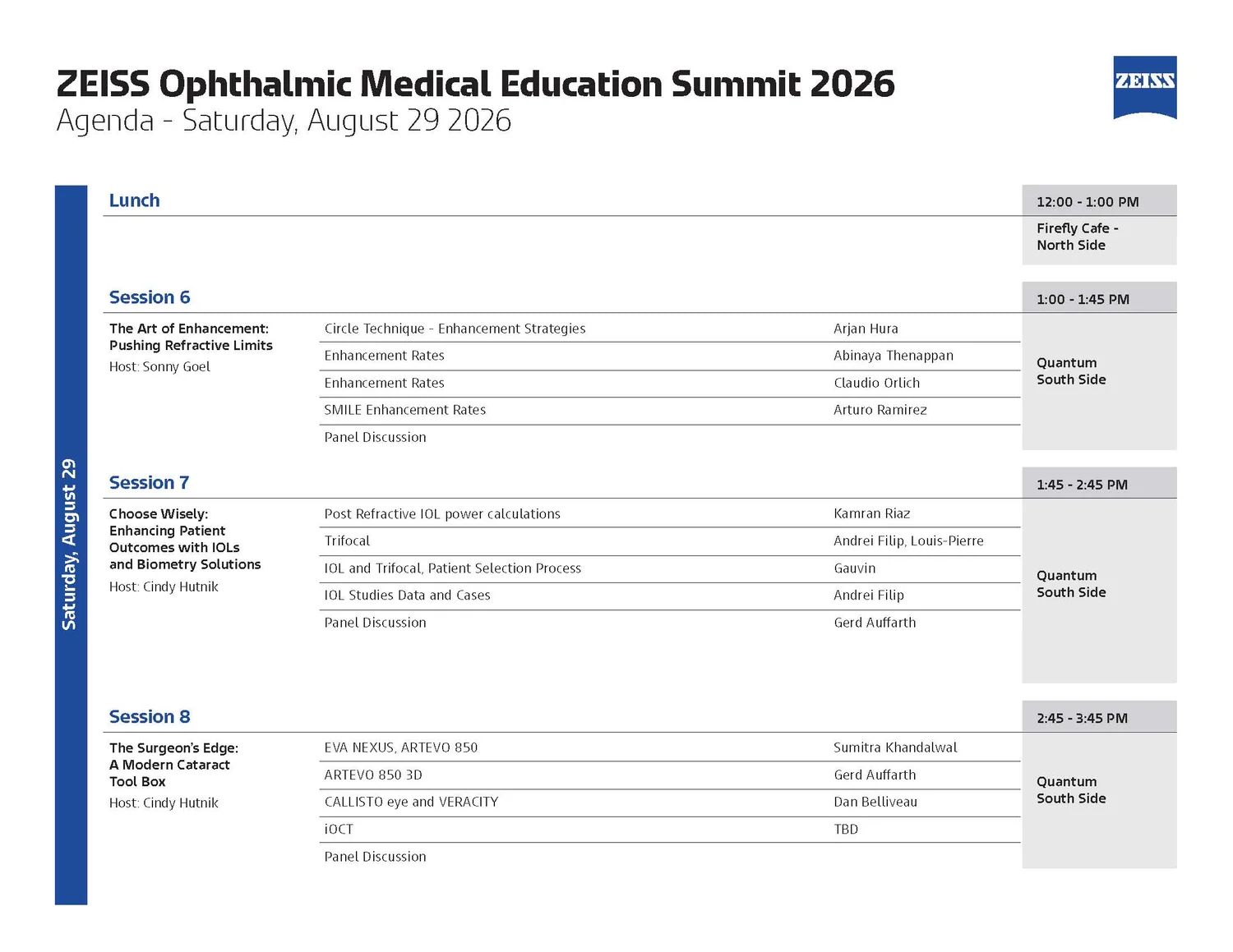
The solution is a fixed three-zone grid. A coloured spine runs down the left edge carrying the day, so a reader flipping pages always knows which day they’re on without reading a header. The centre column carries session title, host and the individual talks with their speakers. The right rail carries time and room, always in the same position, so scanning for “where am I at 1pm” is a single vertical sweep down one edge.
Breakouts are the part that would normally break. Five tracks labelled A through E recur across both days in different combinations and different rooms. Giving each a persistent letter, set large in a tinted band, means a surgeon who has decided they’re a “track D person” can find their session on any page without re-reading the titles. Breaks and transitions get a flat grey bar — visually quiet, structurally load-bearing, and deliberately not competing with sessions for attention.
Medical illustration — the retina in section
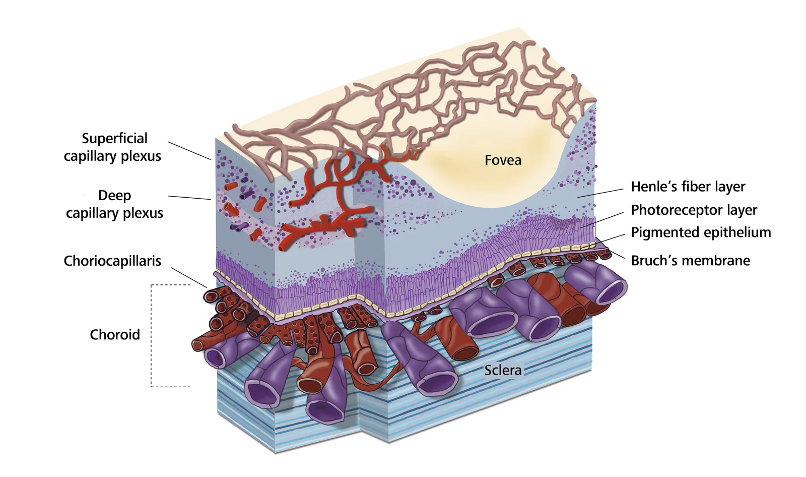
Anatomical illustration for clinical and educational use. The subject is the layered vascular structure of the retina and choroid — something no camera can show as a solid, which is precisely why it has to be drawn.
Drawing what imaging can’t show
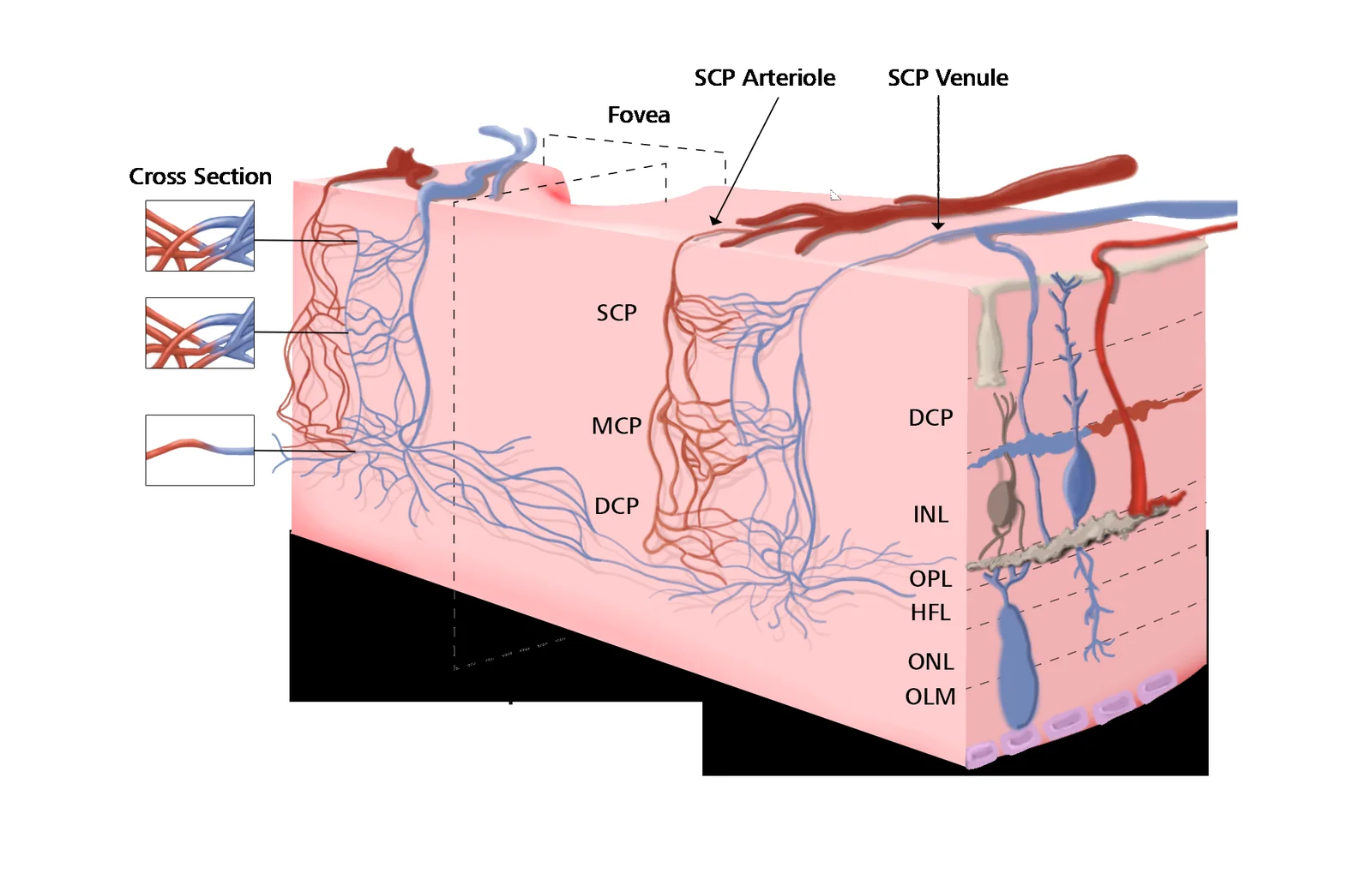
OCT and angiography produce cross-sections and face-on projections; neither gives a clinician the three-dimensional relationship between layers. Cutting a block out of the tissue and drawing it isometrically does — you see the surface, the depth, and how a vessel at the top connects to a capillary bed four layers down, in one image.
Two conventions do the heavy lifting. Colour is never decorative: red is arterial, blue venous, and that holds at every scale including the three magnified cross-section insets. And the block is cut at the fovea, because the foveal avascular zone is the diagnostically interesting feature — the dip in the surface isn’t a compositional flourish, it’s the reason a clinician is looking.
Labelling is set in the ZEISS typeface at a size that survives being dropped into a journal figure, a slide, or a printed handout without redrawing. Leader lines run orthogonally where possible and terminate exactly on the structure named, never near it. In clinical illustration an imprecise leader line is a factual error, not a styling choice.
The restraint that matters most is what isn’t drawn. Every layer that doesn’t bear on the vascular story is reduced to a tint band and a label. A fully rendered version of this tissue would be unreadable — the illustration is useful precisely because most of the anatomy is suppressed.
Clinical education & practice communication
The everyday volume of the account: material that has to carry evidence, product truth and regulatory language without becoming a wall of text. Three different problems — a workflow, a study, and an invitation — each solved by deciding what the reader is allowed to skip.
Making an ecosystem legible
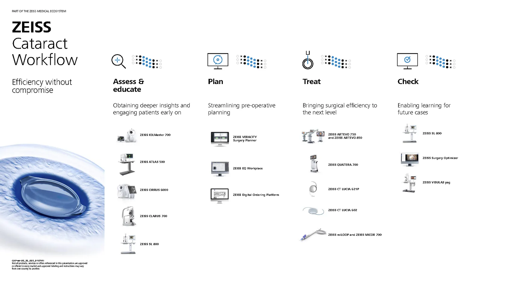
A portfolio this size has a specific failure mode: presented as a product list it reads as a catalogue, and a surgeon can’t tell what they’d actually need. Organising it by the four clinical stages — assess, plan, treat, check — reframes seventeen products as a single procedure, so the reader locates themselves by where they are in the case rather than by product name.
The small dot matrix above each column fills progressively left to right. It’s doing what a progress bar does, quietly, and it’s the one piece of graphic invention on the page — permissible because it encodes information rather than decorating.
Two different kinds of persuasion
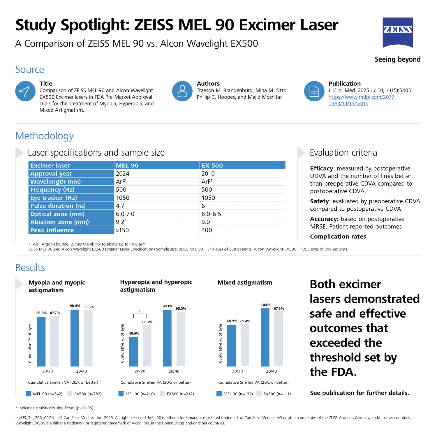
The study spotlight is a competitive comparison, which is the most scrutinised thing a medical device brand can publish. The structure defuses that: source, authors and journal citation come first, methodology and sample sizes second, results third. By the time the charts appear the reader has already been told exactly where the numbers come from and can verify them.
The conclusion is the part that earns trust — it states that both lasers exceeded the FDA threshold, including the criterion where the competitor performed better, and marks the statistically significant difference honestly. A one-pager that admits a loss is read as evidence; one that doesn’t is read as advertising, and surgeons are unusually good at spotting the difference.
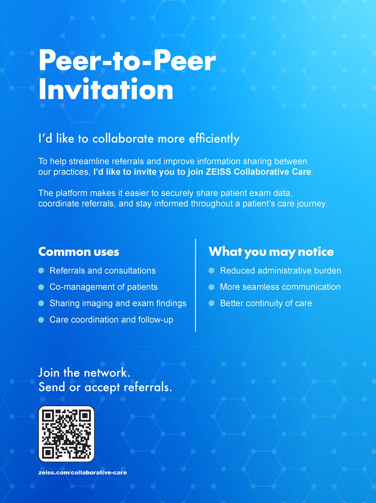
The Collaborative Care invitation solves an unusual brief: it’s sent by one practice to another, so it can’t sound like ZEISS. It’s written first person — “I’d like to collaborate more efficiently” — and the brand appears only as the platform being recommended. The blue field with its faint hexagonal network is doing the only atmospheric work on the page, and the two columns split the argument into what you’d use it for and what would change, which is how a colleague would actually pitch it.
Two key visuals, one idea
The multi-modality case library had a claim that’s awkward in words and obvious in motion: no single imaging modality tells you everything, but together they do. So the animation builds the eye out of wedges — colour fundus, infrared, angiography, autofluorescence — spinning in one at a time until the disc closes around a photographic pupil and lands on “Color. Clarity. Complete.” The gap in the ring is doing the persuading. You feel the incompleteness before the line names it.
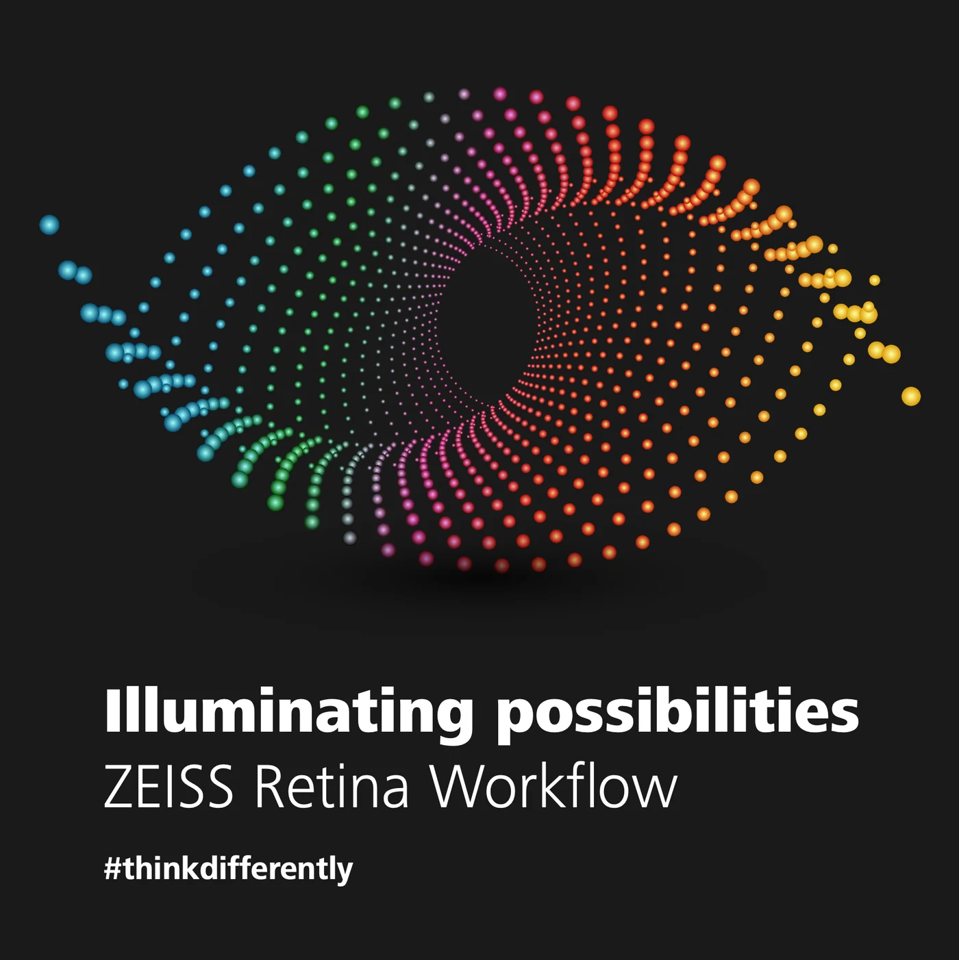
The Retina Workflow eye works the same way from the opposite direction. It’s an eye made of nothing but dots, each one sized and coloured by where it falls, sweeping the full spectrum from blue through magenta to yellow. Every other piece on this account earns its place by restraint; this one earns it by being the exception — a near-black field and a burst of colour in a brand that almost never allows either.
That’s deliberate rather than indulgent. A retina workflow is about seeing what’s otherwise invisible, and a photograph of equipment can’t say that. The dots can. And because it sits inside an otherwise disciplined system, it hits harder than it would anywhere else — the restraint everywhere else is what buys this one its impact.
Fleet — the surgical suite that travels
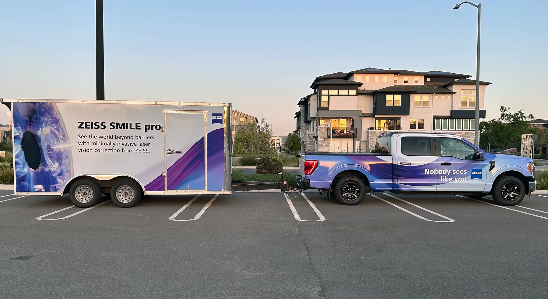
Where the brand leaves the building. A wrapped truck and trailer housing a mobile SMILE pro laser suite, so surgeons can experience the platform at their own practice rather than travelling to a demonstration centre.
Designing for a moving surface
A vehicle wrap has constraints a poster doesn’t. It’s read from the side at varying distance, interrupted by wheel arches, door seams and handles, and it has to survive being photographed in a hospital car park at dusk by someone with a phone — which is, realistically, how most people will encounter it.
So the graphic is built as one continuous iridescent form derived from corneal imagery, flowing across both vehicles as if they were a single object, with all copy placed in the flat panels where no seam interrupts it. The trailer carries the product name and the explanatory line; the truck carries only the brand line. Splitting the message that way means each vehicle works alone if they’re parked separately — which they usually are.
The tagline placement is the detail I’d defend hardest. “Nobody sees like you” sits on the rear door of the cab, at eye height, on the side facing the practice entrance — the last thing read as someone walks past, and the only line on either vehicle that isn’t about a machine.