Case 02 / Northwell Health
A thrift shop
that drives to
the people
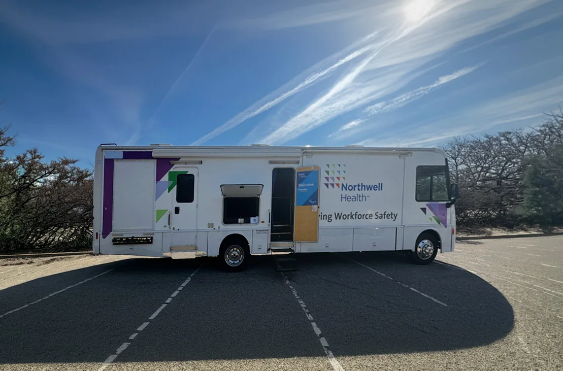
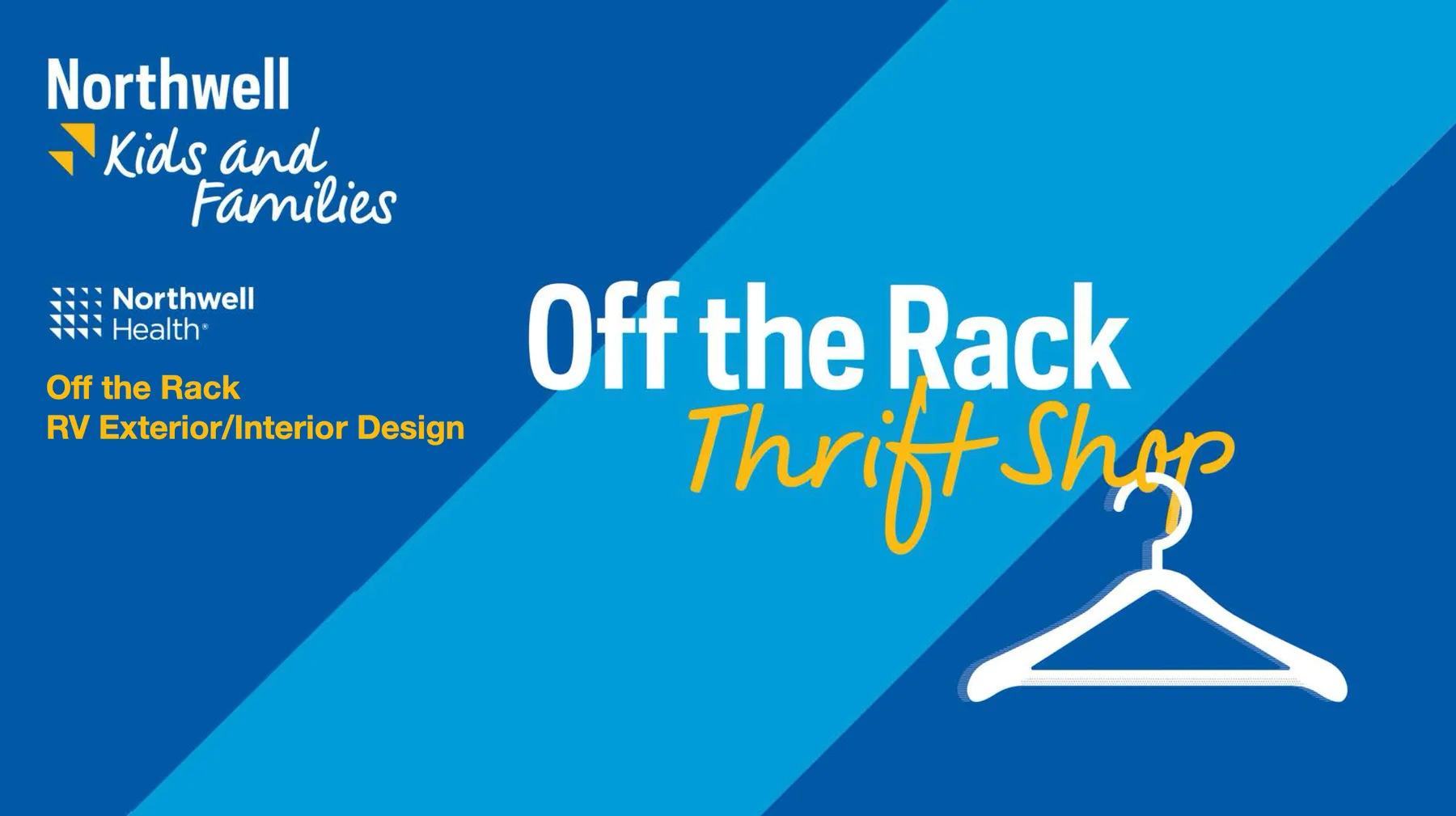
Northwell Health had an idea and an RV. Off the Rack is what came out of the two — a mobile thrift shop that travels to Northwell locations so employees and their families can take home donated clothes, shoes, jewellery and household goods. Exterior wrap and interior retail design, worked up from renders on the existing vehicle through to the wrapped, fitted, touring shop.
- Client
- Northwell Health
Kids and Families - Role
- Creative & Art Director
- Year
- 2025
- Scope
- Vehicle wrap
Interior fit-out & signage
How this one started
Through work already done rather than through a pitch. I’d been doing bus wraps and social content for elitefeats, and Northwell’s marketing department knew that work — so when they had a mobile thrift shop concept and an RV sitting in a lot, they came straight to me. Vehicle graphics are a small enough speciality that having done one well is most of the argument for the next one.
The concept was theirs and it was a good one: Northwell staff and their families donate things they no longer need, and the shop brings those things to whichever Northwell site it’s parked at that day. Prom dresses, shoes, jewellery, handbags, home goods — all of it like-new, all of it going to a colleague.
Why a moving shop is a different problem
The building is already built. Retail design usually starts with a plan and a fixture budget. This one starts with a vehicle that exists, has a floor plan nobody chose, and has to keep working as a vehicle. Every decision is a retrofit: the cabinetry, the window blinds, the bench, the wheel arch, the emergency exit — none of it moves, so the shop has to be designed around the parts that can’t change.
It has no frontage. A shop on a street has a window and a sign and a stable address. This one arrives in a car park and has to explain itself in the time it takes somebody on a break to walk past it. So the exterior isn’t decoration — it’s the shop front, and it has to read at fifty feet from any angle, because there’s no controlling which side people approach from.
It gets rebuilt every time it stops. Stock arrives donated, gets scanned in through a set process, and is merchandised fresh before each event. So the interior couldn’t be a fixed planogram — it had to be a system of labelled zones that staff can restock differently at every location and still have it read as the same shop.
The approach
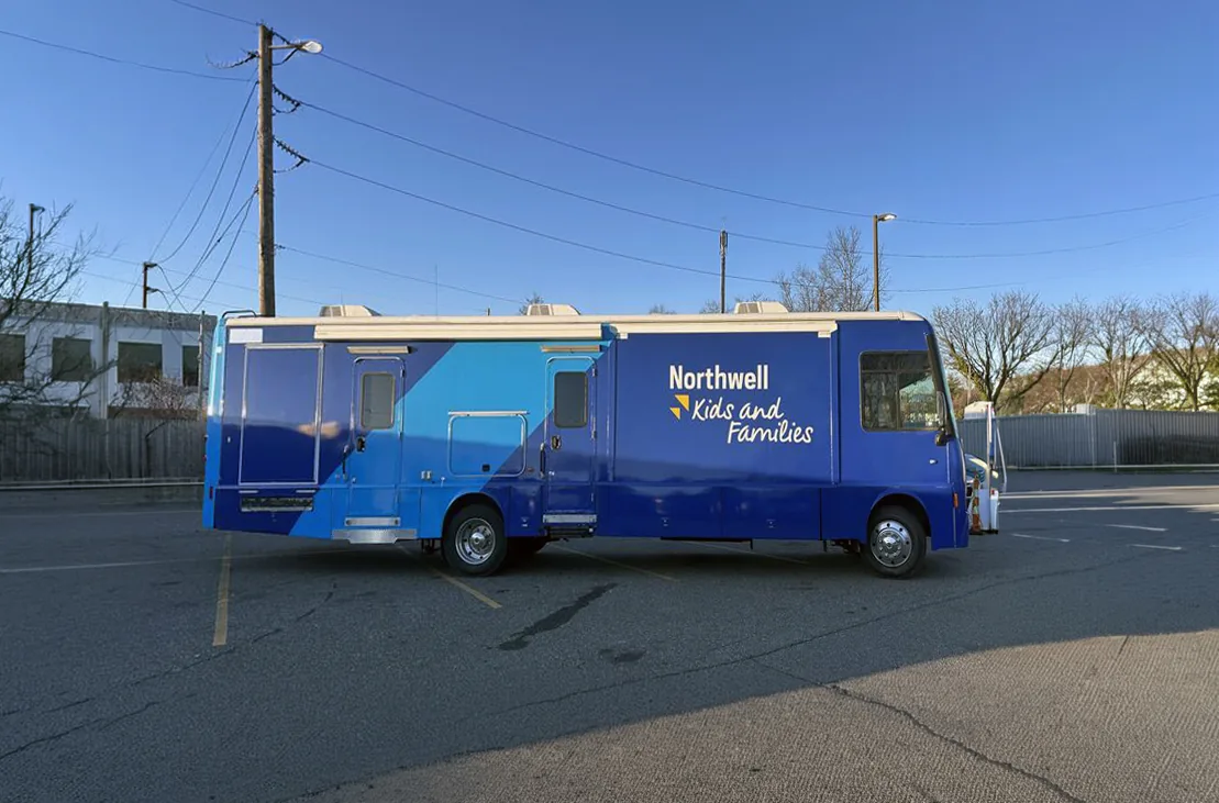
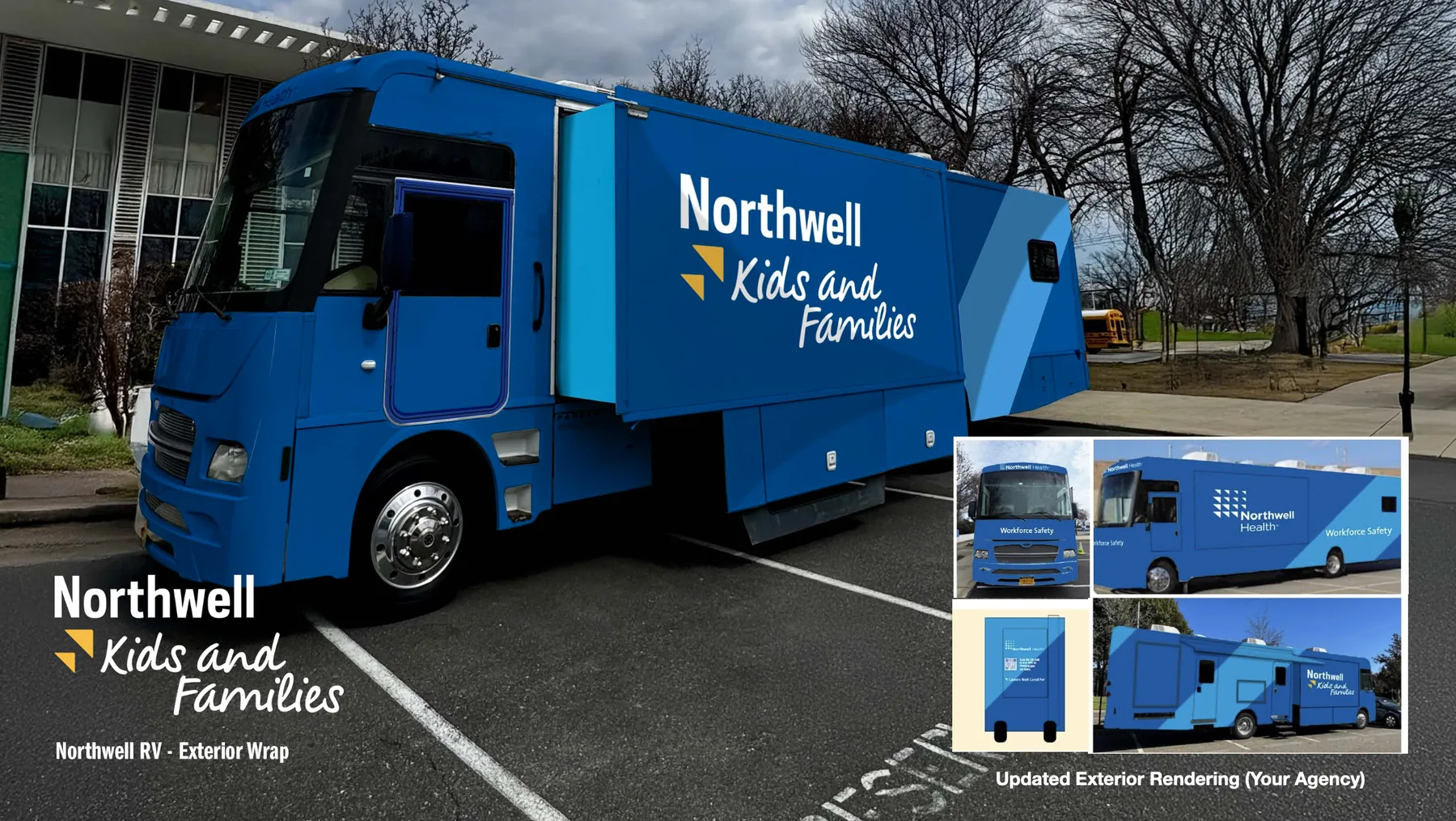
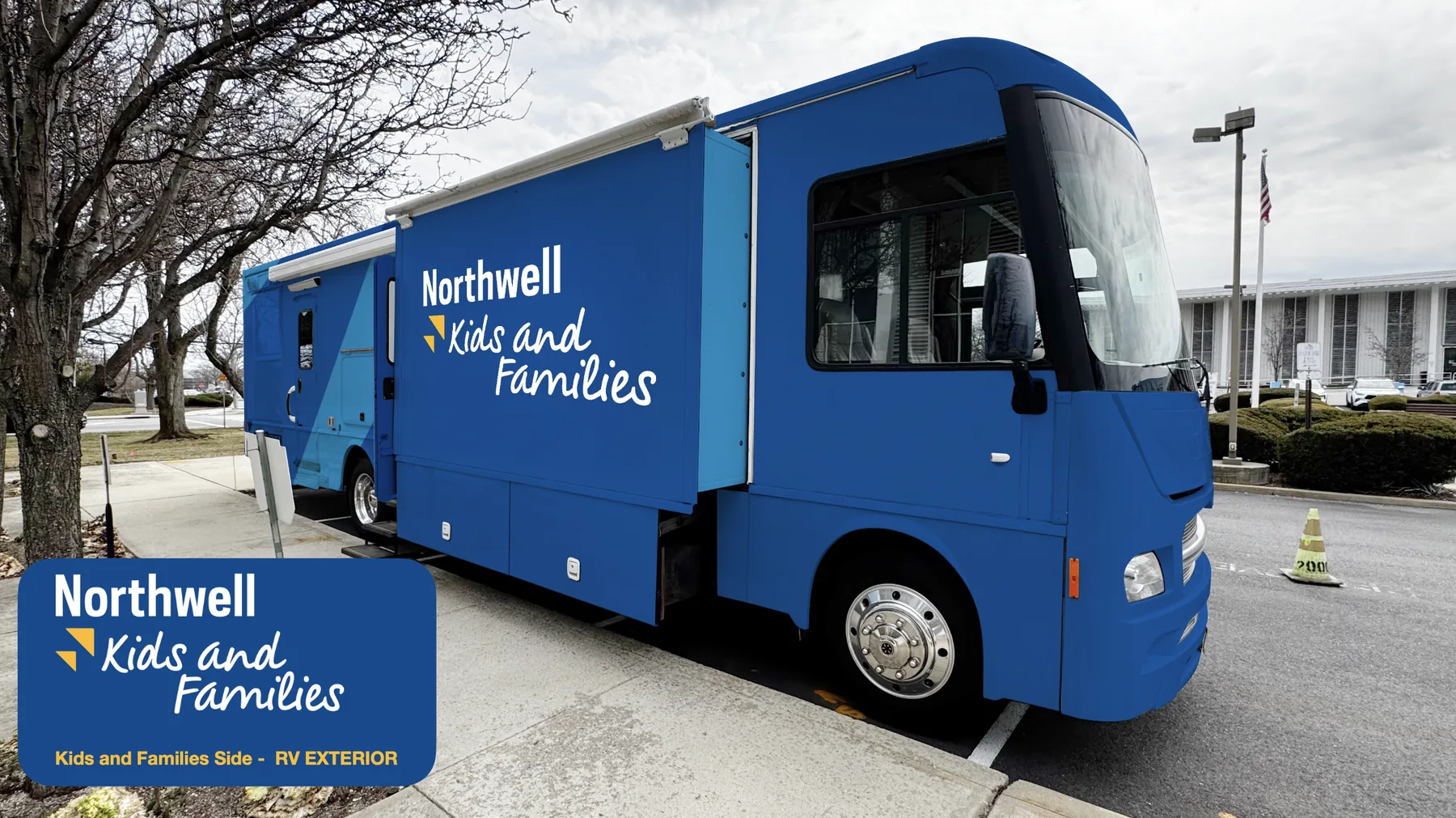
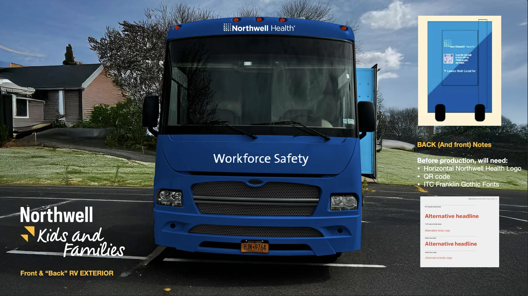
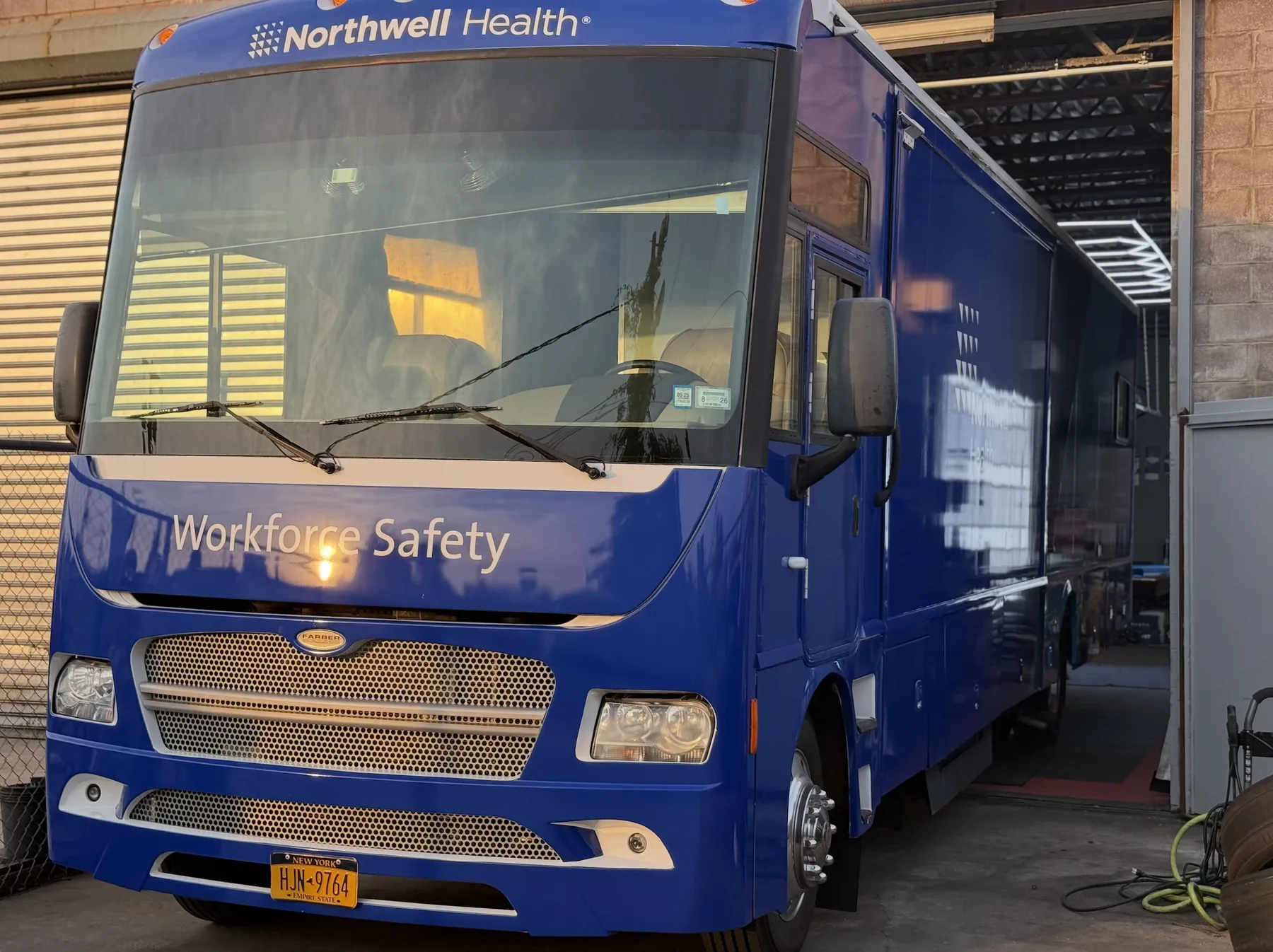
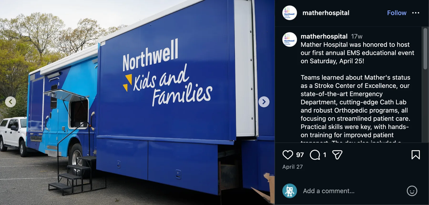
The exterior runs on one device: a diagonal split between two blues, cutting across the body and carrying through the slide-out, the door and the panel joins. It does two useful things at once. It ties a vehicle made of mismatched planes into one object, and it gives the Kids and Families logo a field to sit in that stays legible whichever side you come at it from. The mark is set large and low on the body so it clears parked cars, and the front keeps the Northwell Health lockup so the vehicle still reads as institutional when it turns up at a hospital.
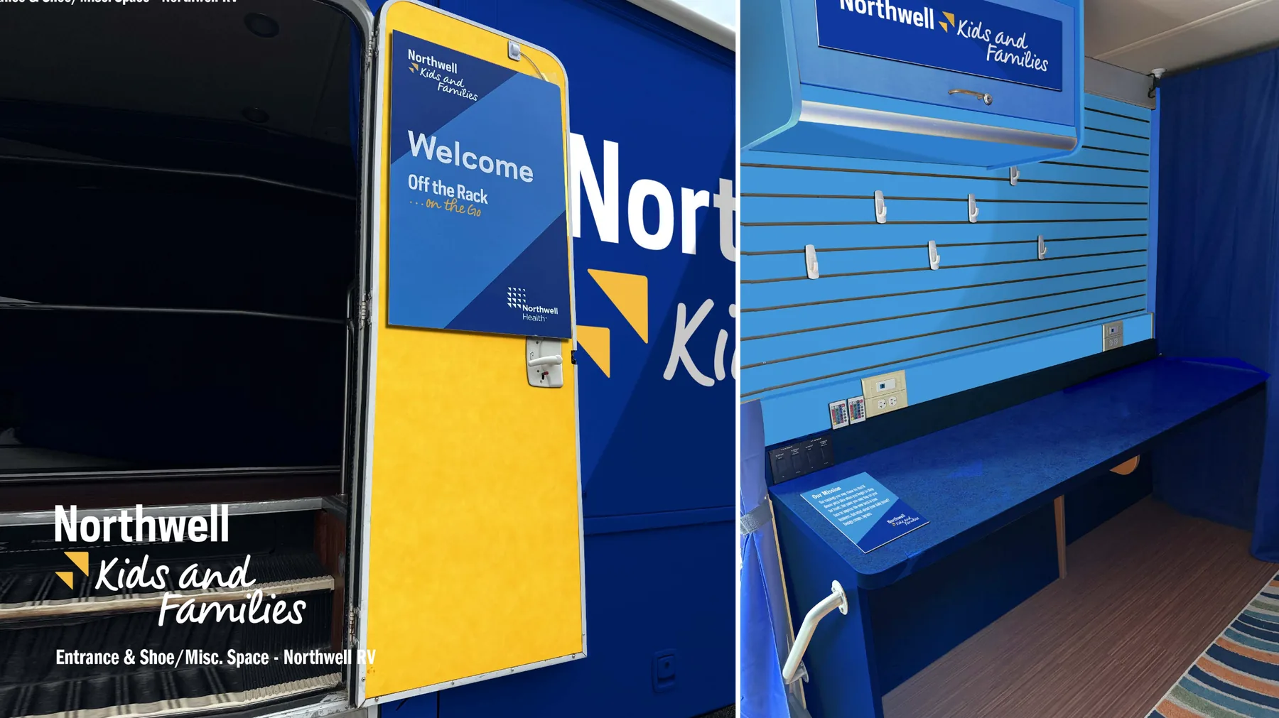
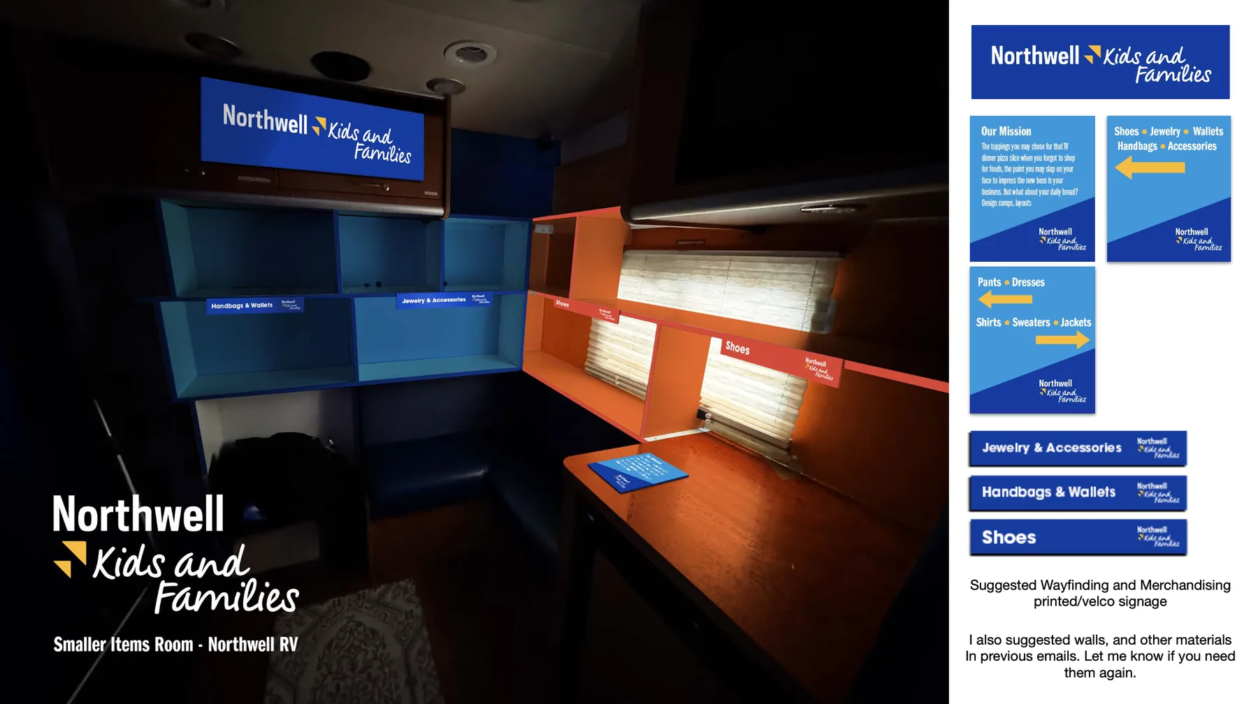
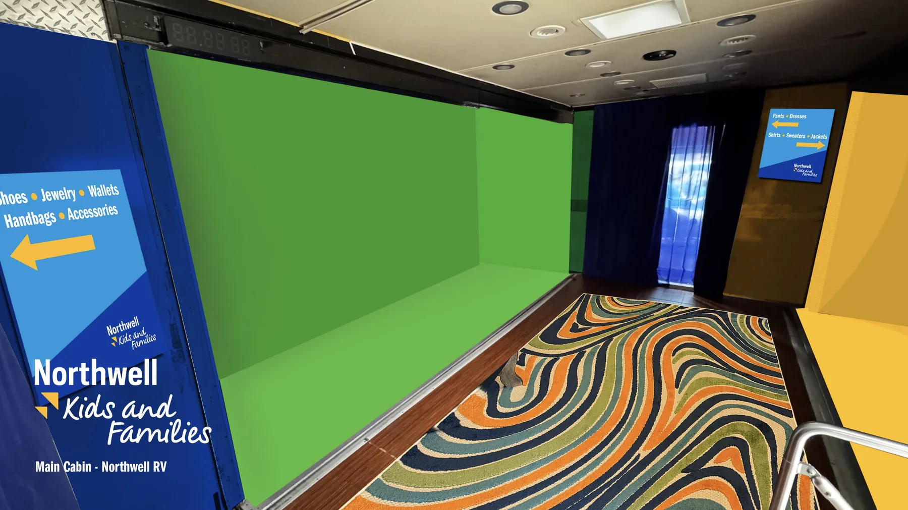
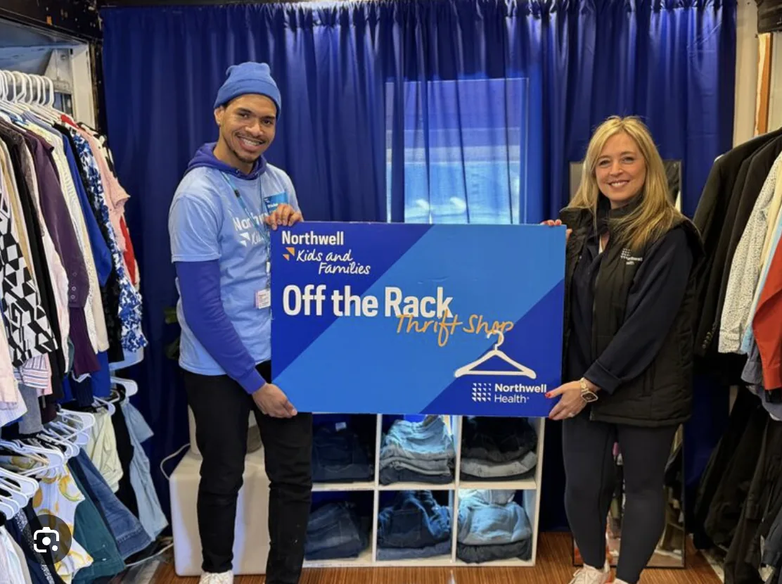
Inside, the job was turning an RV into a shop that can be read without a staff member explaining it. The cabinetry is painted into colour-coded blocks so the departments separate at a glance, and every zone carries a printed sign — Shoes, Jewelry & Accessories, Handbags & Wallets — with arrow-marked wayfinding panels pointing between the two ends of the cabin. The signage is mounted on velcro rather than fixed, so a zone can be reassigned when the donation mix changes, which it does constantly.
The welcome sign on the door is where the shop gets its own voice. The wrap is Kids and Families; the door is Off the Rack, in the shop’s own yellow script — so the moment you step from the car park onto the step, the thing stops being a Northwell vehicle and starts being a store.
What I made
- Full exterior wrap design — driver side, passenger side, front and rear, rendered on photography of the actual vehicle
- Production notes for the wrap house: logo formats, QR placement, ITC Franklin Gothic type spec
- Interior colour scheme across cabinetry, slat wall, bench and cabin
- Wayfinding and merchandising signage — category headers, directional panels, mission card
- The Off the Rack door and entrance graphics, plus event signage for the shop on site
The renders did most of the persuading. Because everything was mocked up on photographs of the real RV in real car parks rather than on a clean studio model, the client could see the finished thing before committing to a wrap — and the finished vehicle looks like the render, which is the only test that matters.
Where it landed
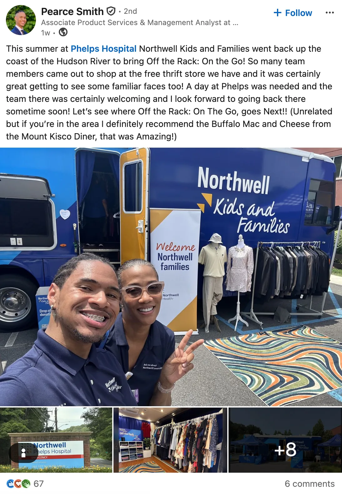
It was built, and it’s working. Off the Rack: On the Go now tours Northwell sites across the region — Mather Hospital on Long Island, Phelps up the Hudson — and the vehicle has been pulled in for other Northwell events too, where it functions as a presence as much as a shop. The posts that follow it are the real result: staff photographing themselves in front of it, hospitals announcing it as a reason to come out, people asking where it goes next.
A retired workforce-safety RV, rewrapped and refitted, now arrives at a hospital car park as a free shop for the people who work there.
Exterior — the wrap
Presented as renders on photographs of the vehicle itself, in the car parks it actually sits in. A wrap is expensive and irreversible, so the whole point of the render stage is to let a client stand in front of the finished thing before anyone cuts vinyl.
Interior — the shop
Where the vehicle stops being a vehicle. The cabin is narrow, the fixtures are fixed, and the stock changes at every stop — so the interior is designed as colour-coded zones with removable signage rather than as a fixed shop layout.
In service
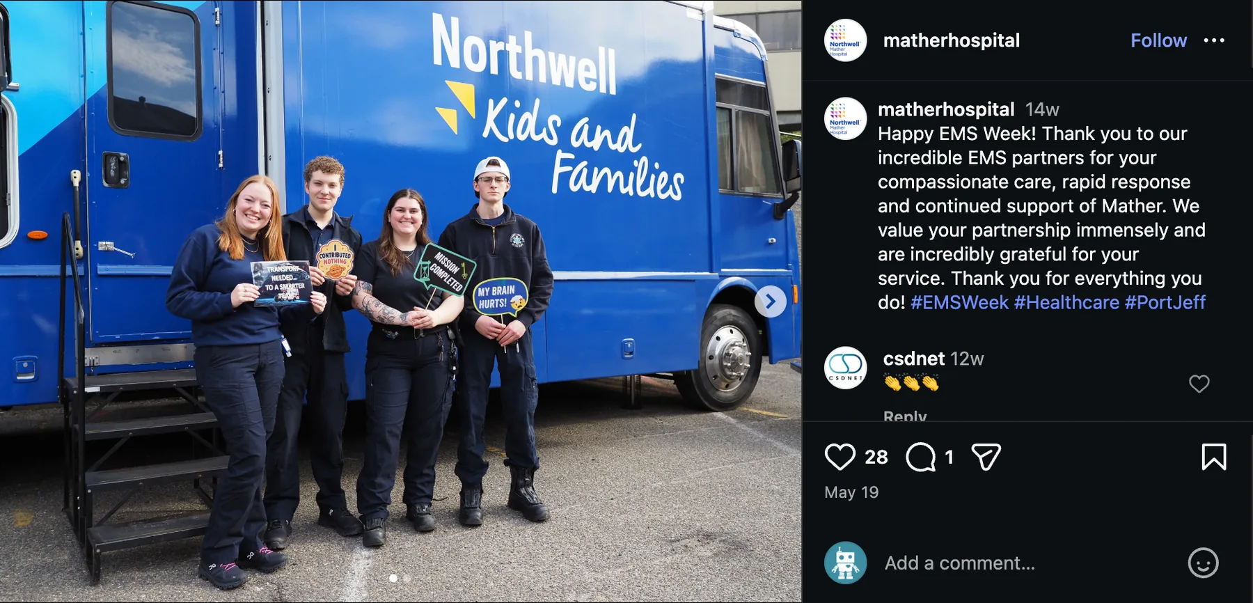
The part you can’t design. Once it was on the road, the hospitals it visited started posting it themselves — which is the most reliable evidence that a piece of brand environment is working, because nobody was asked to do it.
What the photographs prove
Renders are an argument; photographs are a verdict. Three things in these are worth more to me than the wrap itself. The colour holds in flat overcast light and in direct sun, which is the hard test for a two-tone blue. The logo still reads when the vehicle is half-obscured by parked cars and steps and awnings, which is how it actually appears in a car park. And the rug, the rails and the mannequins spilling out onto the tarmac show the thing being used past its own footprint — the shop is bigger than the vehicle now, and the wrap is what tells you where it begins.