Case 04 / Verra Mobility
Two audiences,
one subject:
who gets home
Three years directing creative for a road safety technology company. I was selling automated enforcement systems to cities on one side, and explaining those same systems to the drivers and pedestrians living with them on the other. Same cameras, two completely different conversations — and the second one is the harder sell.
- Client
- Verra Mobility
- Role
- Creative & Art Director
- Scope
- B2B sales collateral
B2C public awareness - Period
- 2023 — 2026

The brief
Verra Mobility builds automated road safety systems — speed cameras, red-light cameras, school bus stop-arm enforcement, work zone and school zone programs. The products are technical, the buyers are municipal, and the end users never asked for any of it.
That last part is the design problem. Most B2B technology marketing only has to persuade the person signing the contract. Here the program only works if a second audience — the drivers receiving citations, the parents at the bus stop, the city council fielding complaints — understands why the camera is there. So every program needed two bodies of work: material that helps a city buy the system, and material that helps a community accept it.
The approach
I ran both tracks out of one visual system rather than splitting them into a corporate brand and a campaign brand. The teal-and-lime palette, the chevron device and the illustration style carry from a trade show banner through to a Facebook post about a school bus. When a driver who saw the awareness campaign later reads a city council agenda, the two things look related — which is the point.
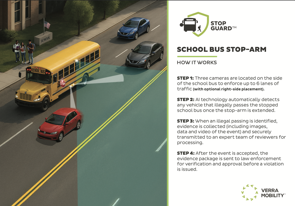
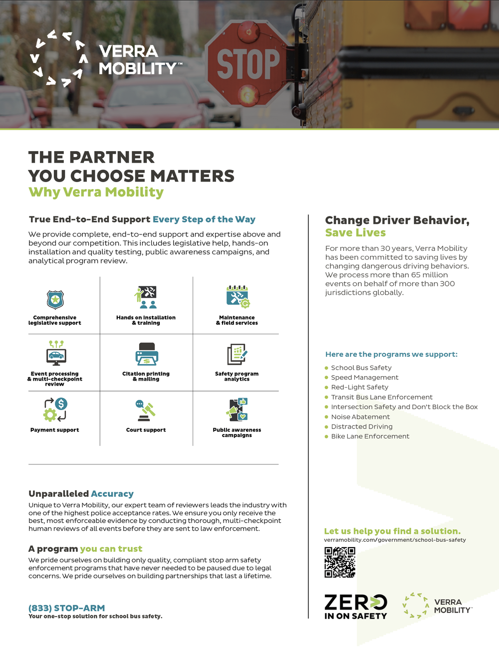
For the B2B side, the rule was: lead with the mechanism. Municipal buyers are not persuaded by lifestyle photography; they’re persuaded by understanding exactly what happens between a violation and a citation, because they’re the ones who will defend it publicly. So the sell sheets are built around process diagrams, numbered steps, and specification lists — closer to technical documentation than to advertising, with the brand doing the warming.
For the B2C side, the rule was the opposite: lead with the outcome. No one needs to know about ANPR or multi-checkpoint review. They need to know that crashes went down, that the bus stop-arm is not a suggestion, and that the cameras are near schools rather than hidden on revenue-generating corners. Those campaigns are built on plain numbers and flat illustration — deliberately unslick, because anything that looks like advertising reads as a company defending its own program.
A recurring constraint shaped a lot of it: the work has to survive being localised. Every jurisdiction has its own logo, its own police department seal, its own statute, its own camera locations. Baltimore City DOT, Tampa Bay Police, Tracy, California and Onondaga County all needed the same underlying piece wearing their identity. So the templates isolate the local variables — mark, colour accent, map data, statute language — and hold everything else fixed.
What I made
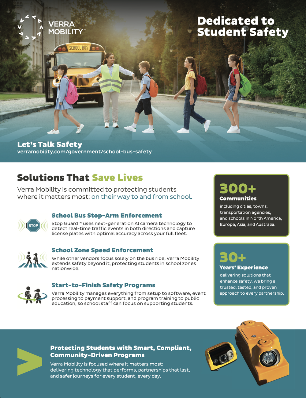
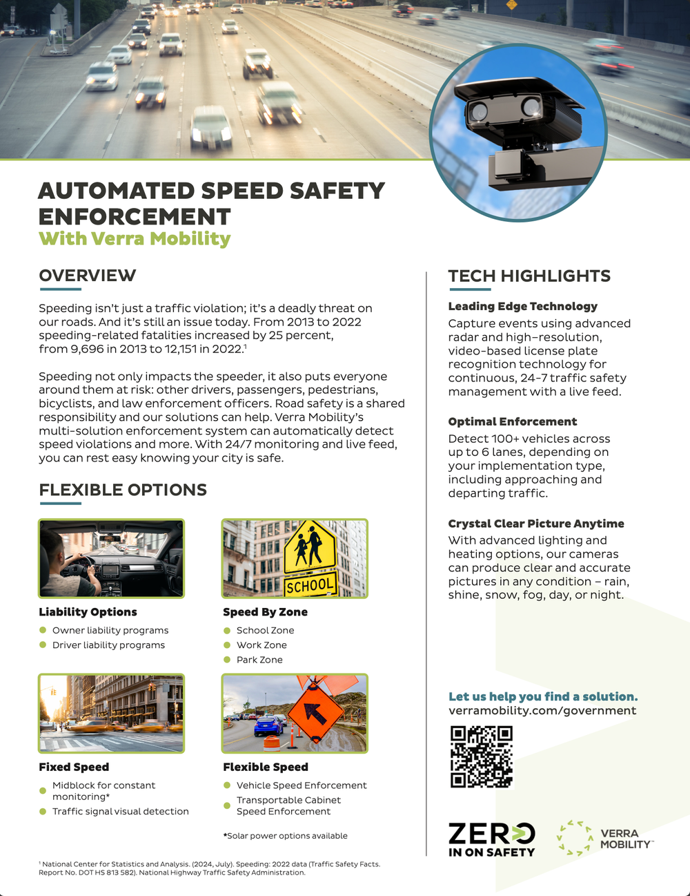
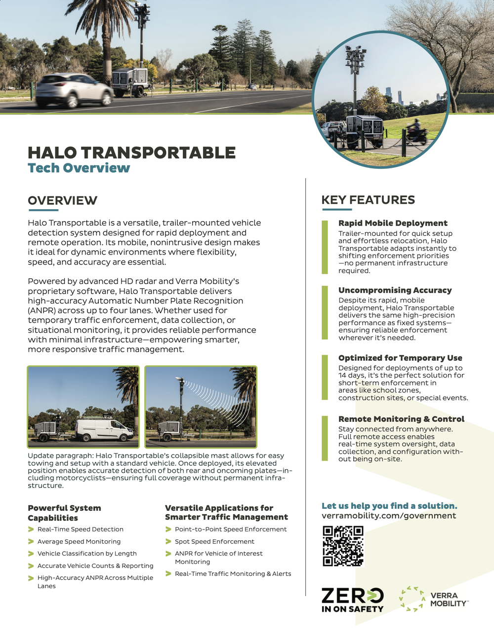
The output ran across print, digital, environmental and web, in service of a portfolio of named programs — Stop Guard for school bus stop-arm enforcement, Redflex for automated red-light and speed enforcement, Halo Transportable for mobile deployment.
- Product and program sell sheets — school bus safety, speed safety, red-light, mobile enforcement
- Trade show graphics: retractable banners, booth advertising, event-dated calls to action
- Co-branded municipal campaigns for city DOTs and police departments
- Large-format camera location maps, produced at 2ft × 3ft for public posting
- Animated social assets and static post systems for Facebook, LinkedIn and city channels
- Isometric explainer illustration for statutory concepts like the child safety zone
- Web page design and art direction for the corporate solutions pages
I directed the illustration and 3D rendering rather than producing all of it.
Where it landed
The work supports programs operating across multiple jurisdictions, each requiring its own localised version of the same core assets.
Selling the system — B2B collateral
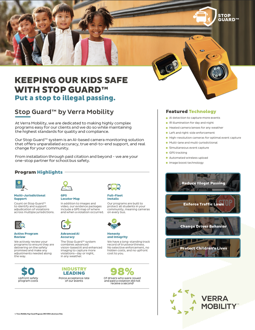
Material for a buyer who has to justify the purchase in public. Every sheet is built on the same skeleton — a photographic band, a mechanism explained in numbered steps, a specification column, and hard figures at the bottom — so a city evaluating three different Verra programs is reading three versions of one document rather than three unrelated brochures.
Trade show & print
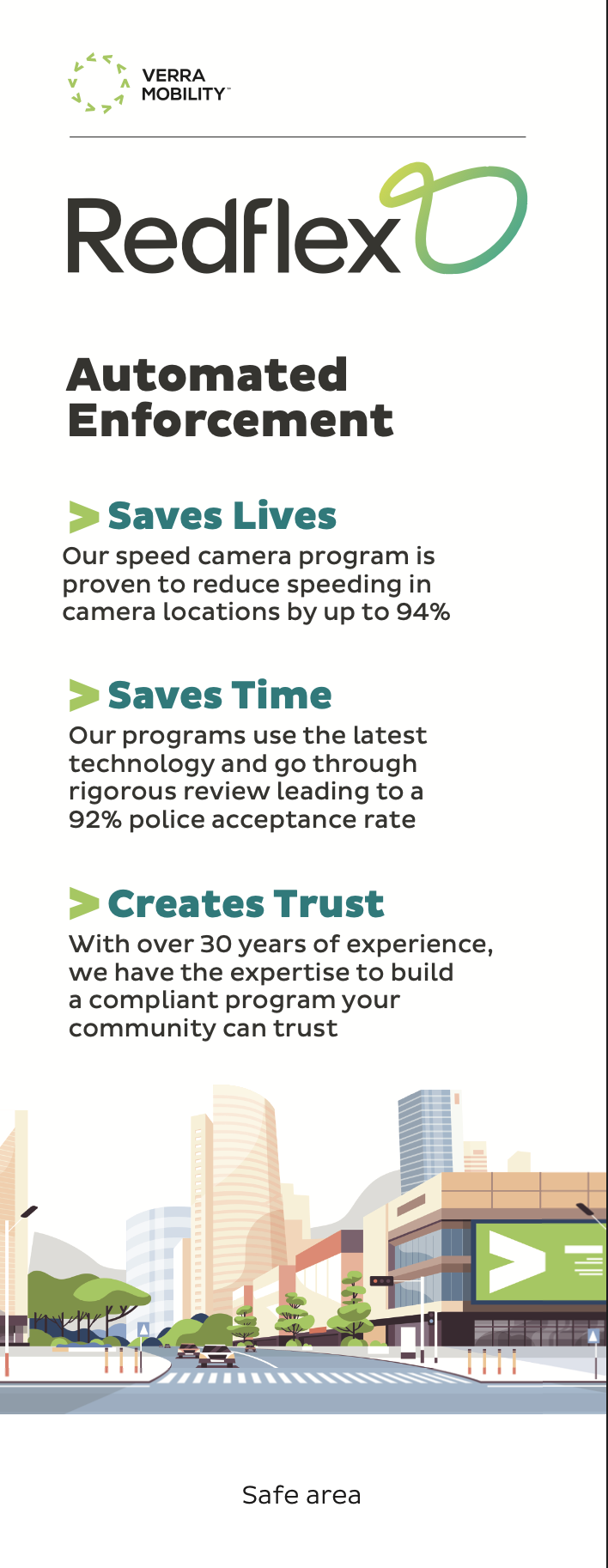
The conference floor is a different reading distance and a different attention span. The retractable banner is stripped to three claims with a figure attached to each, sized to be read across an aisle; the booth ad keeps the full program detail but hands off to a booth number set large enough to function as a directional instruction.
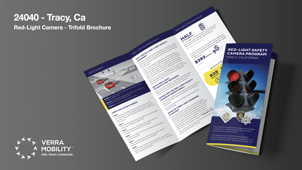
The Tracy trifold is the municipal end of the same pipeline — a public-facing brochure explaining a red-light program to residents, co-branded with the city and its police department, and structured so the “how the system works” spread reads before any justification does.

Public awareness — B2C campaigns
Where the tone flips completely. These run on city and county channels, and they’re read by people who may have just received a citation. Nothing here sells a product; the assets report what changed, and the brand signature sits at the bottom rather than the top.
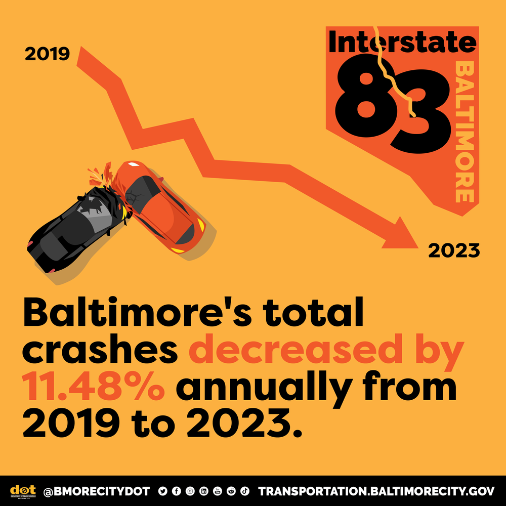
Baltimore City DOT — Interstate 83
A stat-card series for Baltimore’s I-83 corridor program, running on the city DOT’s own social channels. The design decision that matters is the restraint: flat orange, one statistic per card, no photography, no imagery of injury. The subject is crash data, and anything dramatised would read as a company arguing for its own cameras.
The animated cards hold the empty road for a beat before the number lands. That pause is the whole mechanic — the viewer registers an ordinary stretch of highway first, then the figure attached to it. Each card is built on the corridor’s own I-83 shield mark, with the DOT handle bar locked to the base so the message reads as the city speaking rather than a vendor.
Onondaga County — Stop Guard launch
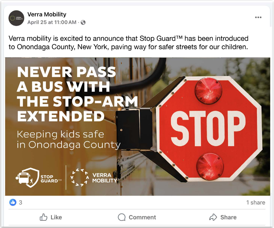
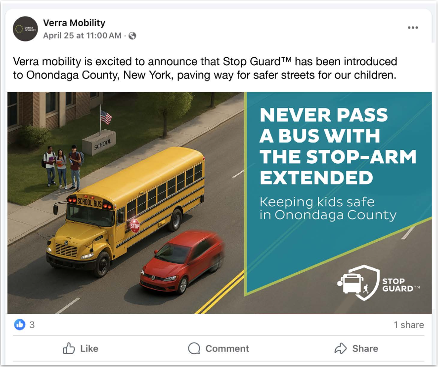
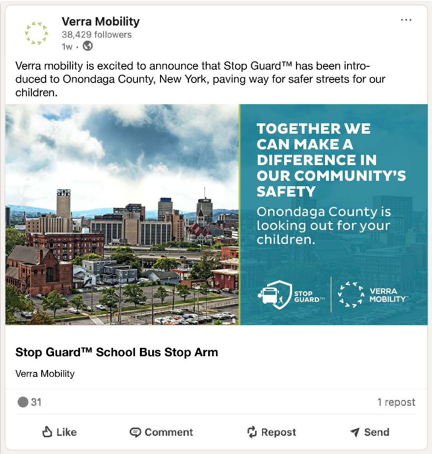
A program announcement running as paired posts across Facebook and LinkedIn, and a good illustration of why the same message needs two executions. The Facebook pair speaks to residents: a hard instruction — never pass a bus with the stop-arm extended — carried once by a photographed stop-arm at close range and once by the aerial illustration that shows the offence being committed.
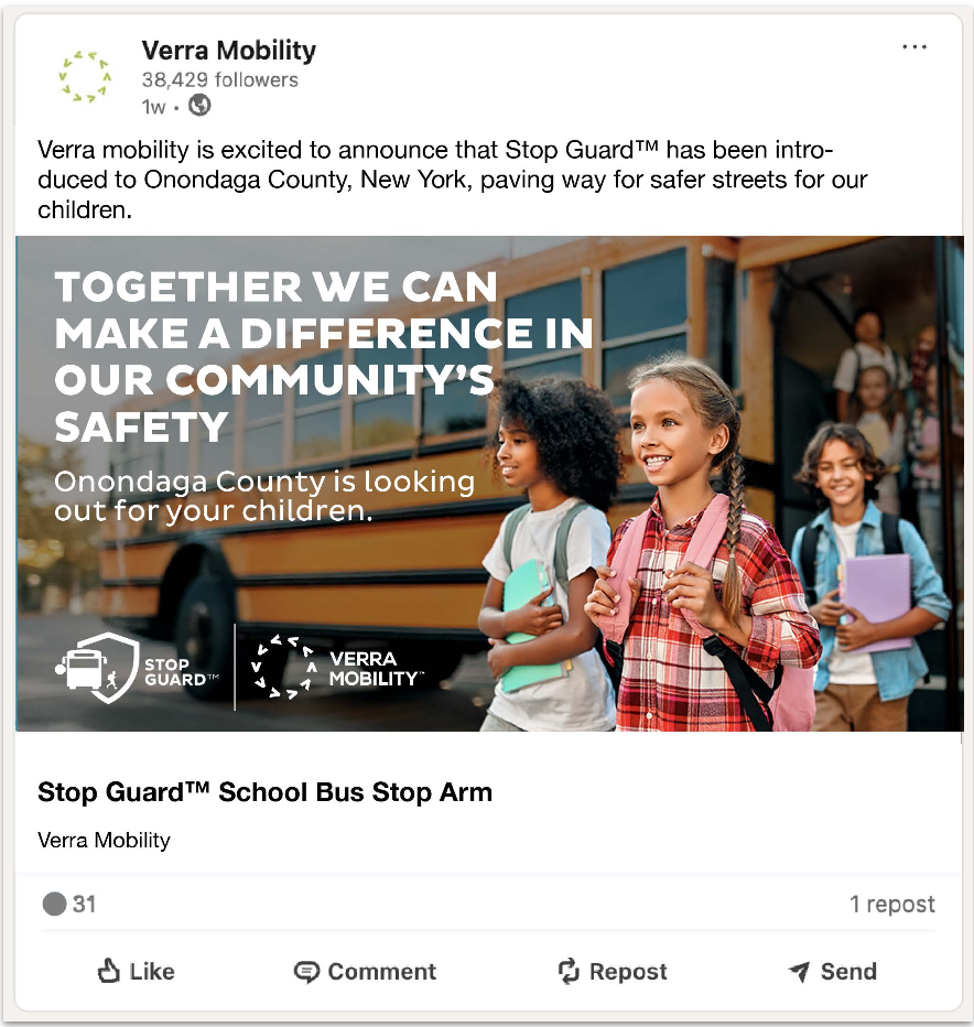
The LinkedIn pair speaks to the county and its peers, so the register softens to a shared commitment rather than a rule, and the imagery shifts to children arriving safely and to the Syracuse skyline. Same launch, same lockups, opposite emotional direction — which is the argument for building these as a system rather than resizing one asset.
Explaining the system — maps & diagrams
The pieces that sit between the two tracks. A camera map and a statutory diagram are used in a council presentation, a press release and a public notice board without changing — which makes them the highest-leverage things on the account, and the ones worth over-building.
Why the map is the argument
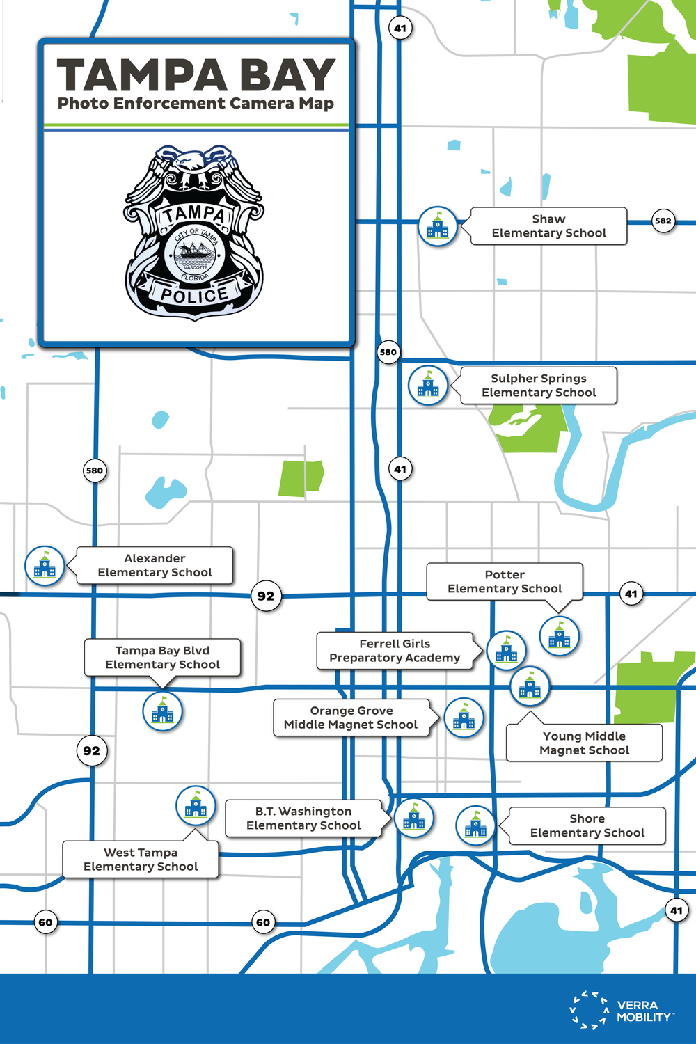
The single most common objection to automated enforcement is that cameras are sited for revenue rather than safety. A map that names every enforced location and shows that each one sits at a school answers that objection before it’s made — which is why it’s printed at 2ft × 3ft and posted publicly rather than buried in a PDF.
The design work is mostly subtraction. Road hierarchy is reduced to two weights of blue, everything not load-bearing is greyed back, and the only saturated elements left are the school markers and their labels. The police badge sits in a panel at top left rather than in a footer, because the map has to read as the department’s document, not the vendor’s.
The child safety zone diagram solves a related problem. The statute defines the zone as one-eighth of a mile from the property line of a school or park, extending to the nearest intersection — legally precise and almost impossible to picture. Drawing it isometrically with the measurement arrows visible converts a paragraph of legislation into something a resident can check against their own street.
Digital — solutions pages
The web work is where the two tracks converge: a page that has to open with the emotional case and close with the procurement case, without the seam showing.
The page structure
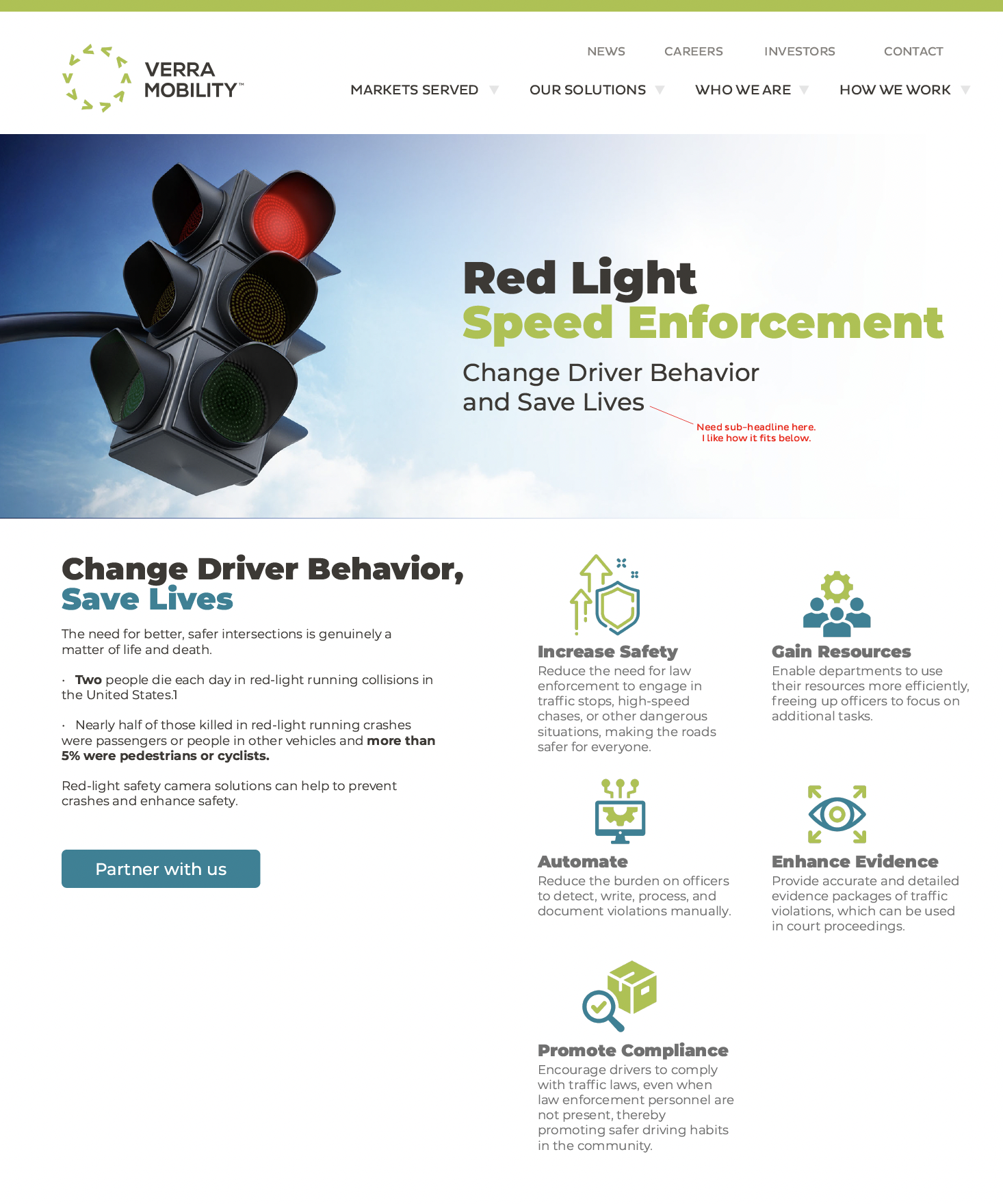
The hero is photographic and singular — one traffic signal against sky — because the page’s first job is to make an abstract policy question feel like a physical object. Immediately beneath it, the argument gets specific: two people die each day in red-light running collisions, and nearly half of those killed were not the driver who ran the light. Placing that directly under the hero means the emotional case is made before any product language appears.
The five-benefit icon grid then does the procurement work — safety, resources, automation, evidence, compliance — which maps to the objections a department actually has to answer internally. The single call to action is deliberately not “request a demo”; partnership language matches how these programs are actually contracted.
I’ve left the comp as presented, annotation intact, rather than cleaning it up.