Case 05 / PepsiCo
Pepsi, off
the shelf and
into hand
Four separate PepsiCo briefs across a single year, each one asking the same underlying question in a different format: what does the brand look like when someone can pick it up, wear it, or walk into it? Structural packaging, an Amazon storefront, a tiered summer activation, and a licensed merchandise program for UEFA Champions League.
- Client
- PepsiCo — Pepsi
- Role
- Creative & Art Director
- Studio / Team
- PepsiCo Agency
with CD Sunnie Guglielmo - Period
- 2019 – Present
Pepsi × DSquared2
Influencer Packaging
A structural packaging problem disguised as a graphics problem: how do you make one commemorative can feel like an object worth keeping — and keep it from falling out of the box on the way home?
The brief
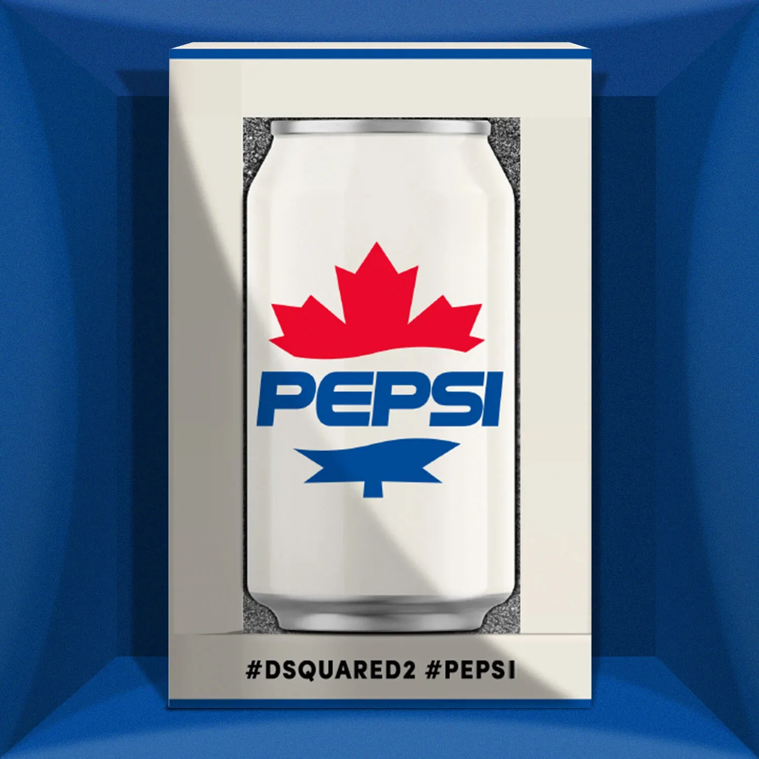
Pepsi's collaboration with the fashion house DSquared2 needed a package for guests at a Pepsi Super Bowl party — the can and the carton both co-branded, handed to people on their way through a live event. The contents were deliberately minimal: a single commemorative can carrying the retro maple-leaf Pepsi mark. Everything the recipient would react to had to come from the container.
The engagement ran in two phases. First, concept mockups — structural routes worked up far enough for the client and DSquared2 to react to something real. Then, once a route was approved, the material call: which stocks, which foils, which inks, and how each one behaves under the finishing process that has to produce it.
The approach
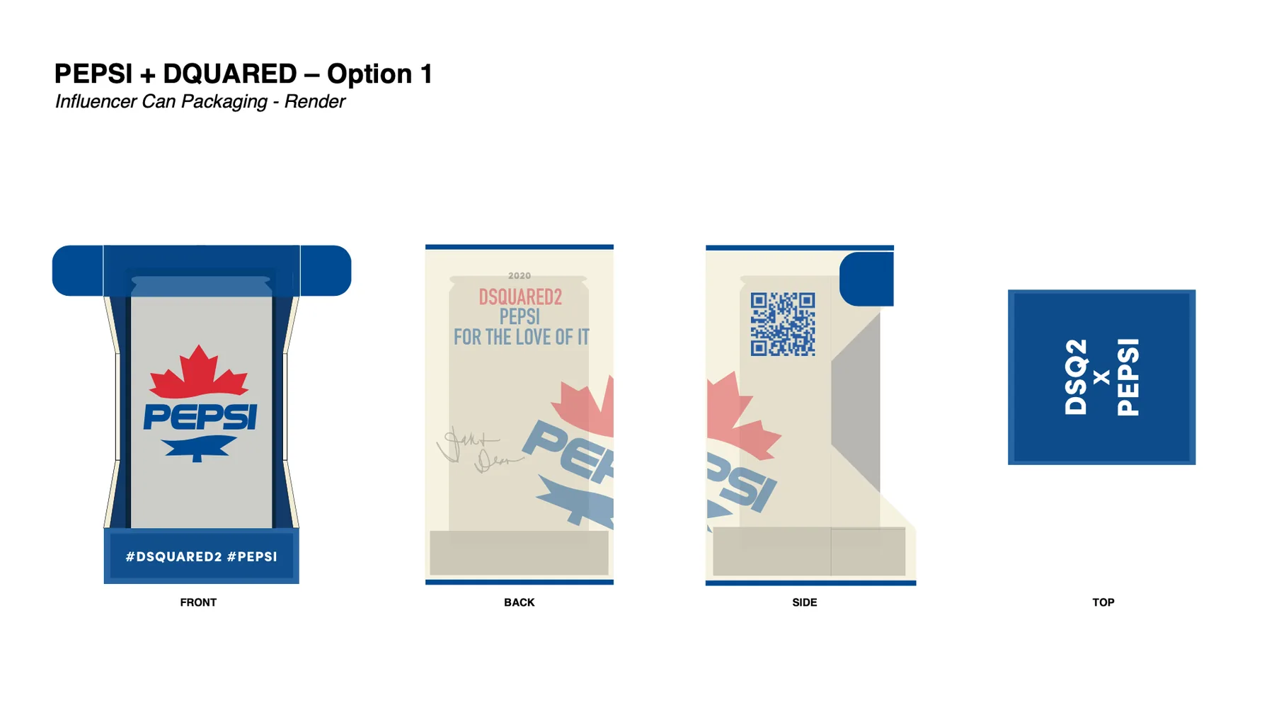
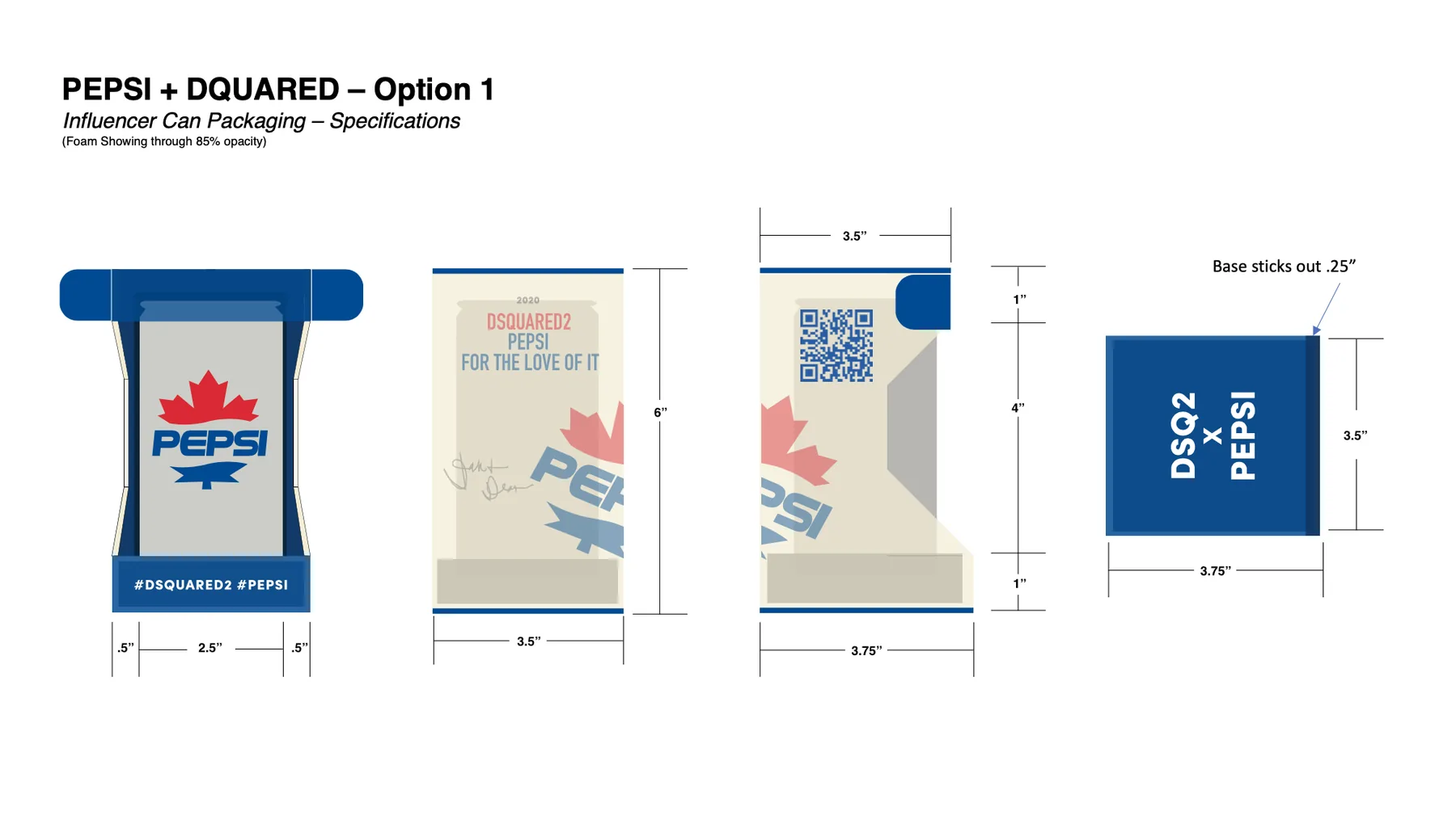
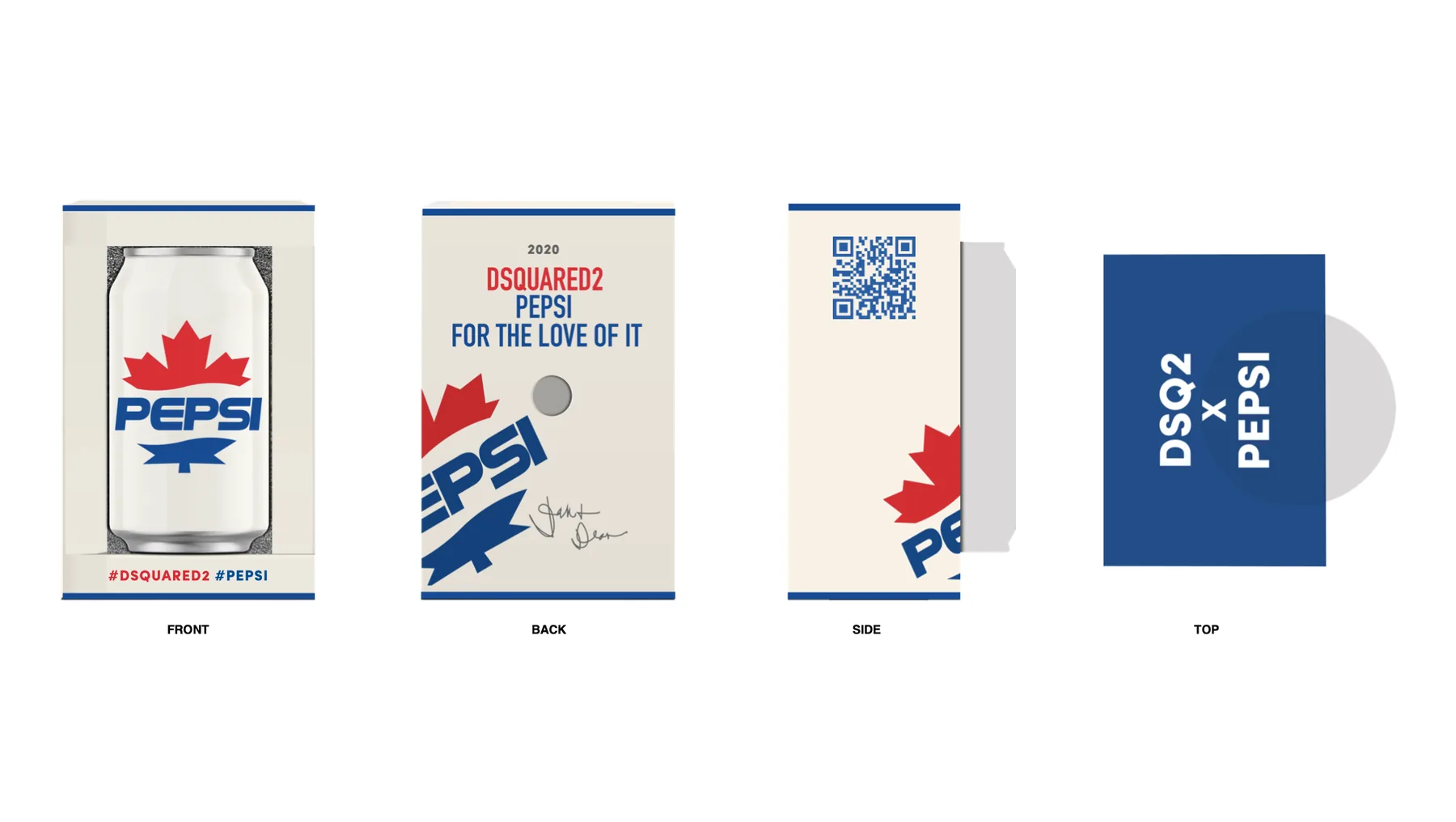
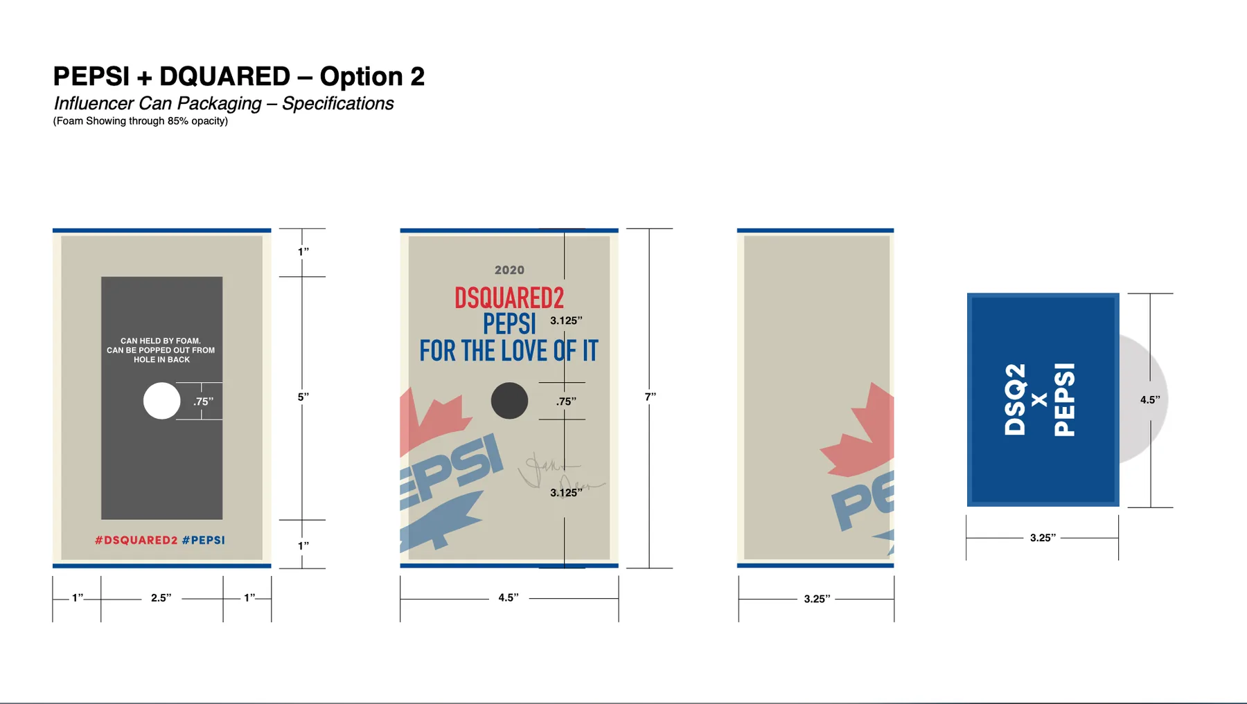
Rather than presenting two graphic skins on the same box, I developed two genuinely different structures so the decision would be about behaviour, not decoration. Option 1 treats the can as an object on display: a plinth-and-shroud form where the outer sleeve lifts to leave the can standing on a printed base band. Option 2 keeps the familiar flat retail slab and hides the trick on the back — a 0.75-inch push-out port lets you pop the can free of its foam nest with one thumb.
Both routes share a single graphic system so the choice stayed structural. The retro Pepsi lockup is blown up past the trim edge and cropped, the collaboration line sits centred and quiet at the top, and a QR panel and hashtag band handle the campaign mechanics without crowding the face.
What I made
Presentation renders and full production specifications for both routes — front, back, side and top elevations with dimensions called out, foam positions shown at 85% opacity so the client could see how the can sits inside, and the base overhang dimensioned at 0.25 inch. Option 1 runs 6″ × 3.5″ × 3.75″; Option 2 runs 7″ × 4.5″ × 3.25″ with the port centred 3.125″ from the top and bottom edges.
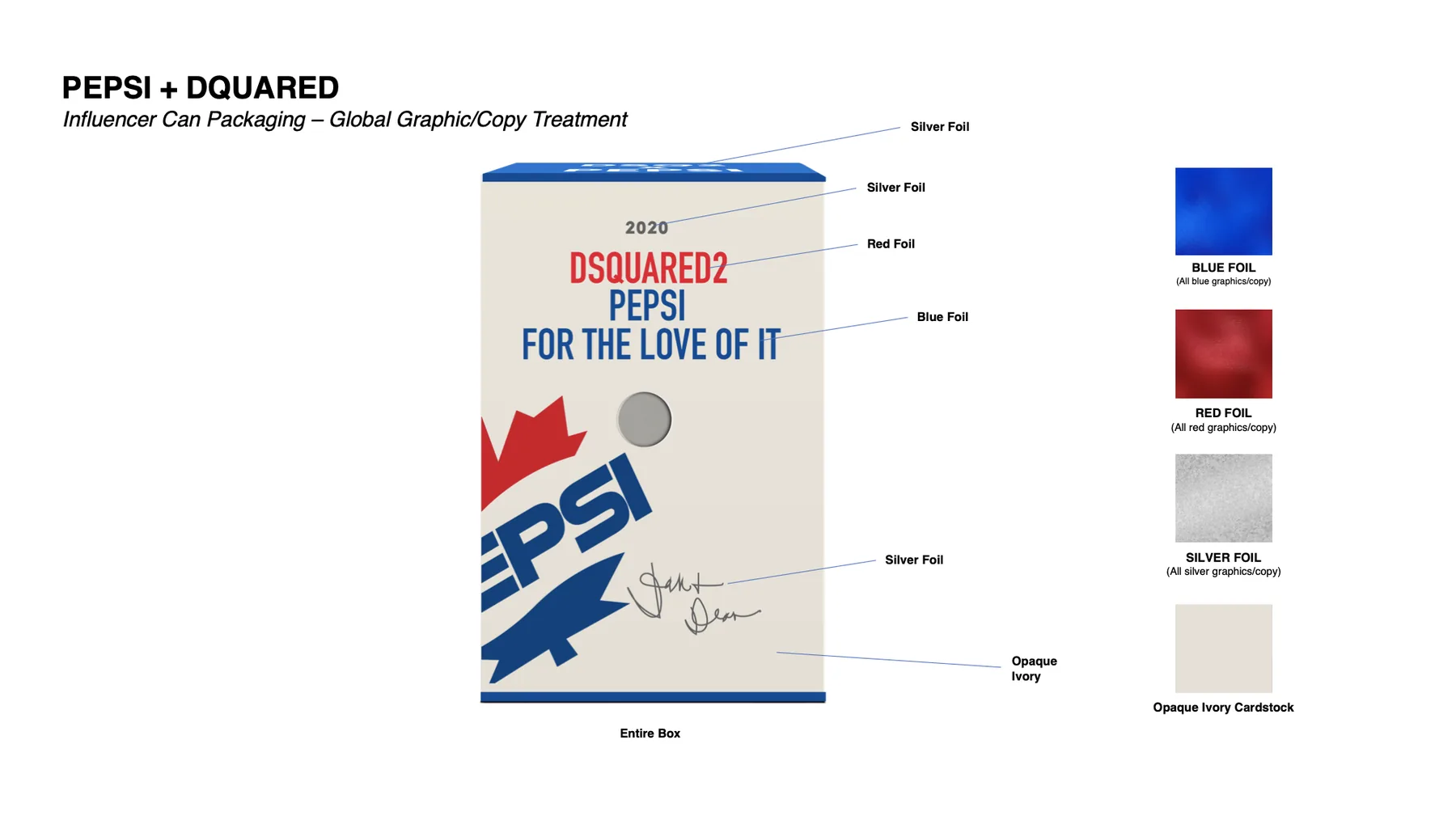
I also wrote the global graphic and copy treatment sheet: a single page that maps every element on the carton to its finishing process, so red type stamps in red foil, blue in blue, the year and the signature in silver, all on opaque ivory cardstock. That sheet is what makes a quote possible.
Where it landed
Option 2 was selected. Both routes tested well and the preference between them was close — the deciding factor was security. At a Super Bowl party the package is handed over in a crowd and carried around for hours, and the plinth route lets the can stand free the moment the shroud is lifted. The slab holds it captive in foam until someone deliberately pushes it out. The structural idea that looked like the quieter of the two turned out to be the one that survived the room it was designed for.
Pepsi Brand Store
on Amazon
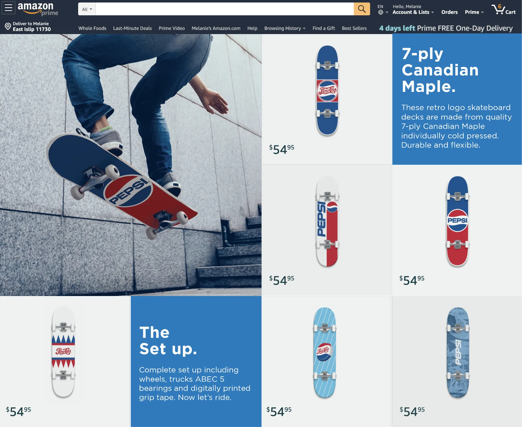
Product design and storefront design in the same brief — the skate decks and the page selling them were drawn to the same grid.
The brief
Pepsi's licensed merchandise needed a home on Amazon that read as a brand environment rather than a search result. The launch category was skate hardware: complete boards built on 7-ply Canadian maple, priced at a single tier of $54.95.
The decks were new designs rather than existing product given a page — the graphics and the storefront were drawn as one job, so the range and the environment it sold in arrived together. Some of the prototype work on saleable product can't be shown here for legal reasons; what's on this page is the storefront and the deck graphics that went with it.
The approach
Amazon Stores hands you a fixed set of tiles, so the design work is deciding what goes in them and in what rhythm. I treated the page as a chequerboard: a full-bleed lifestyle plate anchoring the top-left, product cells on clean neutral grounds, and solid Pepsi-blue copy tiles dropped into the grid at intervals so the eye gets a beat of information between every run of product. The copy tiles carry the two things that actually sell a deck — what it's made of, and what's in the box.
The deck graphics themselves come out of the Pepsi archive rather than the current logo: the 1940s bottle cap, the crown zigzag, the script wordmark, the globe. Skate graphics trade on heritage, so the retro marks were the range, not a nostalgia sub-line. A denim-wash camo deck sits at the other end to keep it from reading as a museum shelf.
What I made
The full storefront layout and its module order, the product photography direction and cell treatments, the animated hero, and the on-page copy — including the headline structure that gives each blue tile one job: 7-ply Canadian Maple. The Set up. I also designed the deck graphics across the range and the product-detail views, with the three-dot carousel and the description block that repeats the material and component spec at the point of purchase.
Where it landed
The store went live and sold the range. It has since been retired — licensed merchandise programs run to their term and come down, and this one has come down.
Summer Activation
#Summergram
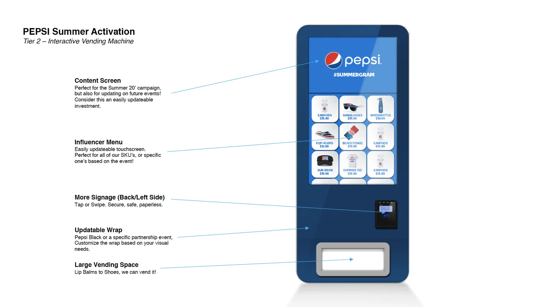
One illustration system, three physical footprints — a vending kiosk, a retail endcap, and a truck — each with a different budget and a different dwell time.
The brief
A summer campaign that had to exist physically, in venues with wildly different constraints — and had to be affordable at more than one price point. The answer was tiered: the same visual world scaled up or down depending on what a given activation could carry.
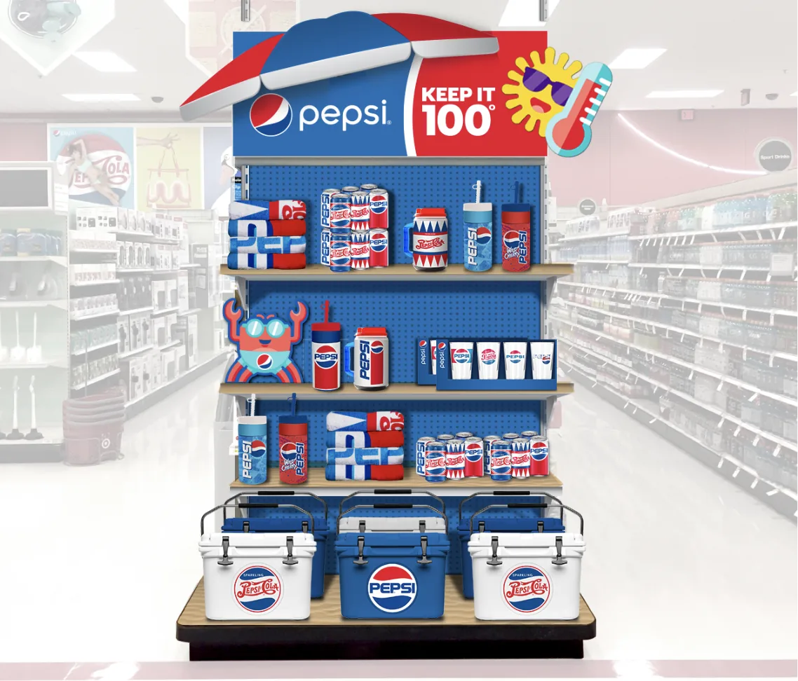
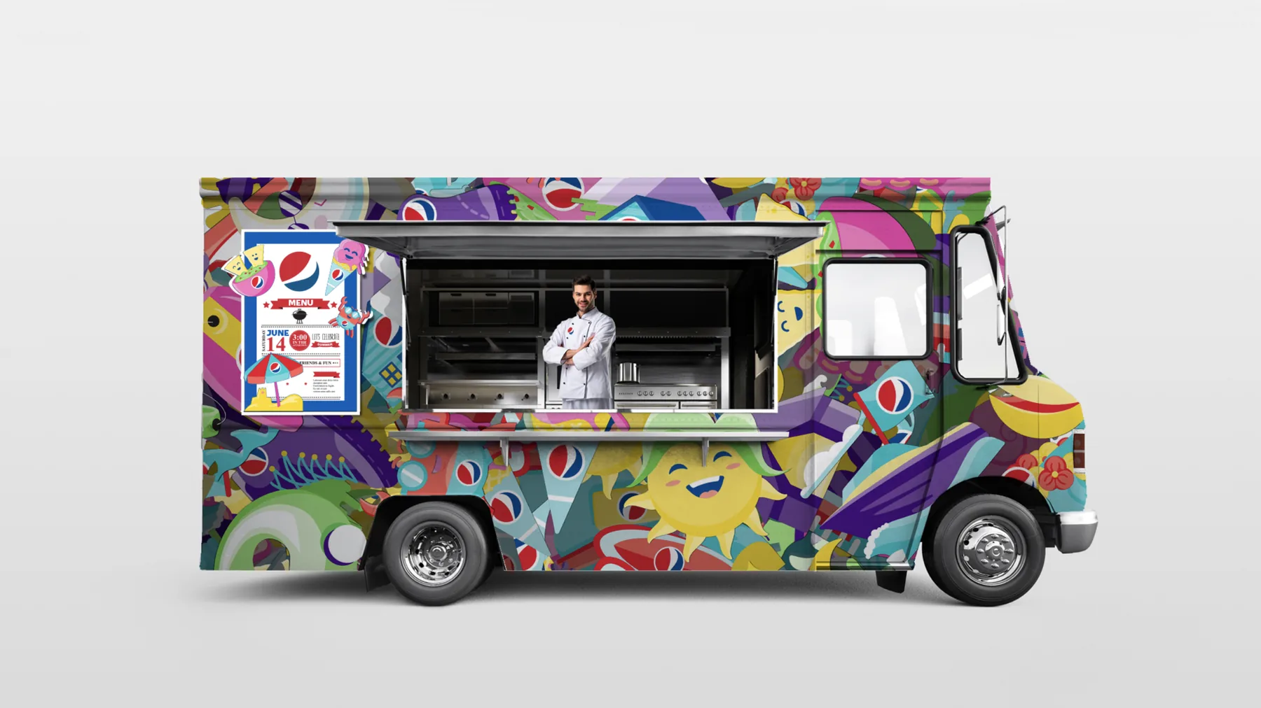
The objective was a seasonal push: drive Pepsi into summer, under a #Summergram banner and a beach-forward idea. Each tier attacks that from a different angle. The vending kiosk gives away Pepsi-branded sun-and-beach merchandise with or without a purchase, so the brand buys attention rather than a transaction. The food truck is the deepest version — a full menu built around PepsiCo products, so the brand is the meal and not the cup. The retail endcap carries the same world into the store aisle, where the purchase actually happens.
The approach
I built the summer world as a dense, flat illustration set — sun and crab characters, beach umbrellas, popsicles, ice cream, pool floats, cut-paper geometry — held together by a palette that pushes well past Pepsi's blue and red into magenta, violet and citrus. That density is what makes it survive being shrunk onto a shelf strip or stretched across twenty feet of truck panel.
The retail endcap works the opposite way: a hard structural umbrella topper, a Keep It 100° lockup, and three shelves of merchandise stepping down to a cooler-loaded pallet base, so the fixture reads as a temperature and a destination from the end of the aisle. The vending kiosk sits between the two — a piece of hardware, so it was designed to be re-skinned rather than replaced.
What I made
The illustration system and its application across three builds: the kiosk UI and wrap, including the merchandise menu screens and price tiers; the retail endcap fixture design with shelf planogram and umbrella header; and the full food-truck wrap plus its menu board. I also drew the annotated kiosk document — the version that goes to a stakeholder rather than a fabricator, arguing the screen and wrap as an updatable investment they can point at future events.
Where it landed
Well received, and beyond that I can't tell you — which is the honest description of how this kind of PepsiCo work runs. A good deal of it is a think tank for out-of-home concepts, and ideas are commissioned, presented and banked without the designer being told which ones surface, where, or in what season. Some of it I see in the world later. Some of it I never do. Work made under those terms has to be judged on whether it's convincing in the room, which is why the annotated kiosk document above is on this page at all: it's the artefact that had to do the arguing.
Pepsi × UEFA
Champions League
A licensed merchandise program built on two graphic routes, tested across every substrate a football partnership demands.
The brief
Pepsi's Champions League sponsorship needed a premium merchandise range — the kind given to partners, hospitality guests and talent rather than sold at retail. Every piece has to carry the co-branded Proud Partner lockup and survive being applied to knit, mesh, felt, rubber and anodised metal.
The approach
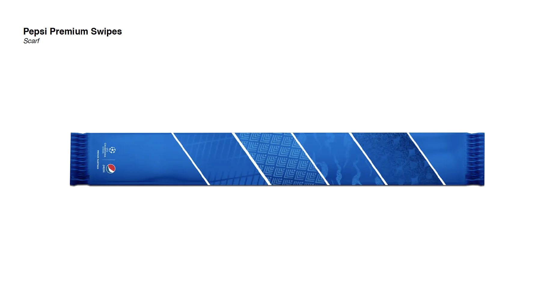
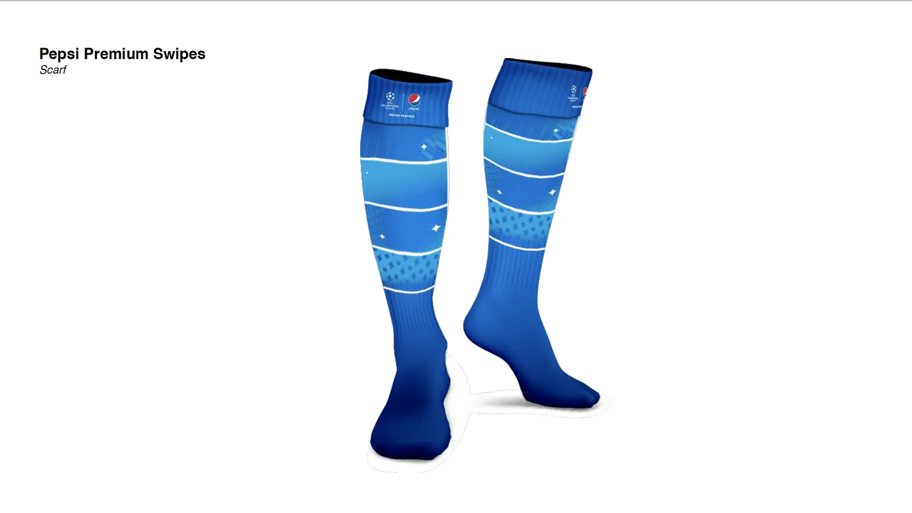
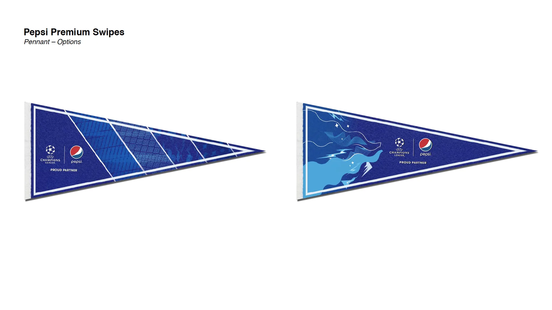
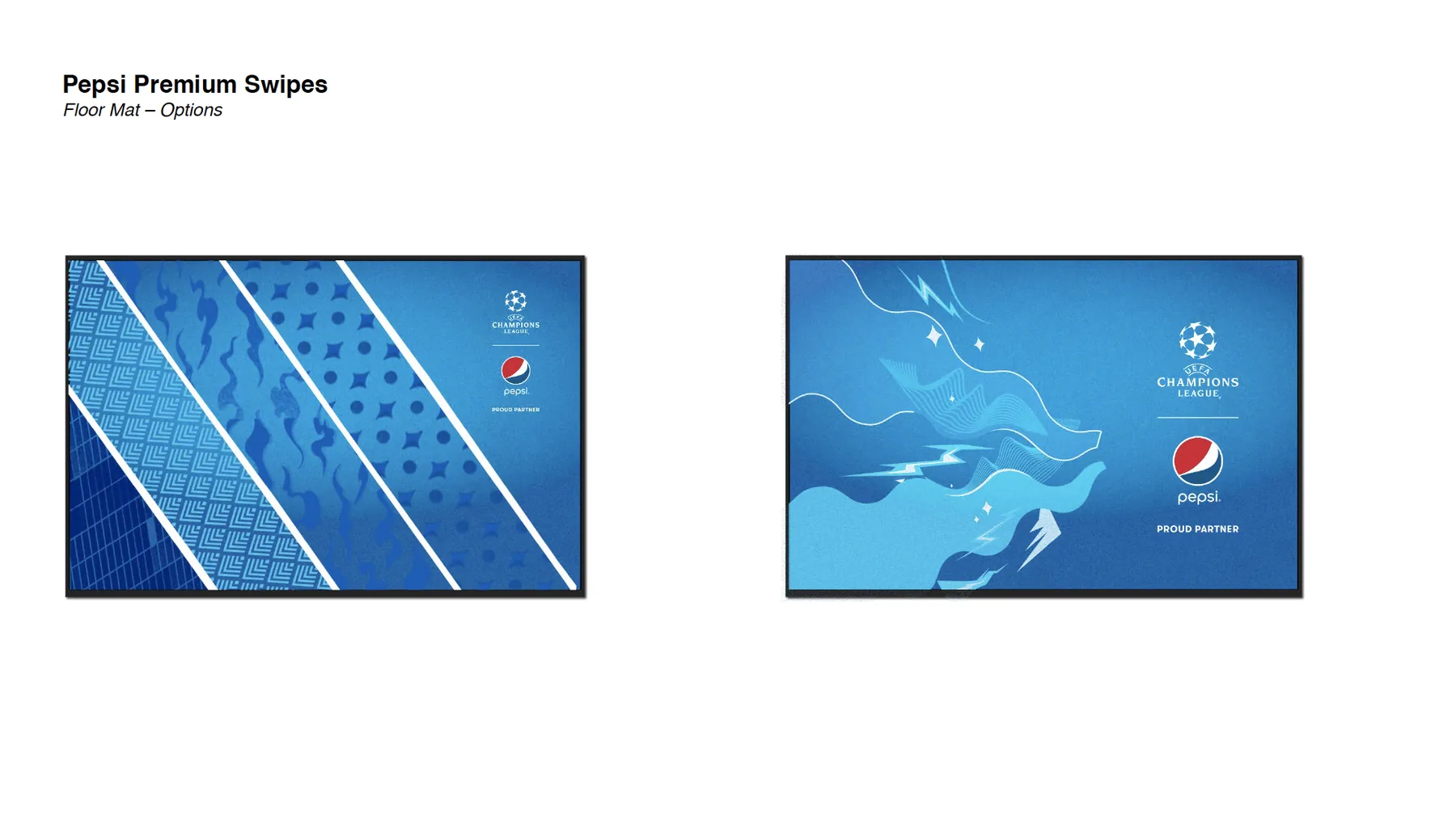
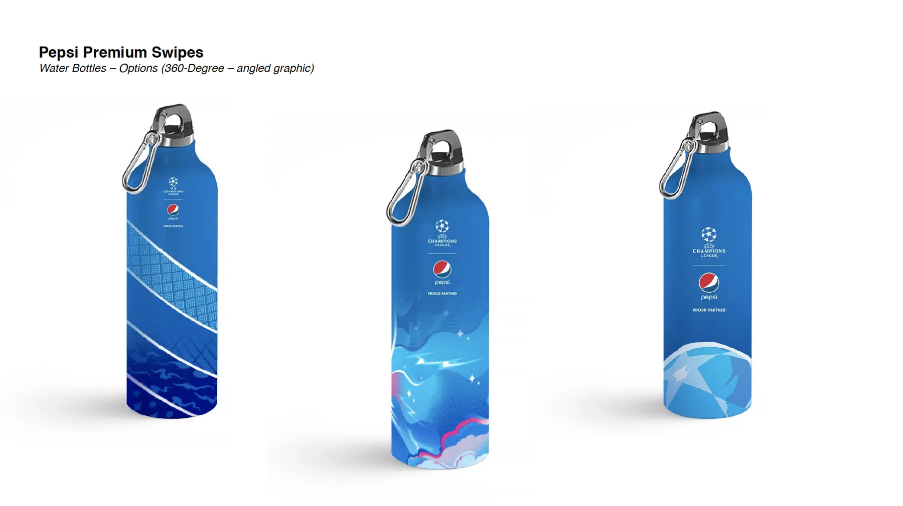
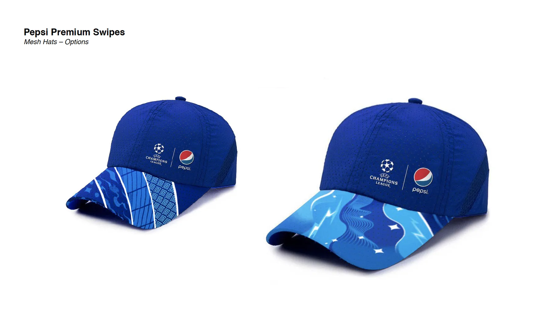
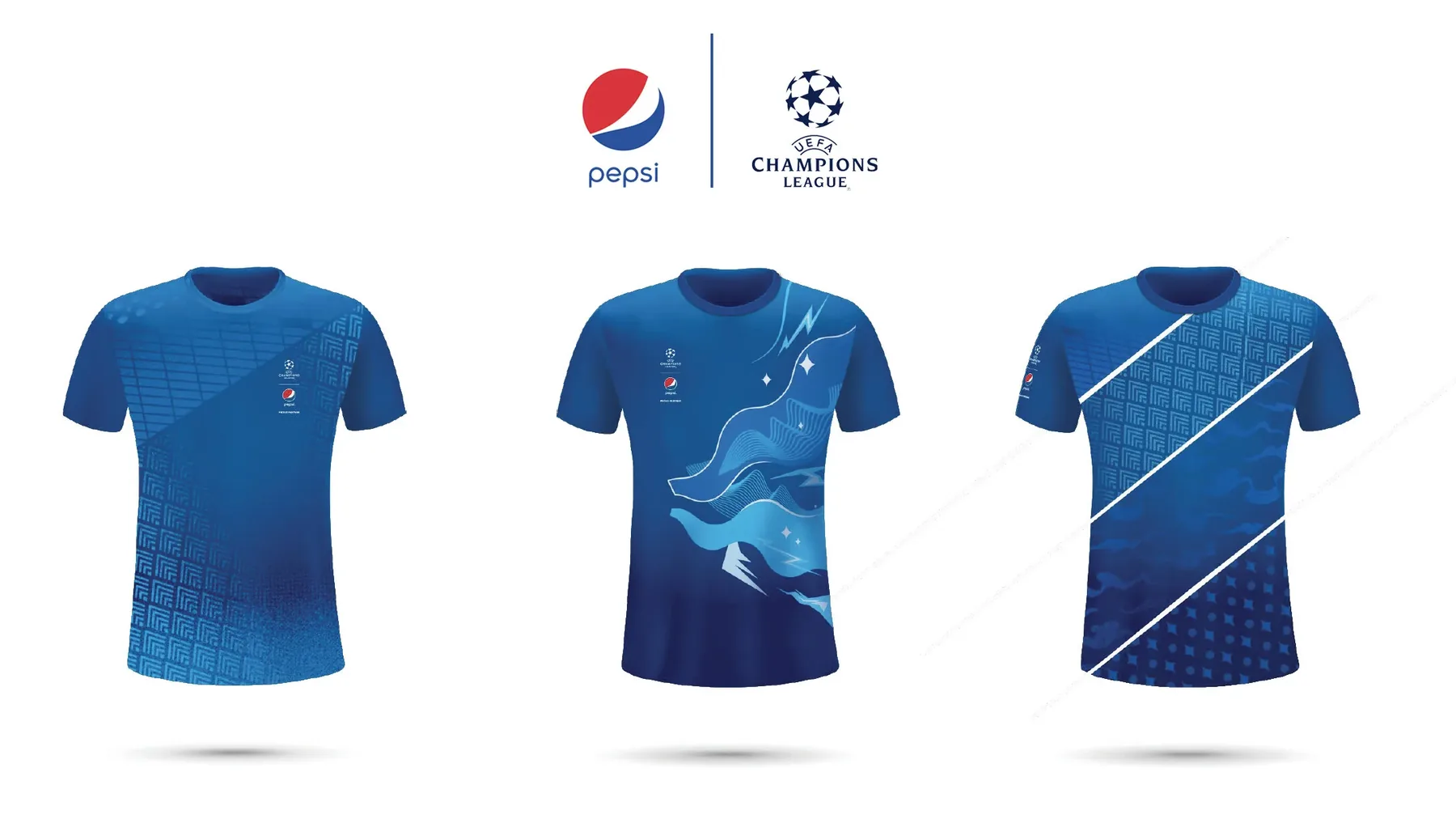
I developed two routes so the client could choose a temperature rather than a layout. The swipe system slices each surface with hard white diagonals and fills the bands with tonal pattern fields — a stadium grid, a chevron knit motif, a smoke texture, a star-and-dot field lifted from the Champions League starball. It is quiet, it tiles onto anything, and it works in a single ink.
The painterly route goes the other way: a ribbon of light and lightning moving across a night-sky gradient, more atmosphere than pattern. On a jersey front or a bottle it behaves like a photograph. On a floor mat it becomes the whole floor.
Both share one rule that made the range hang together — the diagonal. Whether it is a hard white bar or a soft ribbon, everything moves across the surface at the same angle, so a scarf and a cap read as siblings without repeating a motif.
What I made
Both graphic systems and their application across the full range: three jersey options, scarf, match socks, felt pennant, floor mat, 360-degree water bottles with the graphic wrapped on the angle, and perforated mesh caps with the pattern isolated to the brim. Each item was presented as a paired option so the routes could be compared like for like, and each carries the UEFA and Pepsi lockup positioned to licensing rules.