Case 09 / SAI360
Drawing software
that doesn’t
go out of date
Nearly 100 technical illustrations explaining how SAI360’s governance, risk and compliance platform works — built as a single drawn system rather than a folder of screenshots, so the artwork survives every release, every customer, and every language.
- Client
- SAI360
- Role
- Art Director
- Period
- 2020 — ongoing
The brief
SAI360 sells governance, risk and compliance software — the kind bought by committee, evaluated against a requirements matrix, and configured differently for every customer. The company needed a visual language for explaining how the product works: how-to and how-it-works illustrations for sales material, documentation, onboarding and internal training.
Screenshots were the obvious answer and the wrong one. A screenshot ages out at the next release, shows one customer’s configuration when the whole pitch is flexibility, carries live data you can’t publish, and has to be recaptured for every language. At the scale required — the illustrations are numbered against a documentation outline, running to nearly a hundred — recapture would have been a permanent tax.
The approach
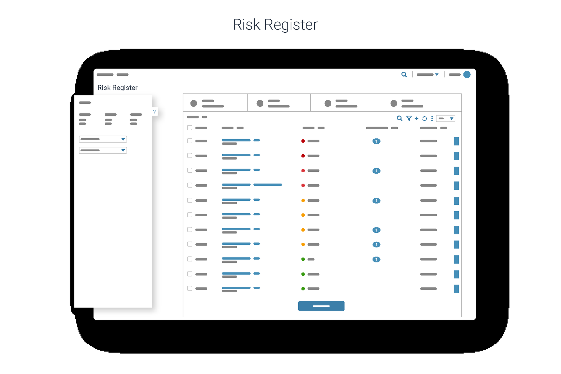
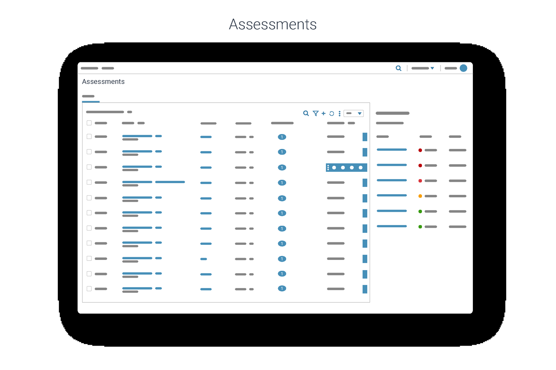
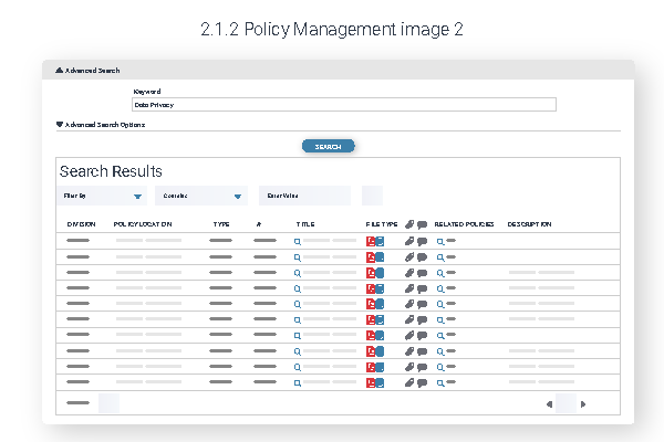
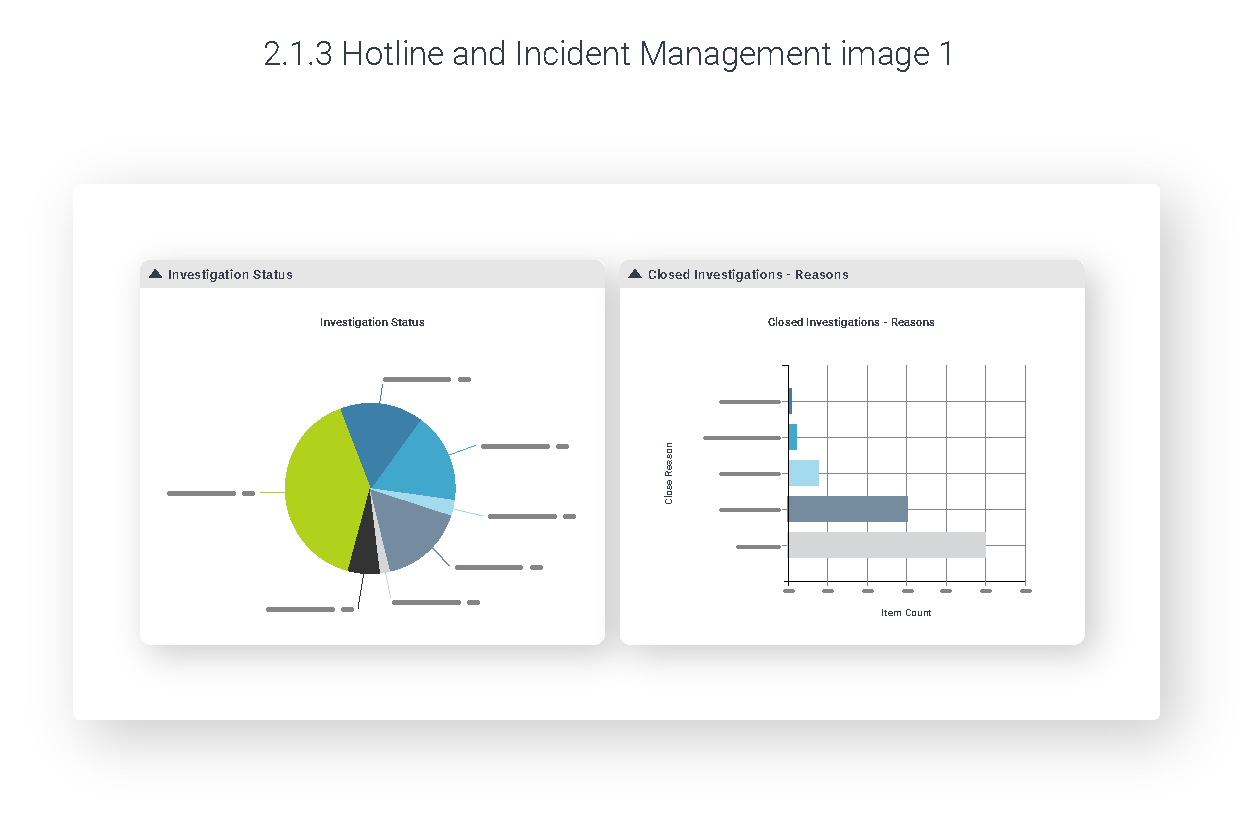
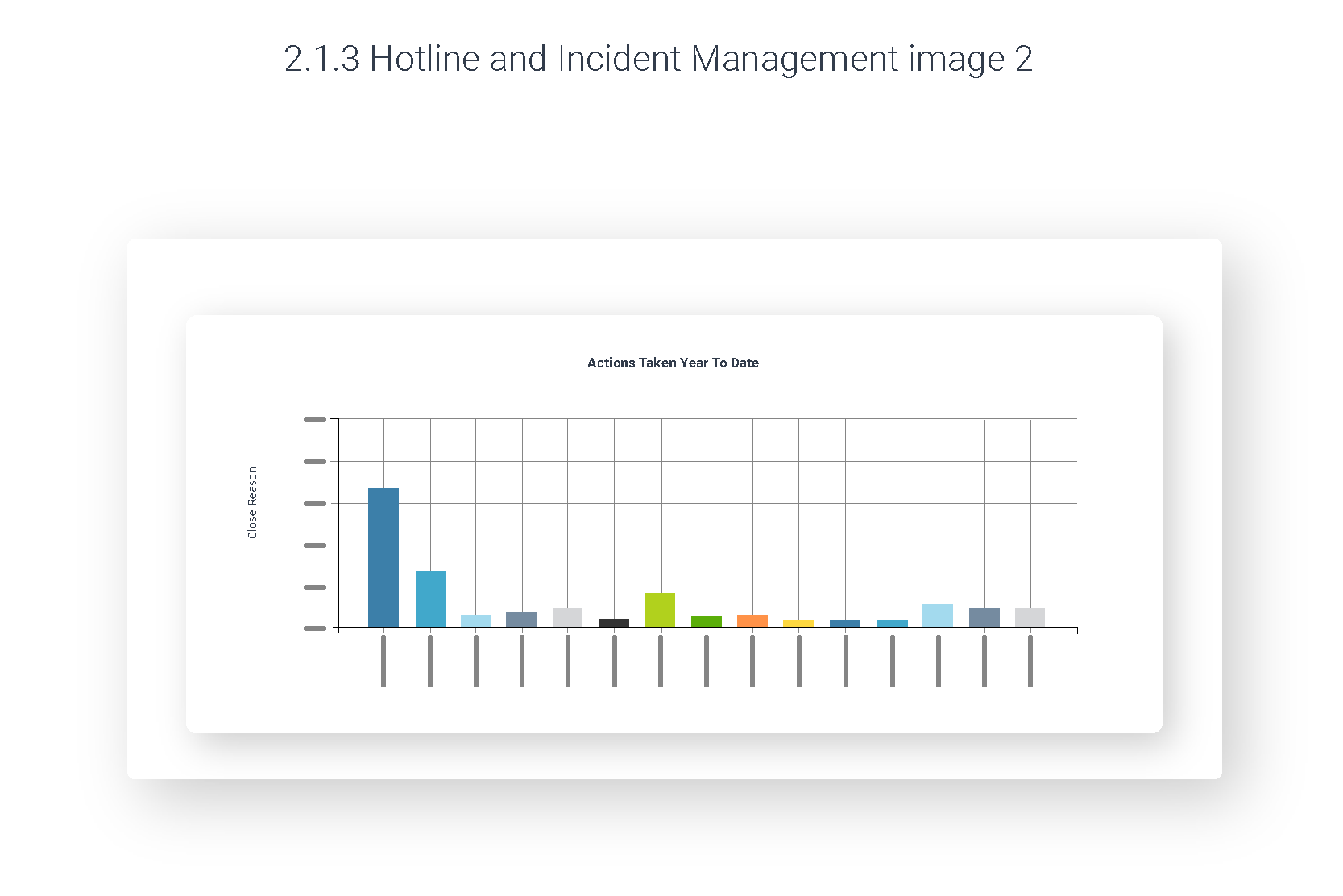
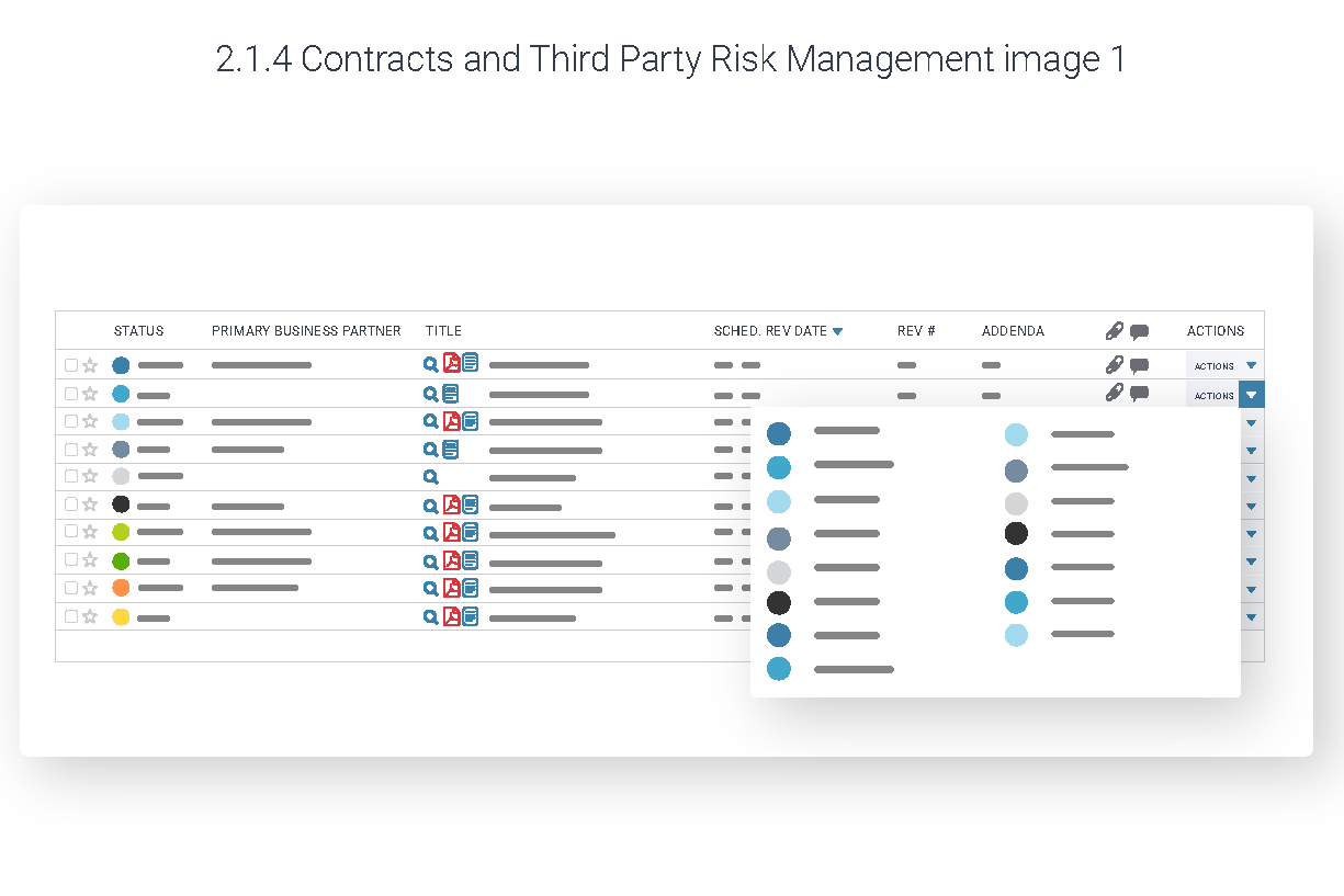
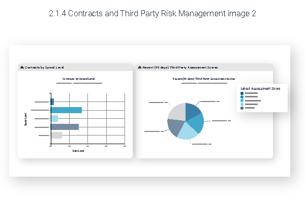
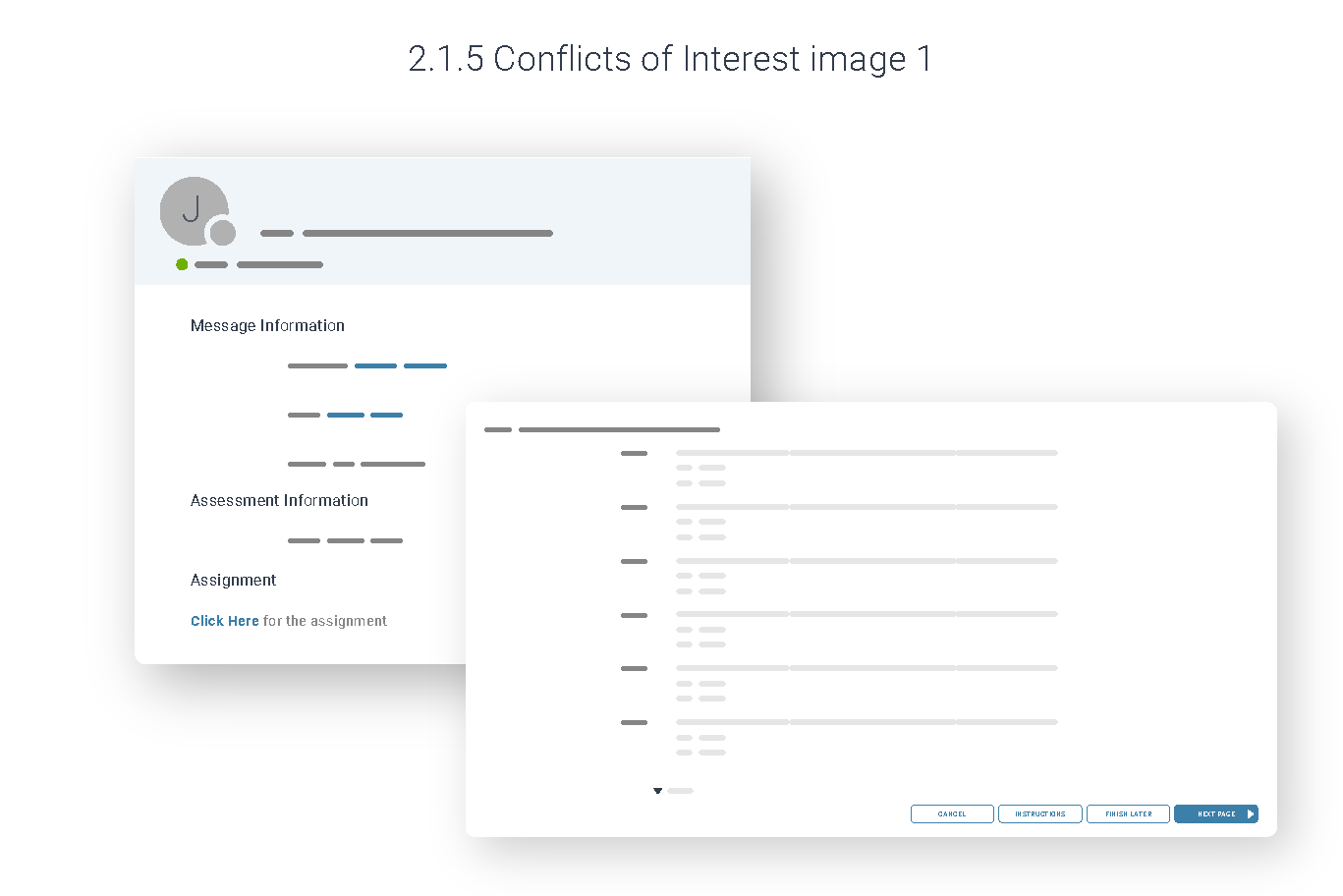
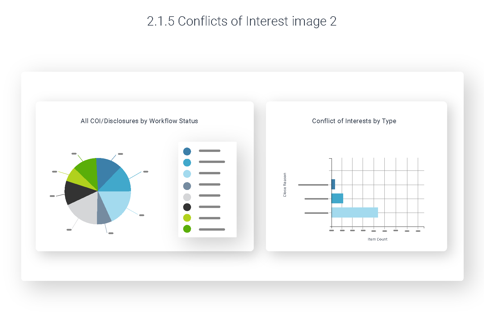
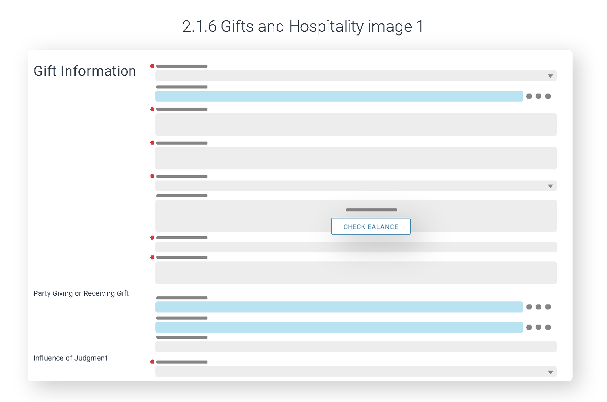
I drew the interface instead of photographing it, and made one editorial decision that carries the whole system: only the labels that teach get to be words. Section headers, chart titles, column names and calls to action are set in real type. Everything else — body copy, record names, numbers, dates — becomes a grey bar.
That single rule does a lot of work at once. The reader’s eye goes straight to the feature being explained rather than getting lost reading invented sample data. No customer information is ever exposed. The artwork doesn’t need re-translating, because there is barely any text to translate. And when the product ships a new release, the drawing is still true, because it describes structure rather than pixels.
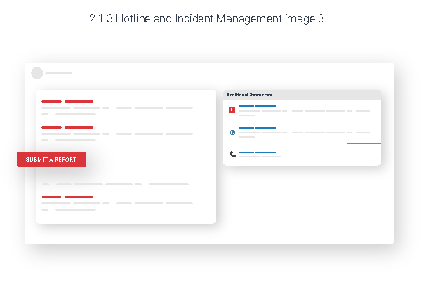
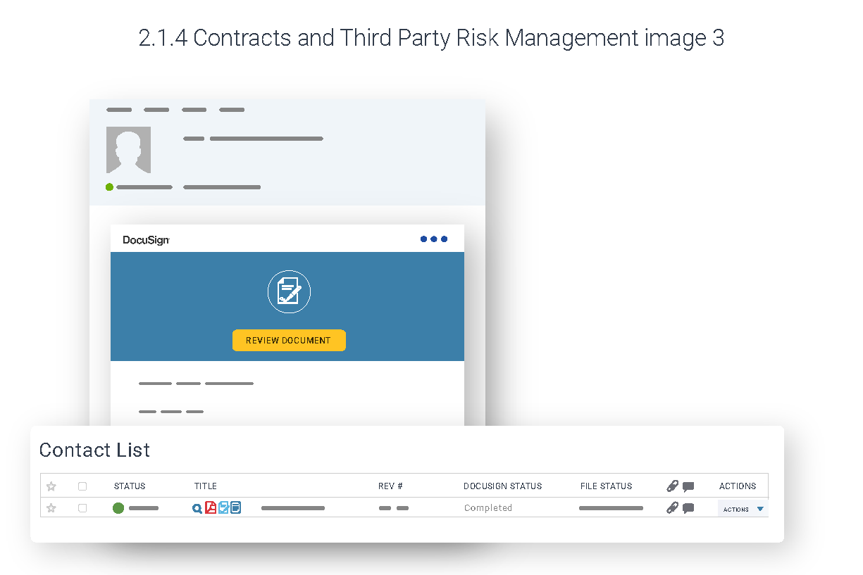
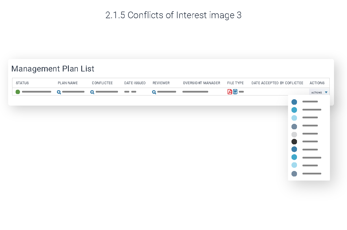
The second decision was compositional. Rather than showing flat rectangular screens, each illustration lifts one element — a filter panel, a chart, a dropdown, a confirmation email — off the surface and floats it in front, with soft shadow and generous white space around the whole assembly. That’s the equivalent of a pointing finger: it tells you which part of the screen the paragraph beside it is about, without needing a callout arrow.
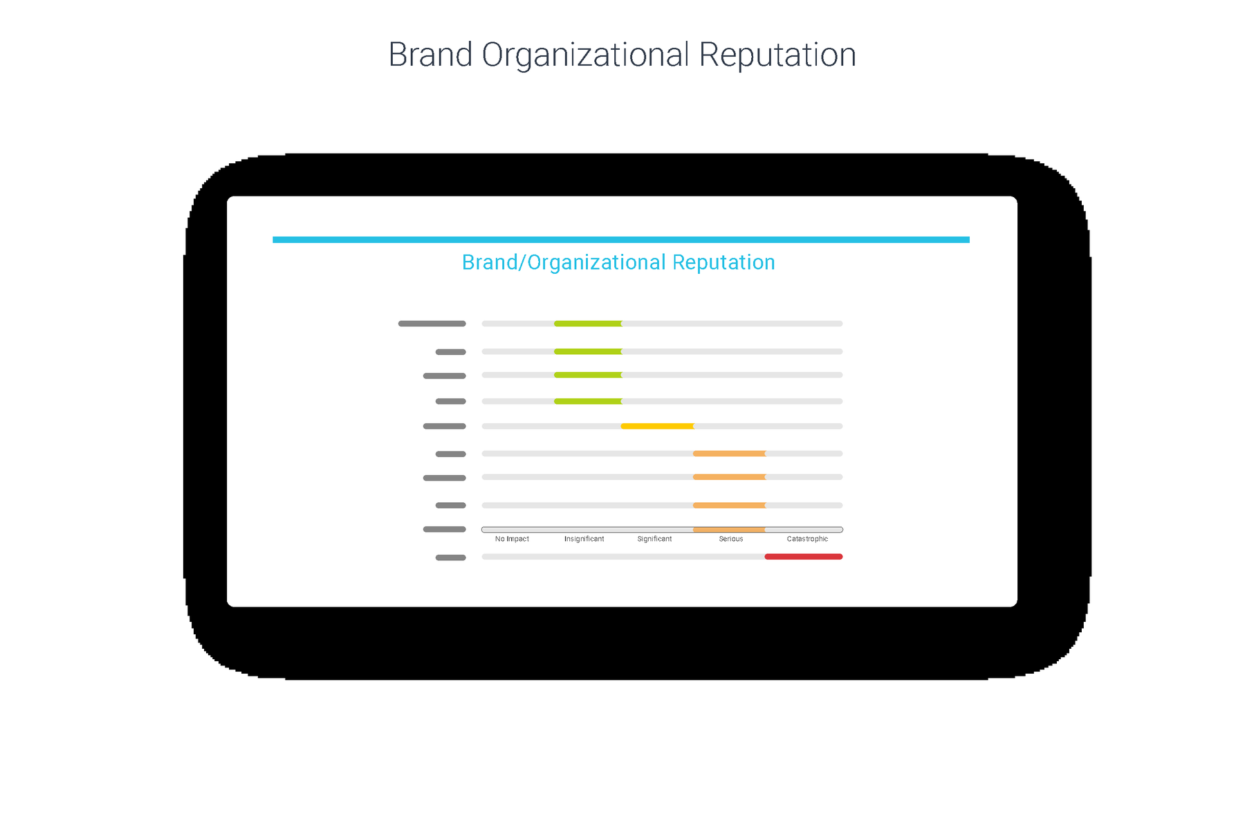
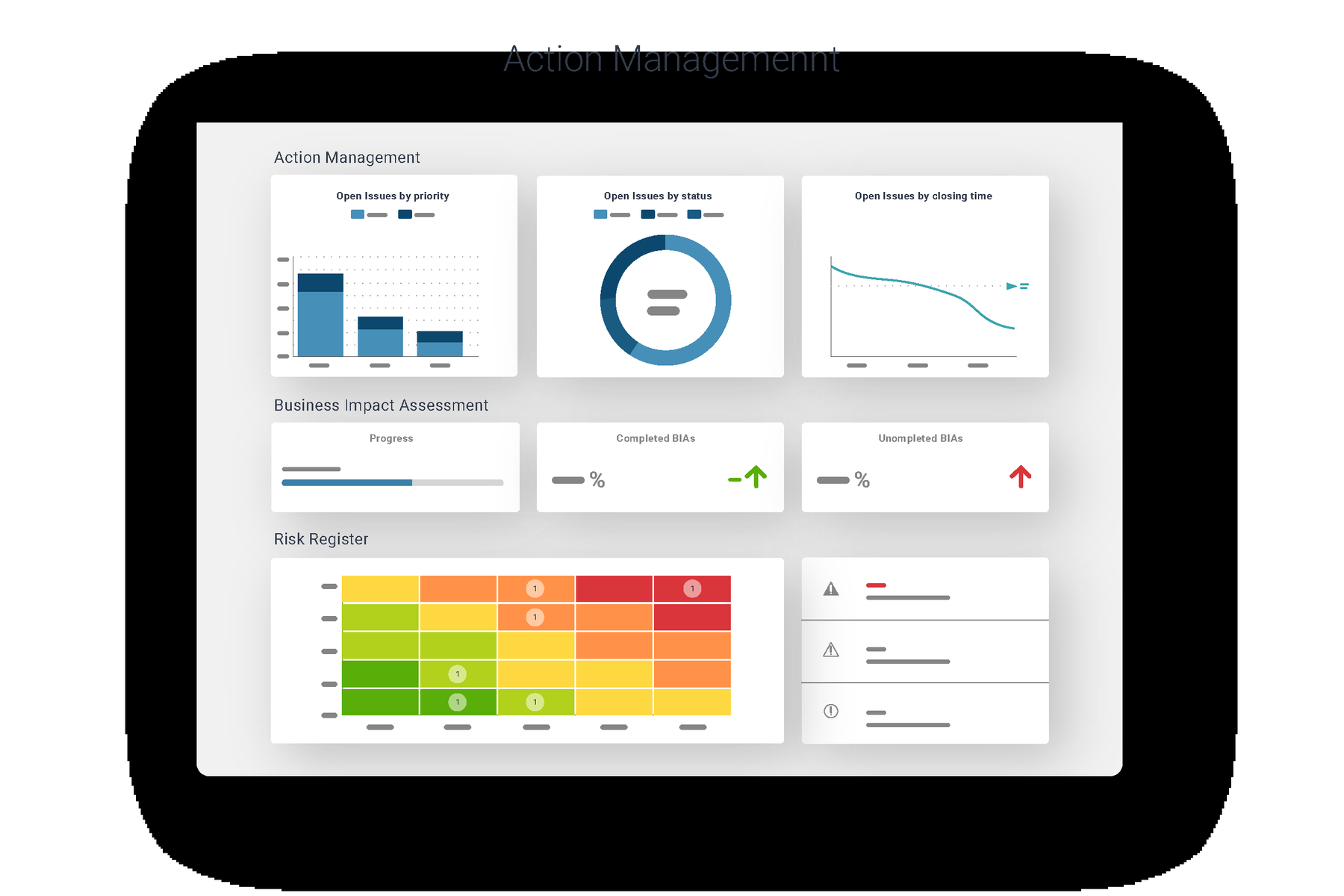
Colour is doing real work too, not decoration. Blue is the interactive layer — links, primary actions, active data. Grey is inert content. Saturated red, amber and green appear only where the product itself is making a judgement: risk heat maps, severity dots, impact scales. In a compliance tool, colour is the meaning, so the palette had to stay disciplined everywhere else for it to read.
What I made
Close to 100 illustrations spanning the platform’s modules, versioned and numbered against the documentation structure they served. The set covers Policy Management, Hotline & Incident Management, Contracts & Third Party Risk, Conflicts of Interest, Gifts & Hospitality, Internal Audit and Business Continuity Management.
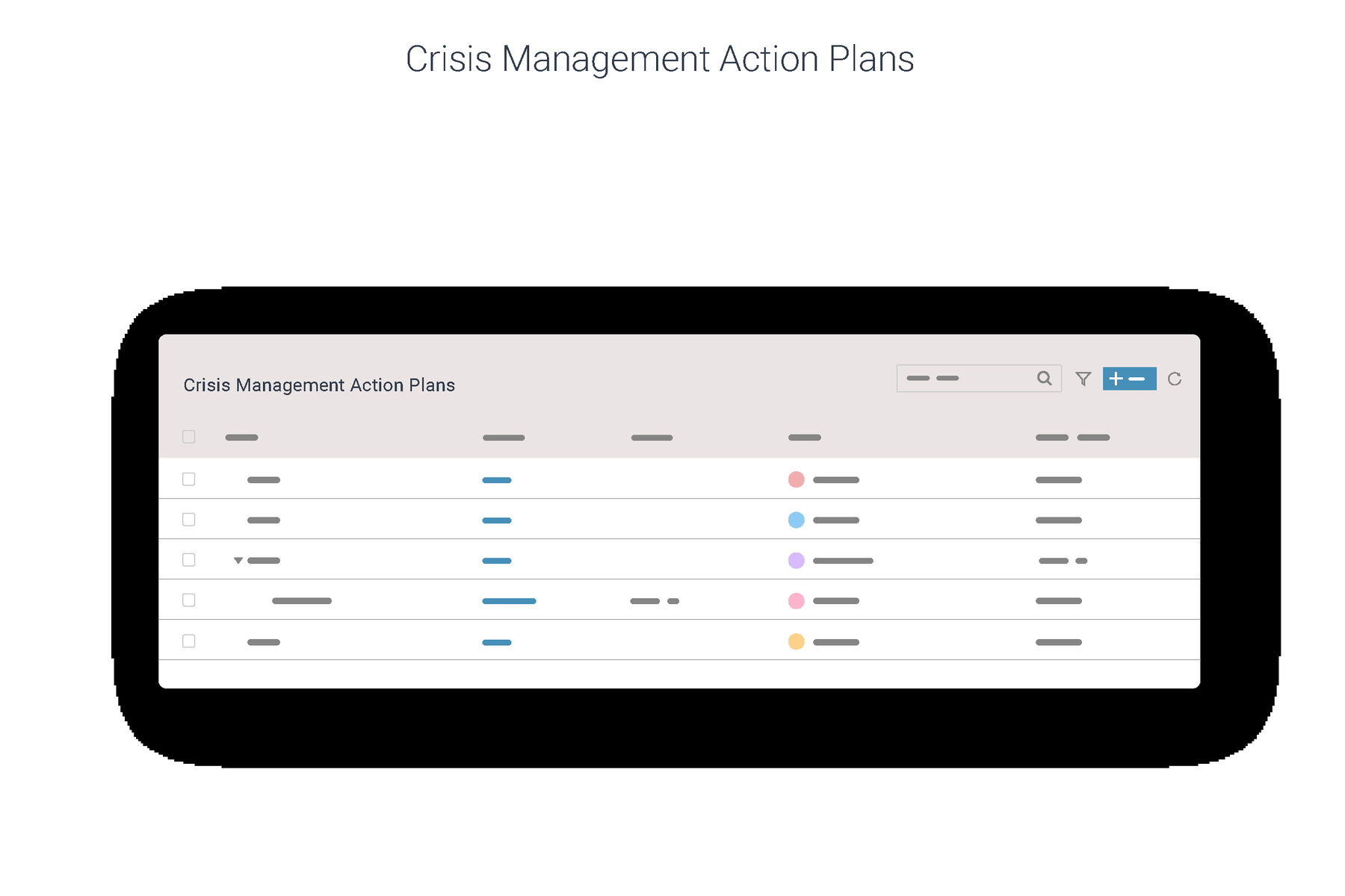
The formats repeat deliberately across modules, which is what makes it a system: list views with filter and action controls, analytics dashboards, form and disclosure flows, document and workflow states, and integration moments where the platform hands off to something else.
Policy Management
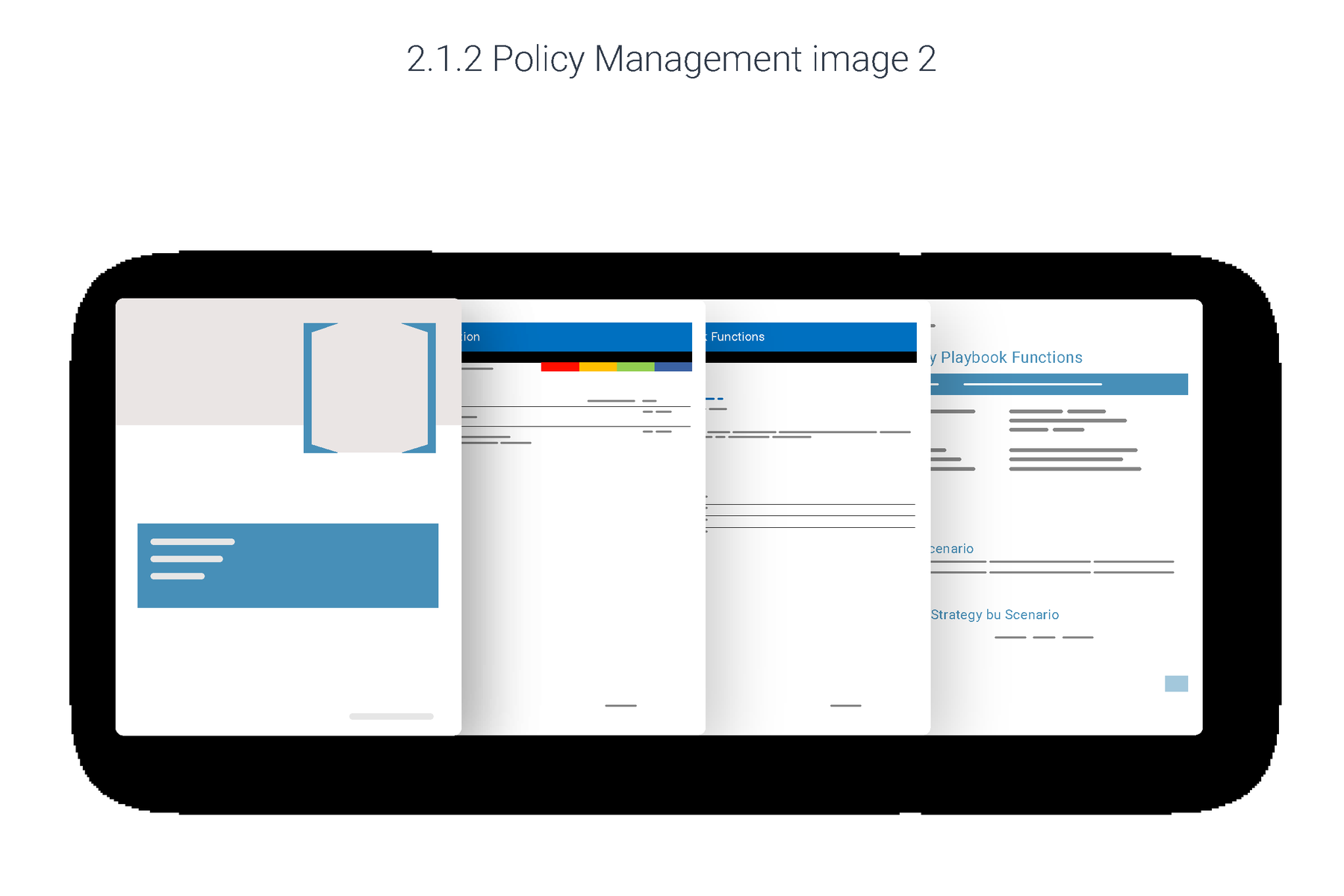
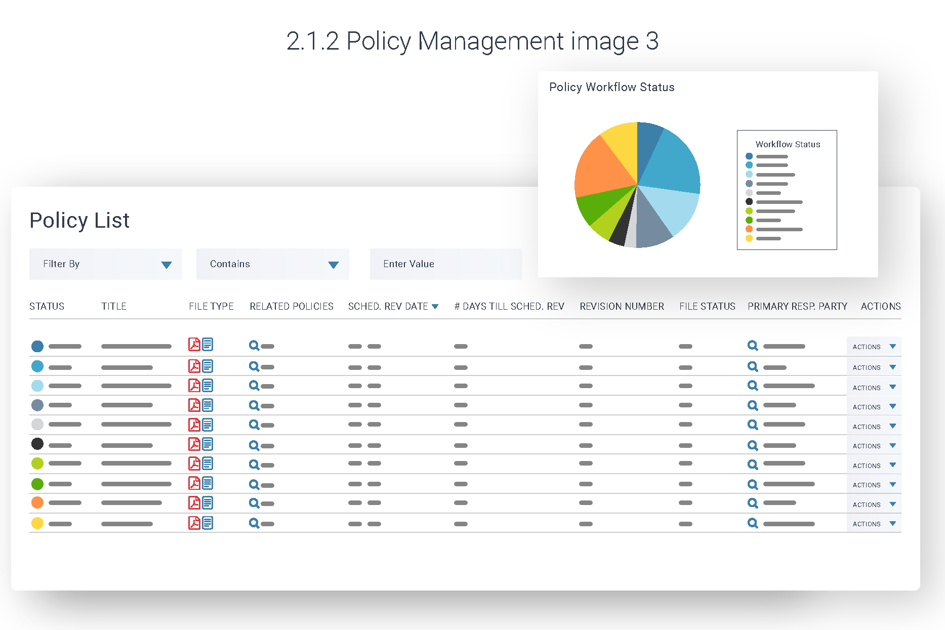
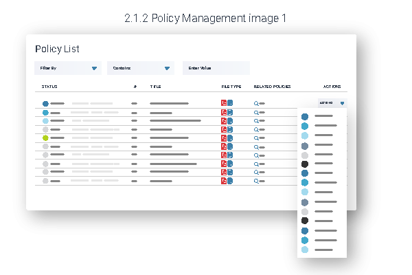
Three views of the same module, each isolating a different job: finding a policy, searching across the library, and seeing where everything sits in its review cycle. The status dot column is the through-line that ties them together.
Hotline & Incident Management
The most sensitive module in the platform — whistleblower reports and investigations — so the illustrations stay entirely abstract. Not one word of case content appears anywhere, which is exactly the reassurance a compliance buyer is looking for.
Contracts & Third Party Risk
Where the platform stops being self-contained and starts talking to other systems. The DocuSign frame is the only place in the whole set where a third-party brand is drawn — a deliberate exception, because integration is the selling point.
Conflicts of Interest & Gifts
Employee-facing modules, so these lean on forms rather than tables. The disclosure and gift-declaration flows are the only illustrations in the set drawn from the perspective of someone filling something in rather than someone reviewing it.
Continuity & risk
The most graphically demanding part of the set, because this is where the product renders judgement. Heat maps, severity scales and impact ratings all had to be legible at documentation scale while staying honest about what the software actually outputs.