Case 10 / Danone — Mizone 脉动
455mg,
said six
different ways
Key visuals for China’s leading electrolyte hydration drink, made over Chinese New Year on almost no notice. One product claim — 455mg of electrolytes a bottle — taken six different directions at once, plus a three-flavour system and an athlete series built to help the brand decide who to sign.
- Client
- Danone
Mizone (脉动) - Role
- Creative & Art Director
- Market
- China
The brief
Mizone is Danone’s hydration brand in China and one of the category leaders. The product claim was already fixed and non-negotiable: ≥455mg of electrolytes per 600ml bottle. What the brand needed was a fresh set of key visuals that made that number feel like an experience rather than a nutrition panel — hydration, sport, refreshment and flavour, each pushed past realism.
The other half of the brief was casting. The athlete visuals weren’t decoration; they were built to help decide which sports and which figures the brand would eventually partner with. That changes what the artwork has to do — it has to hold up as a finished ad while also functioning as a comparison tool.
Worth stating plainly, because it shaped everything: this came to me over Chinese New Year, when most of the market was closed, and it needed to turn around immediately. The client didn’t come to me for a leisurely exploration. That constraint is the reason the work is structured as parallel routes rather than one refined direction.
The approach
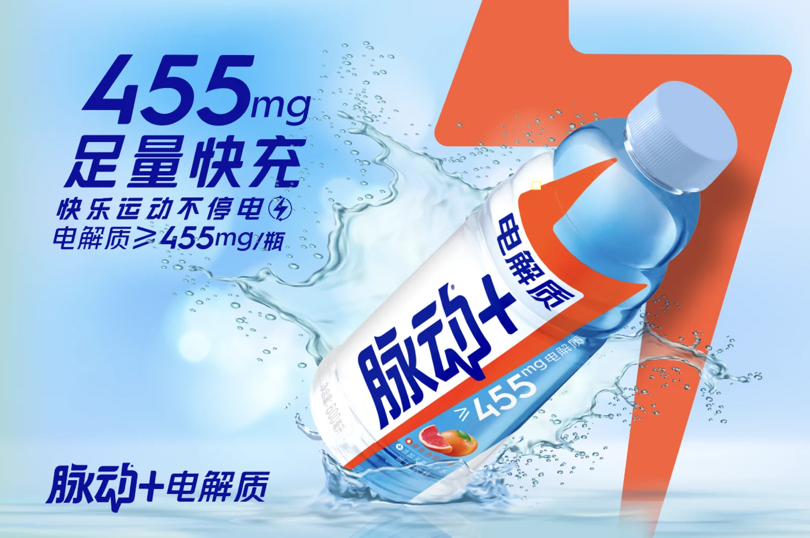
With no time for sequential rounds, I ran the exploration wide instead of deep. Six key visual routes were developed in parallel from the same three fixed assets — the bottle render, the water splash, and the 455mg claim lockup — each one testing a different theory about what sells electrolyte hydration. Bright and graphic. Clean and premium. Wet and textural. Dark and dramatic. Sporty and kinetic.
The device that unified them is the bolt. It’s already in the packaging — the orange diagonal flash on the label — but I promoted it from a label graphic to a compositional element that the bottle sits inside, cuts across, or is lit by. That gave every route a shared skeleton, so the client was comparing genuinely different treatments of one idea rather than six unrelated ads.
The bolt also earns its place linguistically, which mattered for the market. The campaign line — 快乐运动不停电 — plays on 停电, the word for a power outage: keep moving, never lose power. The electrical metaphor is in the copy already, so making it the primary visual device meant the artwork and the line were arguing the same thing rather than sitting side by side.
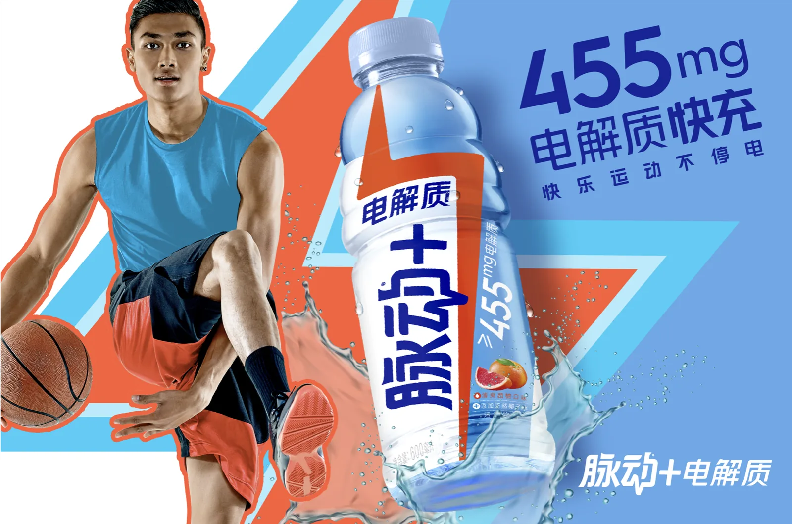
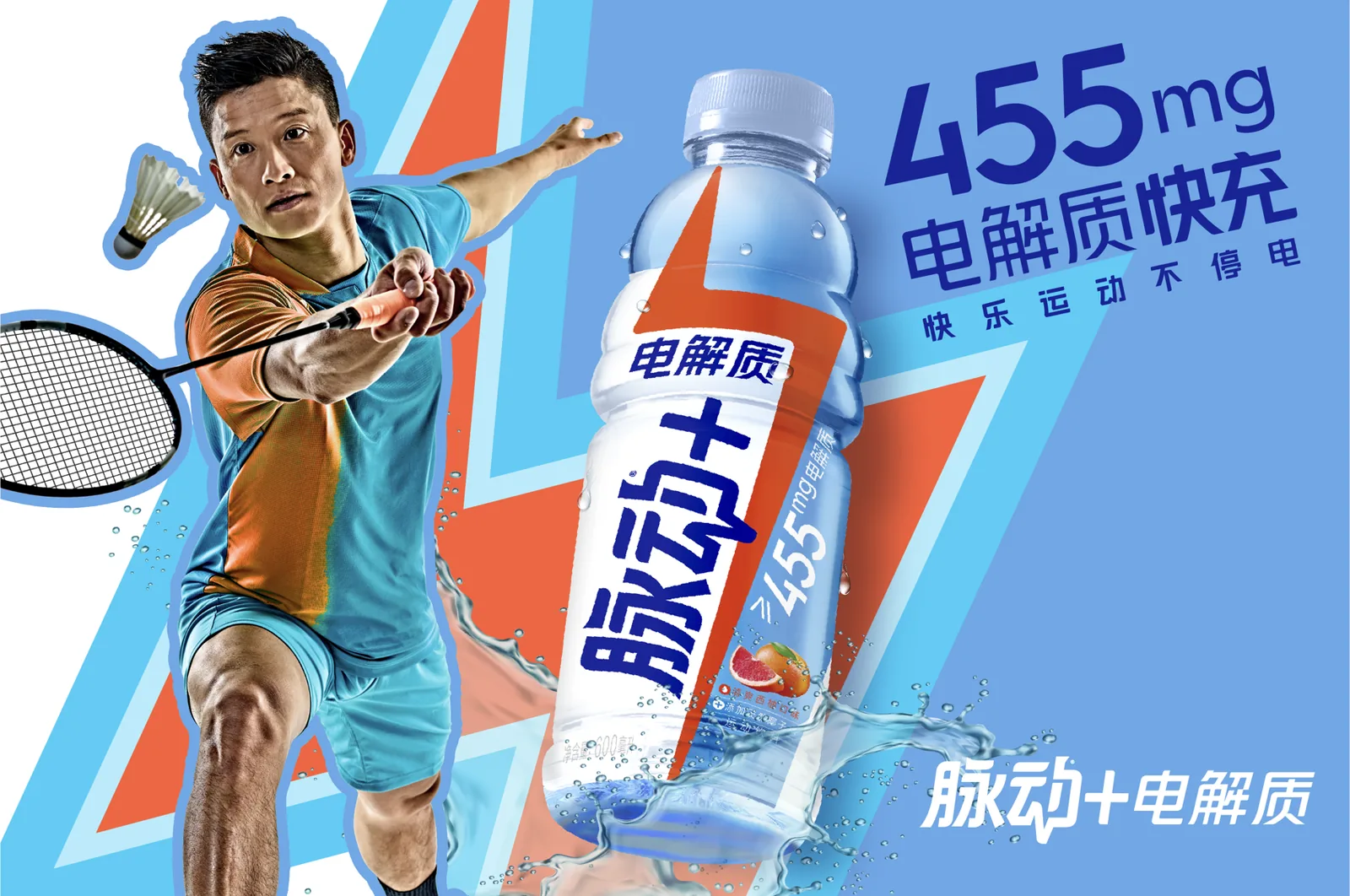
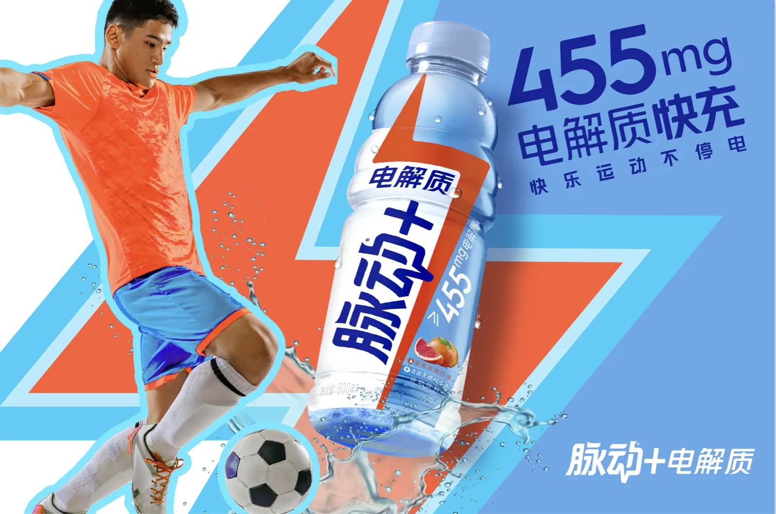
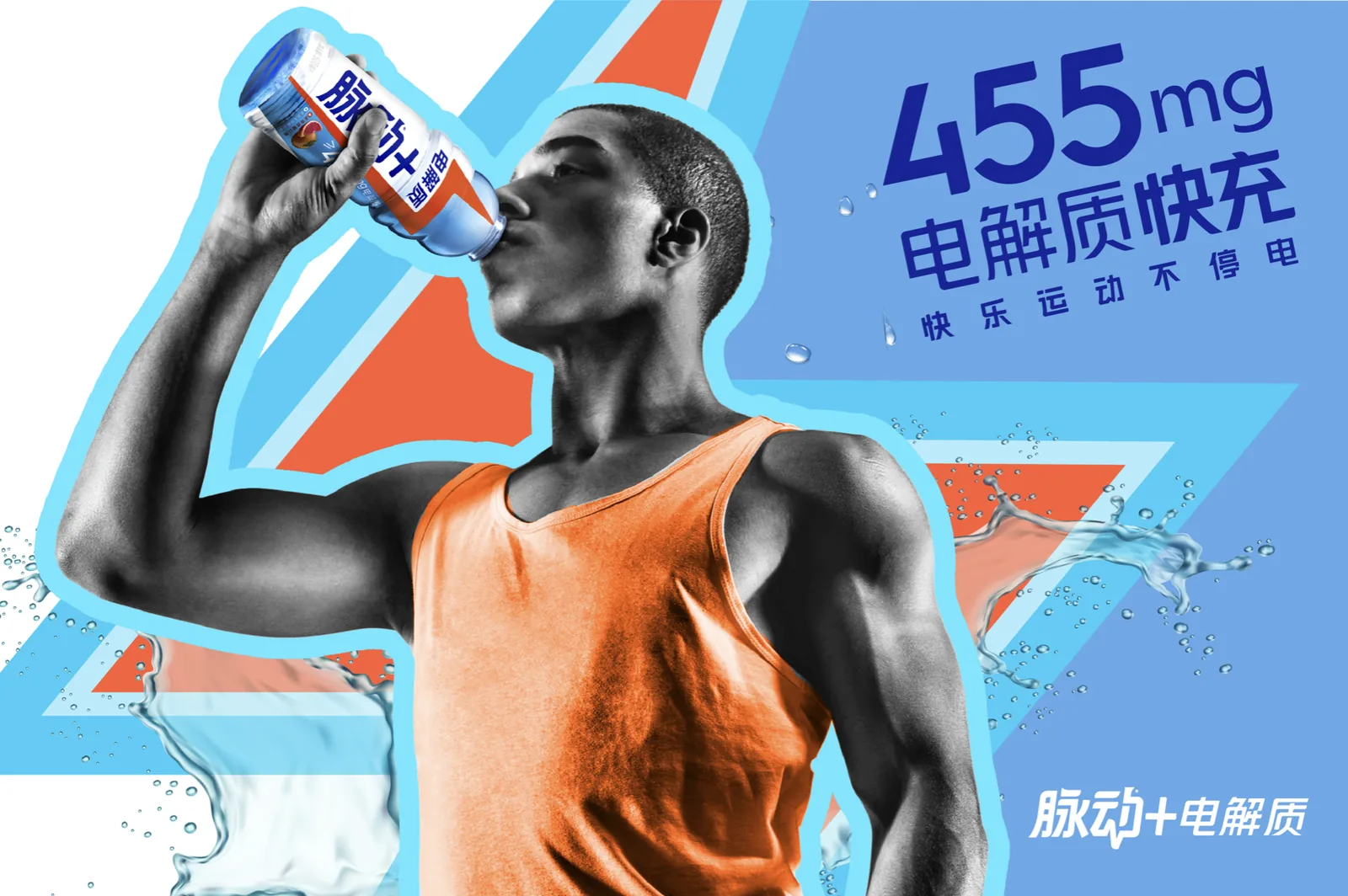
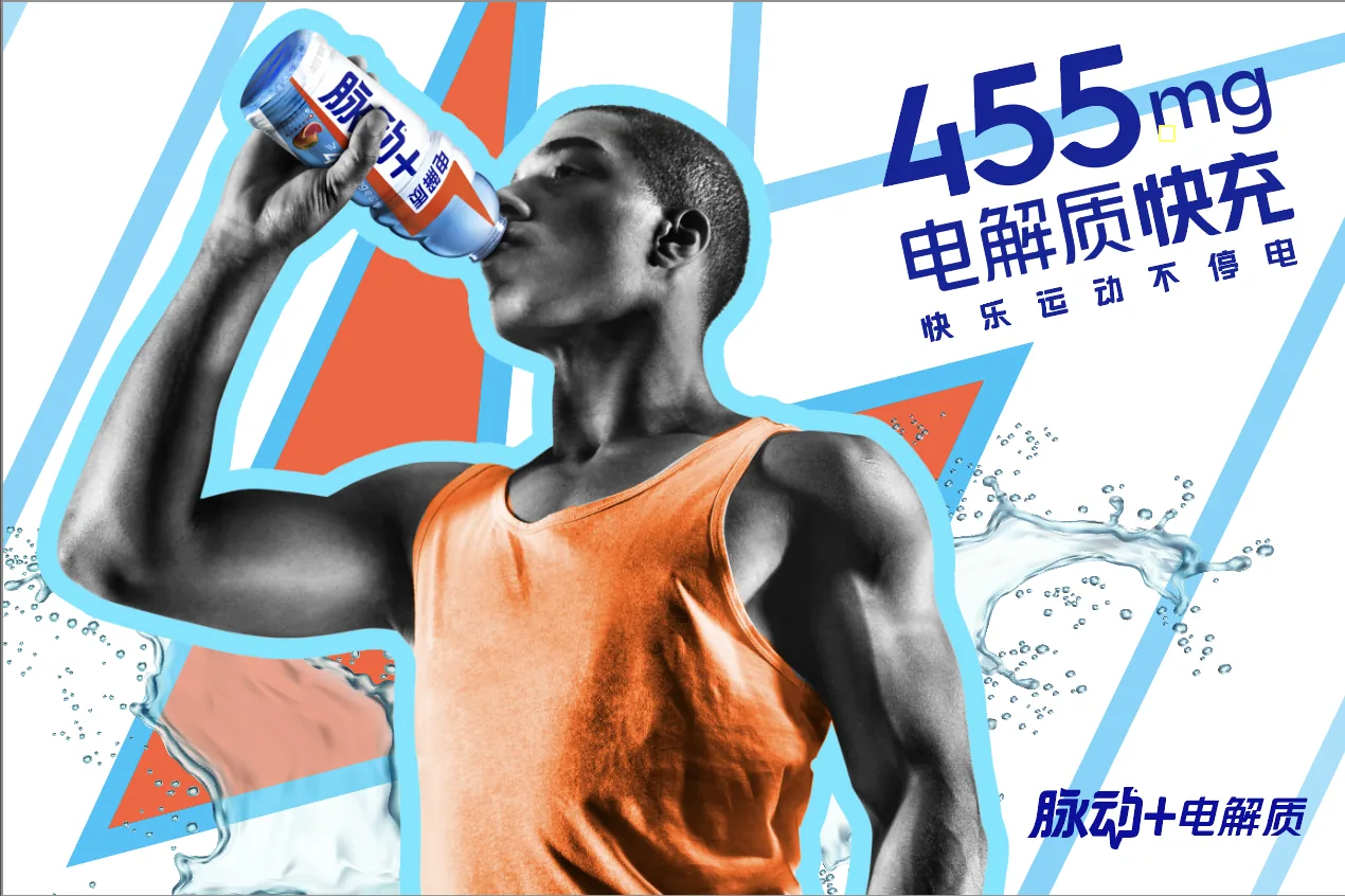
For the athlete series I built a strict template — cut-out figure at one edge, bottle centre, claim block opposite, chevrons behind — and then let only the sport change. Basketball, badminton, football, and a straight drinking shot. Because the layout is identical across all four, a reviewer comparing them is comparing the sport, not the design, which is exactly what a casting conversation needs.
What I made
- Six key visual routes at master horizontal format, from the same fixed asset set
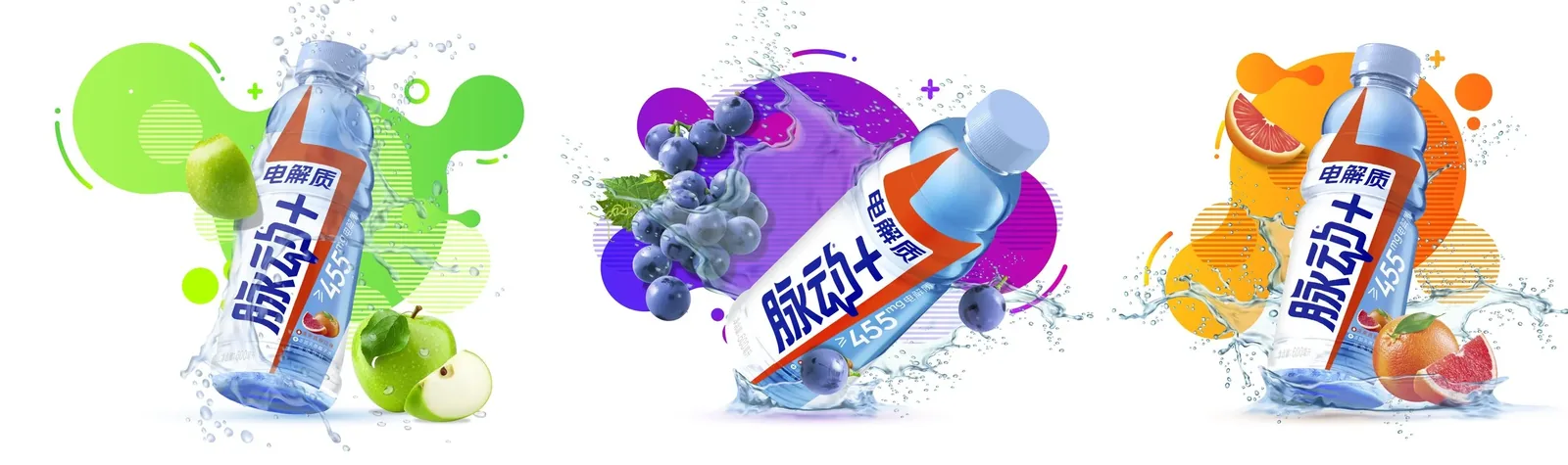
- A three-flavour system — green apple, grape, grapefruit — with per-flavour colour worlds
- Four sport-specific athlete visuals on a shared template, built for casting comparison
- A dark vertical poster treatment for the bolt as a standalone brand device
- Bilingual claim lockups, with English variants for the routes intended to read internationally
Compositing, retouching and colour work across the set.
Flavour — three worlds, one bottle
The flavour exploration solves a problem specific to clear hydration drinks: the liquid is nearly colourless, so unlike a juice or a soda the product itself can’t signal what it tastes like. The flavour has to be built entirely around the bottle.
How the flavour reads
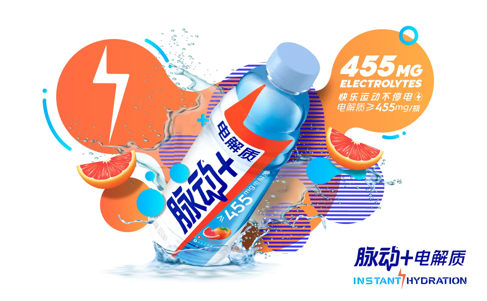
Each variant gets three signals working together: an abstract colour field built from overlapping organic blobs, photographic fruit at two scales — whole and cut, so the interior colour is visible — and a water splash tinted toward the flavour without becoming opaque. The splash is the subtle one. Push it too far and the drink looks like juice; leave it clear and the flavour cue collapses onto the fruit alone.
The blob shapes are deliberately imprecise. A geometric colour block would have read as packaging design; loose organic forms with halftone stripe fills read as energy and movement, which is the brand’s territory. Keeping all three on flat white was the decision that let them be compared honestly — the differences are entirely flavour, not background.
Key visual routes — five treatments of one claim
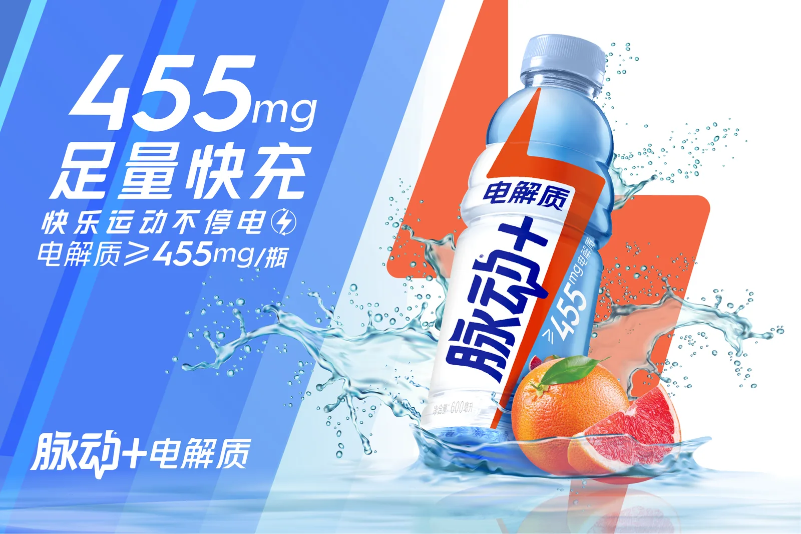
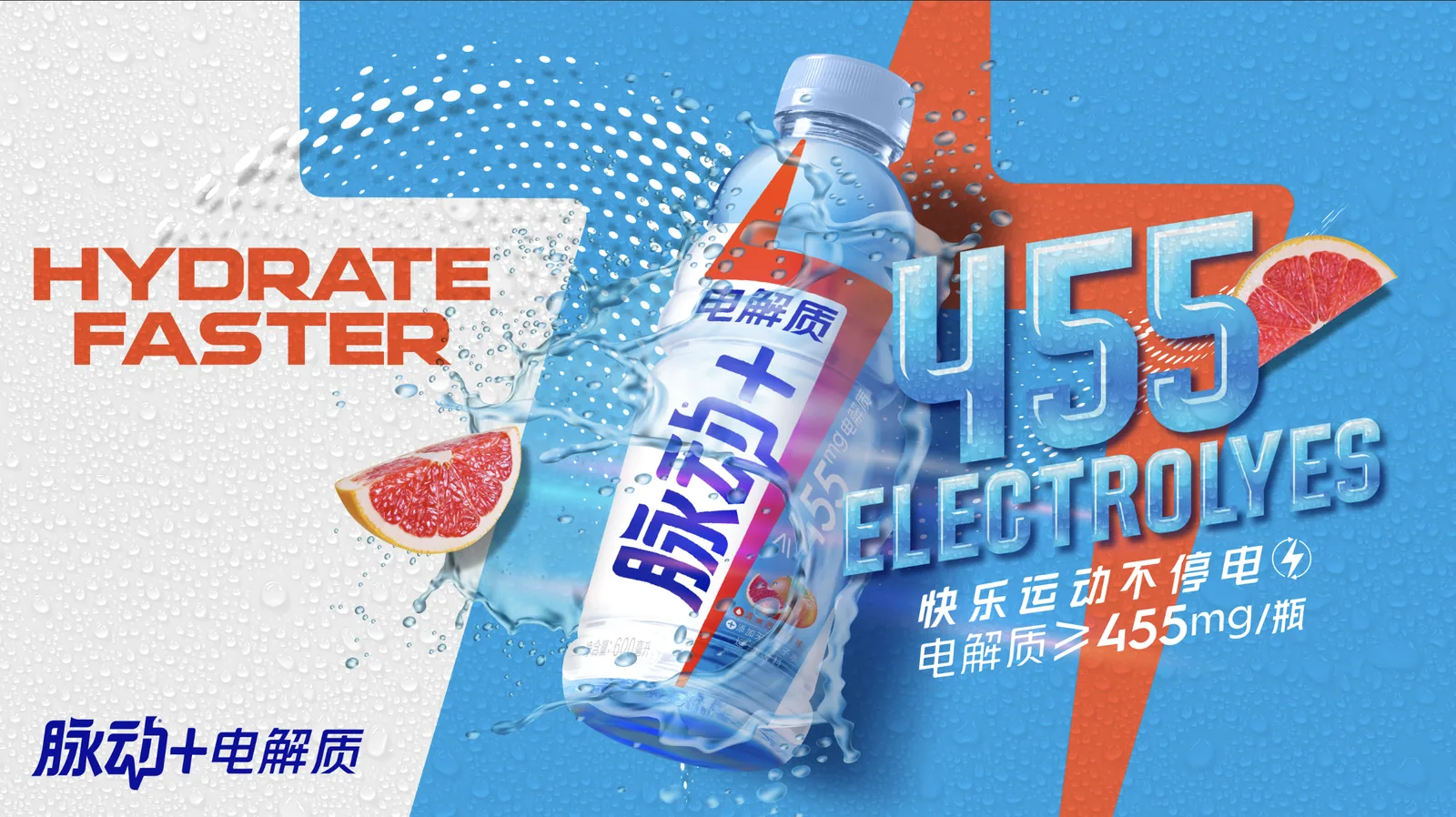
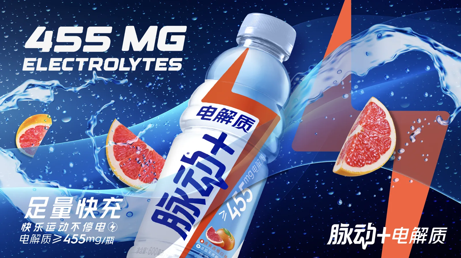
Same bottle, same splash, same number. What changes is the theory of what makes 455mg feel valuable: clinical precision, athletic energy, physical refreshment, or premium drama. Presenting them together rather than sequentially was the only way to cover this much ground on the timeline.
What the routes were really testing
The routes aren’t style options; each one puts the number somewhere different in the hierarchy. On the gradient route the bolt is the hero and 455mg is a supporting caption. On the wet-texture route the number is the hero, built as a chrome object with its own lighting. On the white graphic route it’s demoted into a roundel so the bottle and flavour lead.
That was the real question for the client: is Mizone selling a number, a feeling, or a flavour? Six executions made that choice concrete instead of theoretical, which is usually the fastest way to get a decision out of a group — and speed was the whole engagement.
The dark route is the outlier and was included deliberately. Hydration in this category defaults to bright, wet and daylit; putting one route on a near-black ground tests whether the brand has any appetite for a premium register. Even a rejection is informative — it draws the boundary of the brand for everything that follows.
Athletes — a template built for casting
Four visuals, one layout. The point of holding the design constant is that it removes design from the conversation: when the client compares these, the only variable is which sport carries the brand best — and by extension, which kind of athlete to sign.
The outline, and why it’s there
Every figure carries a thin pale-blue contour. It’s doing three jobs at once: separating the athlete from a background of similar tonal value, disguising the cut-out edge on hair and fingers where masking is always weakest, and giving the composite a deliberate sticker-like quality so it reads as a graphic decision rather than a retouching shortcut.
The drinking visual breaks from the other three by desaturating the figure entirely and leaving only the orange vest in colour. Three of the four sell performance; that one sells relief. Including both registers in the same set means the casting conversation can also settle a tonal question — is Mizone consumed during the effort, or after it?
The bolt — device without product
The one piece in the set where the bottle is almost absent. A test of whether the brand’s equity has moved far enough into the mark that the mark alone can carry a poster.
Why make it at all
Every other asset here is a product shot with graphics around it. This one inverts the relationship: a lone figure on a dark ground raises a fist, and the light from it becomes the bolt. The bottle is present, held low at the figure’s side, at maybe two percent of the frame.
It exists because the campaign line is about power, not about liquid. If 不停电 — never lose power — is the idea, then somewhere in the set there should be a piece where the idea is the entire image and the product is just evidence. Practically, this is the asset that would work as a launch teaser, a social cover frame, or an arena screen, where a 600ml bottle at scale would read as an ad and a bolt would read as a brand.
It’s the riskiest thing in the deck and I presented it as such. On a fast turnaround there’s a pull toward showing only safe work; including one piece that could be rejected outright is how you find out where the ceiling actually is.