Case 06 / Ragged Cuts
Designing for
a laser,
not a press
Award design for a custom engraving studio making laser-cut layered plywood keepsakes for races. More than fifty events so far — trail ultras, half marathons, triathlons, backyard ultras and one 223-mile thru-hike — each one drawn specifically for the event rather than pulled from a catalogue. A client I found through the running community rather than a pitch.
- Client
- Ragged Cuts
raggedcuts.com - Role
- Creative & Art Director
- Scope
- 50+ events
Medals, podium, trophies - Medium
- Laser-cut layered ply
Stain, engrave, assemble
How this one started
Organically, which is rare. No pitch, no brief chain — the connection came through the running community, and the work followed because the creative resonated with people who were already in that world. That origin matters to how the work looks: this is a client relationship built on the art itself rather than on a procurement process.
Ragged Cuts makes custom engraved awards in wood and stone. What I bring is the artwork — an original design per event, drawn to the constraints of the machine that will cut it. Mostly podium awards, sometimes overall and age group, occasionally every finisher.
Why the medium changes everything
Almost every other case on this site ends in ink or pixels. This one ends in a laser cutting through birch ply, and that inverts most of the habits a graphic designer has.
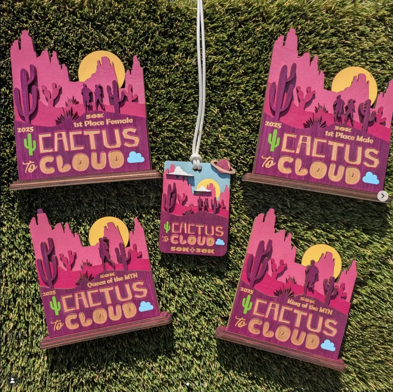
Every shape has to be a closed contour. There is no such thing as a soft edge, a gradient, a drop shadow or a fade. If it can’t be described as a path the machine can follow, it doesn’t exist. So an illustration that would take five minutes with a soft brush has to be rebuilt as discrete stacked shapes — which is why the Cactus to Cloud mesas read as four flat bands of magenta and purple rather than a blended sunset.
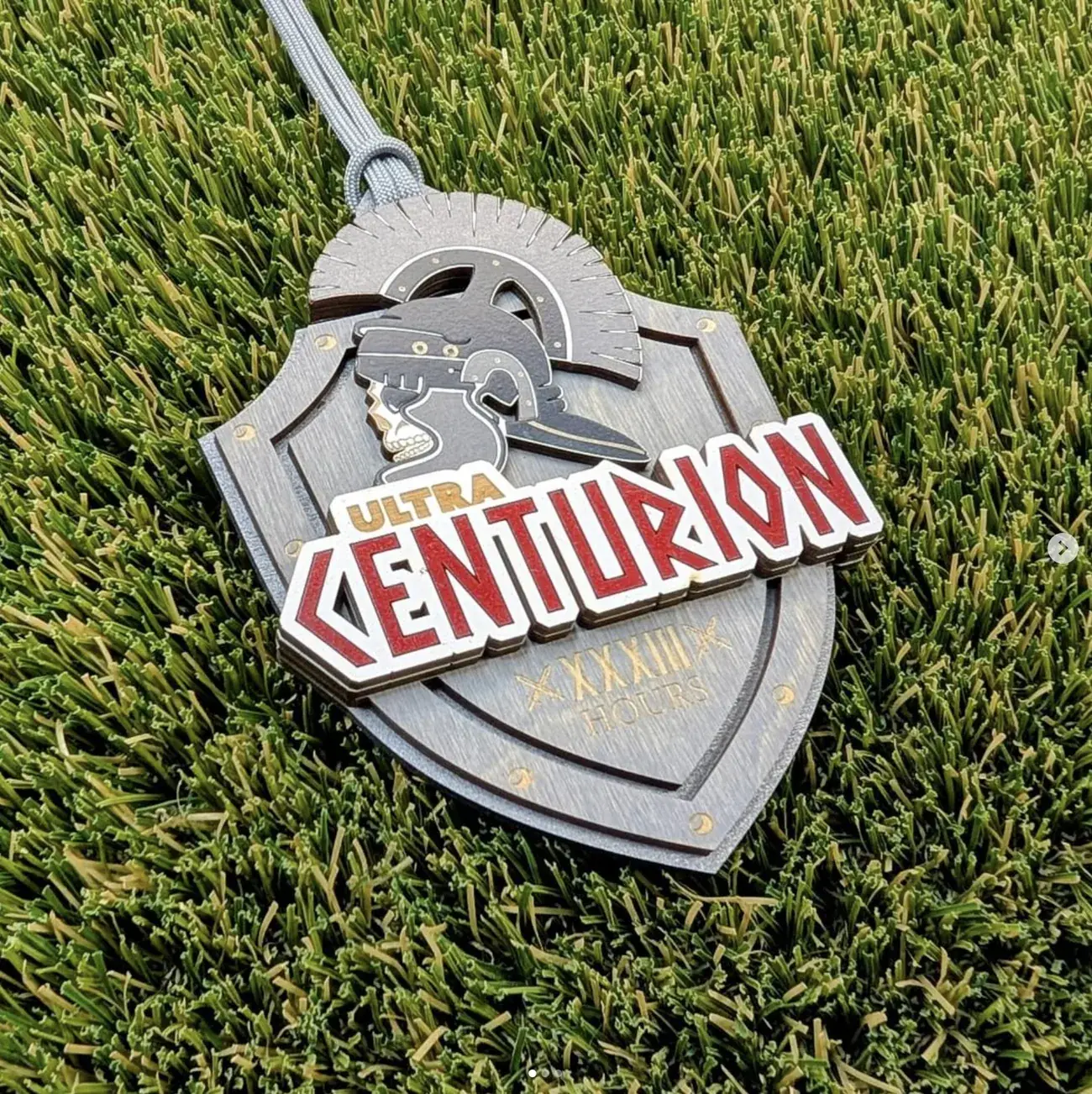
Depth is physical, so it has to be planned as a stack. Every design is really an exploded diagram: which shape sits on which layer, and how many layers deep the piece goes. The Ultra Centurion helmet crest is proud of the shield because it’s literally a separate piece of ply on top. That’s the medium’s great gift — real shadow, real parallax, something a printed medal can only fake.
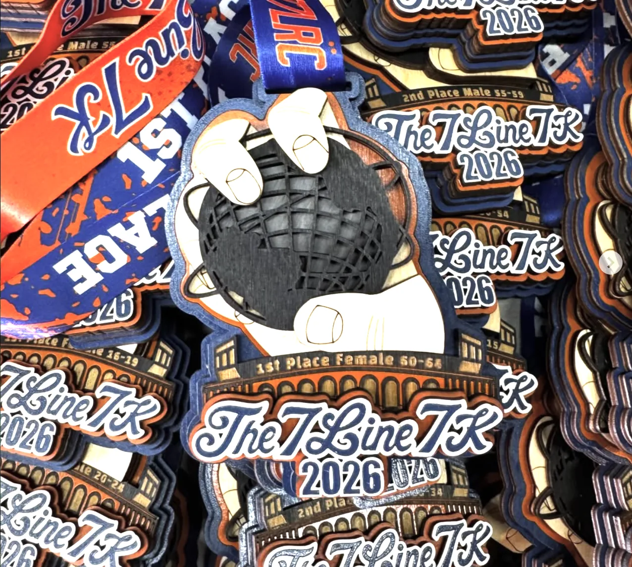
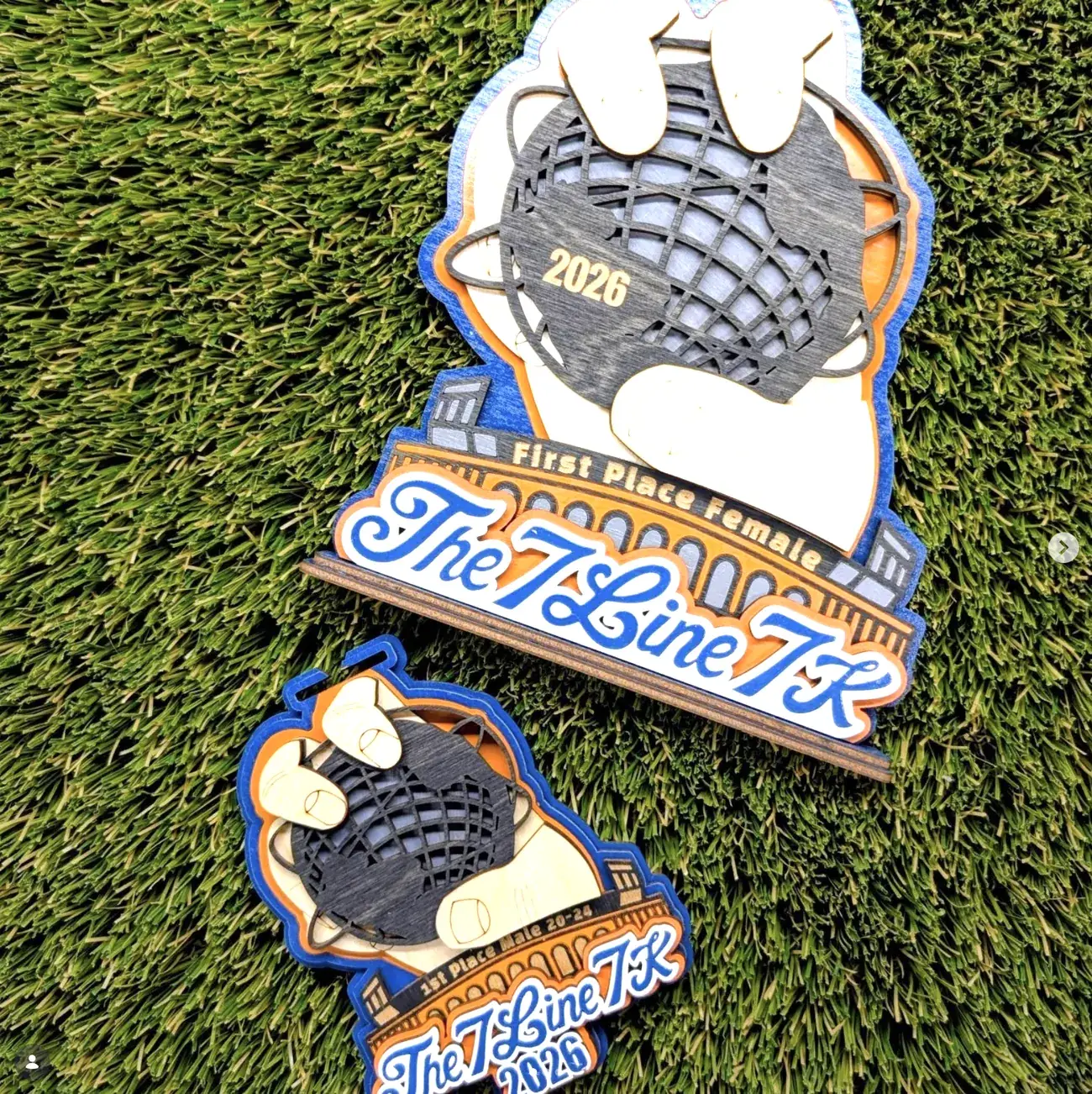
The kerf sets the minimum detail. The beam has a width, and anything finer than it disappears or burns through. So counters in letterforms, the gaps in the 7 Line glove webbing, the tines of a pine tree — all of it has to be drawn above that threshold. It’s the same discipline as designing for embroidery or screen print, just with a harder floor.
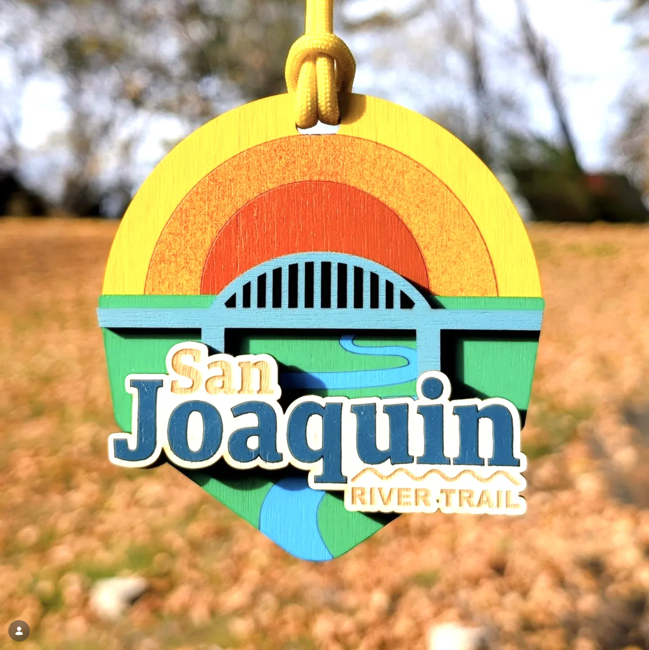
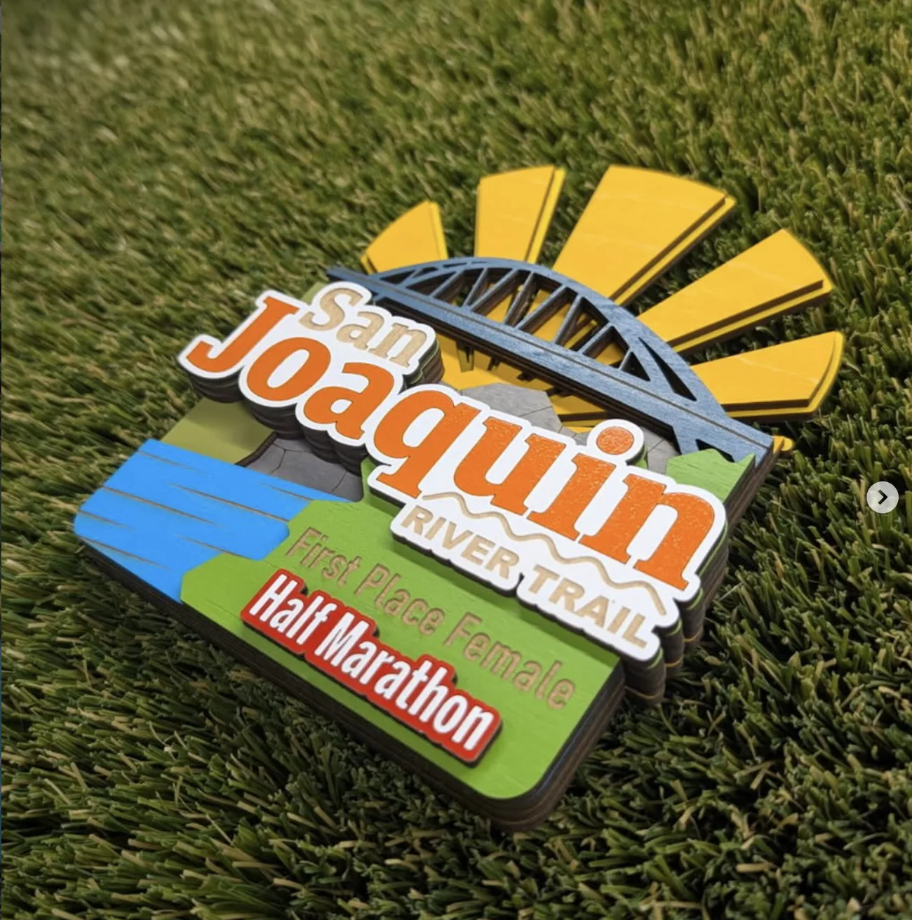
Colour comes from stained wood, not from a swatch. The grain shows through everything, so two pieces are never identical and the colour is always slightly warm. Rather than fight that, the palettes lean into it — the San Joaquin sunburst is built from concentric stained rings precisely because you can see the grain running through them.
What I make
- Original artwork per event — no templates, no reused shells
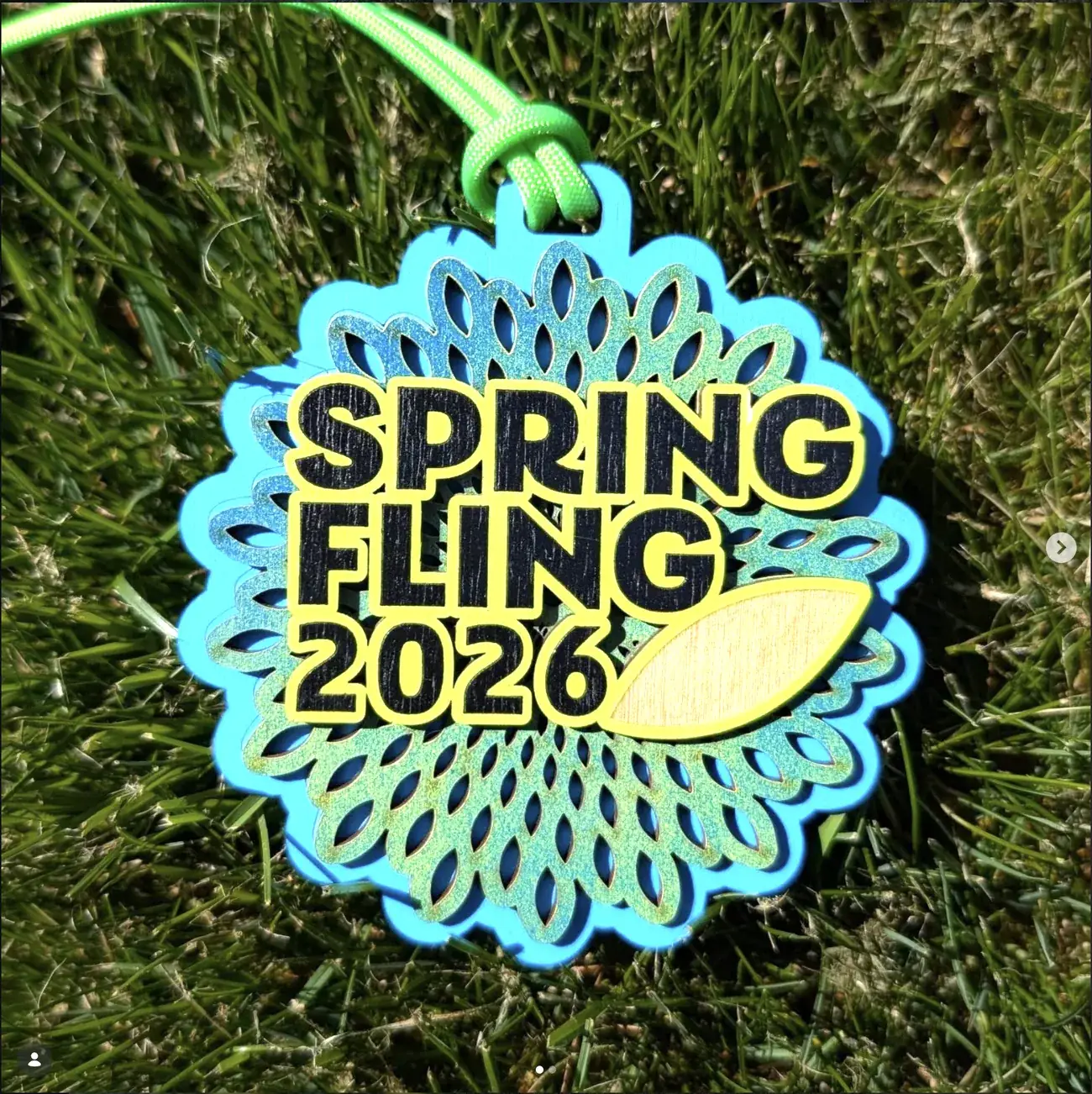
- Hanging finisher medals with paracord, matched to event colour
- Podium awards on stands, tiered for placing and category
- Age-group and category variants engraved from one master artwork
- Bespoke one-off trophies for individual achievements
- Non-running commissions — charity tournaments, community events
Why it matters more than a medal
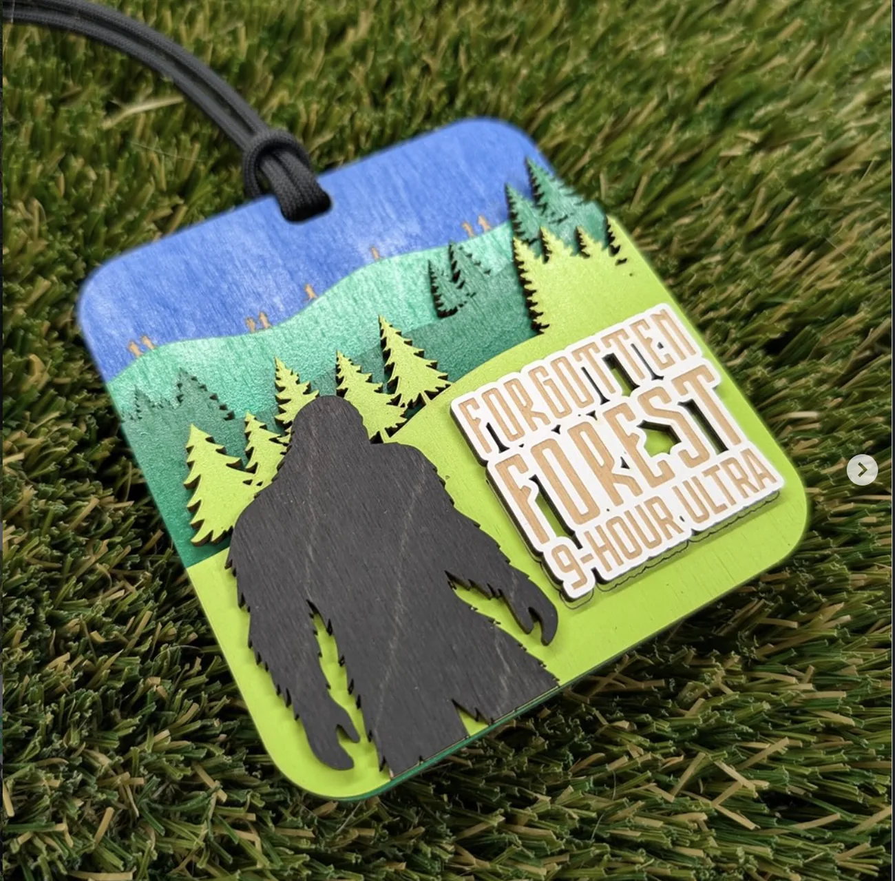
A mass-produced finisher medal is a die-struck disc that mostly differs by the year stamped on it. Runners have drawers of them. These get hung on a wall, because they were drawn for that specific race and are recognisably about that place — the Ithaca gorges, the Verrazzano-scale span at San Joaquin, a Sonoran saguaro, a bigfoot in the Pacific Northwest.
Reading the stack
Four pieces that show what the layering actually buys you — and what it costs.
Cutting away as a technique
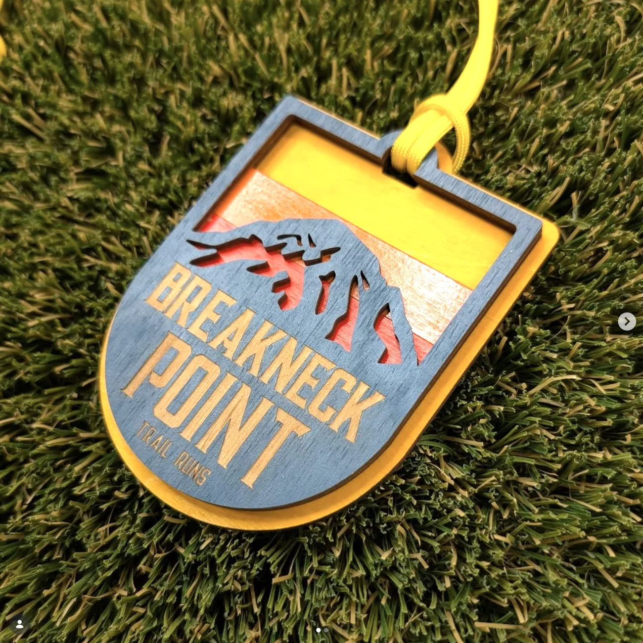
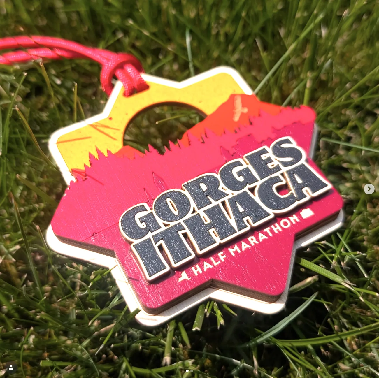
The most useful trick in this medium is the one print doesn’t have: you can remove material and let a lower layer show through. Breakneck Point’s runner and mountain ridge aren’t drawn on the blue face, they’re cut out of it, revealing the orange sunset beneath. Gorges Ithaca’s sun is a hole.
That flips normal figure-ground thinking. Instead of asking what to add, you ask which layer should be visible where — and the negative shapes have to be as well-drawn as the positive ones, because they’re doing equal work. It also keeps the layer count down, which matters on a batch of three hundred.
The San Joaquin medal shows the other half of the constraint. A sunset is the classic gradient subject and gradients are unavailable, so it becomes three concentric stained rings — yellow, orange, red — stepping inward. The stepping reads as deliberate and graphic rather than as a limitation, which is the whole game in this medium.
Trail & ultra — where the events get strange
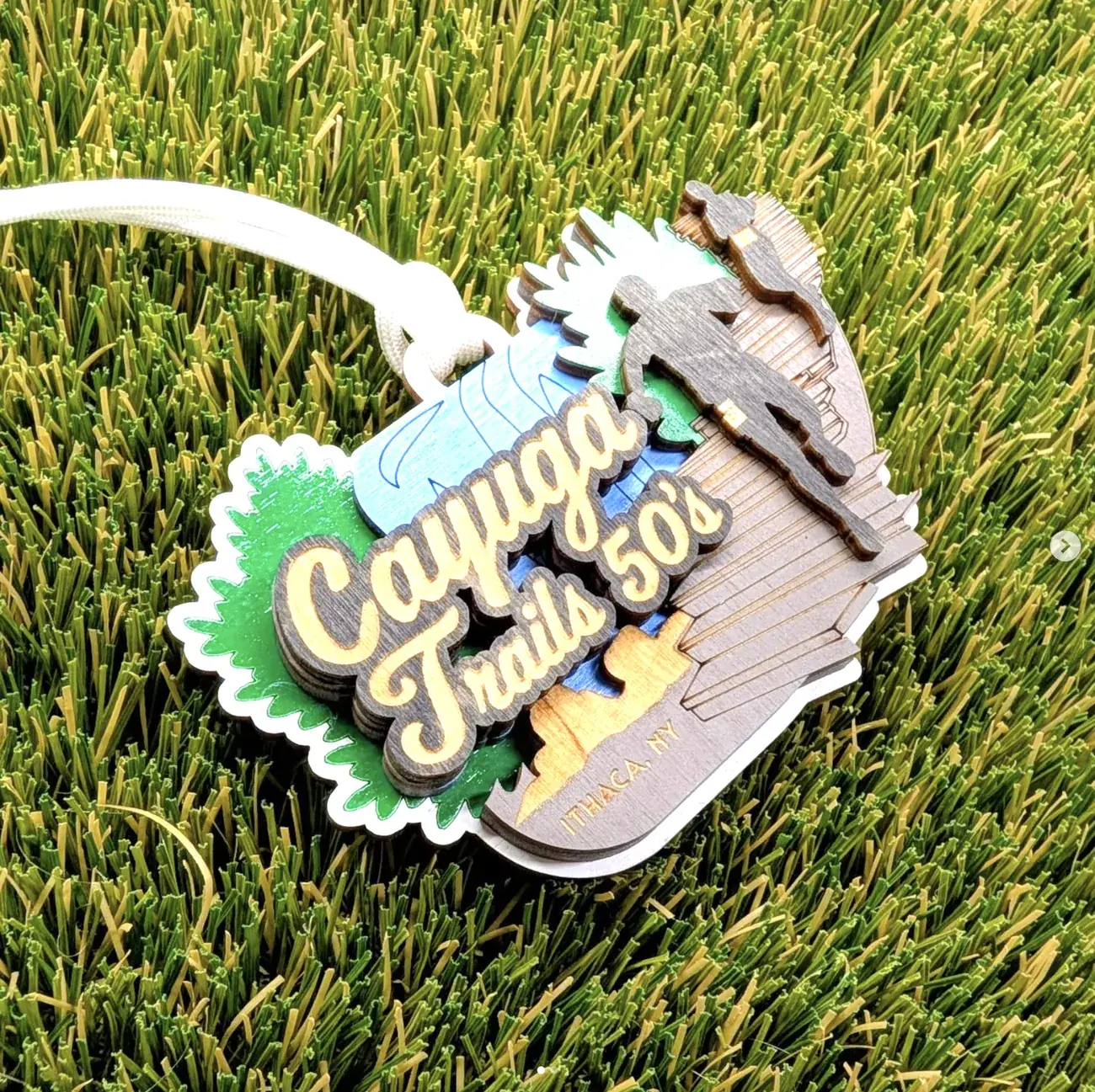
Ultrarunning has a sense of humour about itself that road racing doesn’t, and the awards get to reflect that. These are the pieces where the event’s own personality does the art direction.
Designing the joke correctly
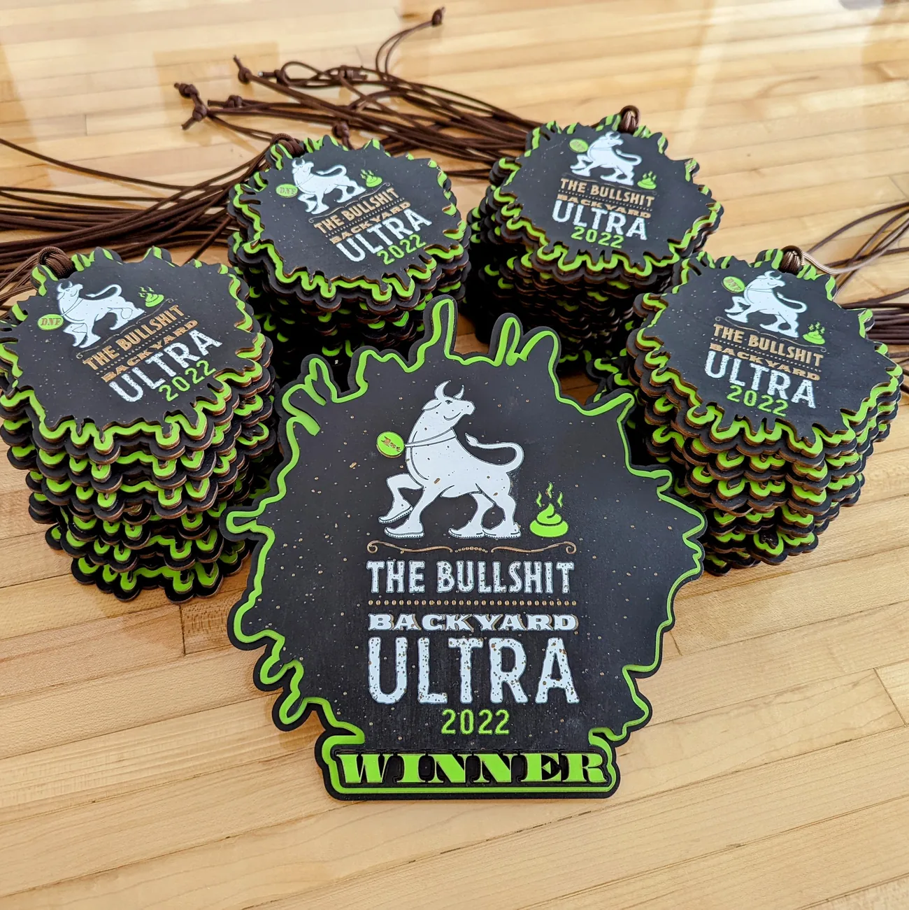
A backyard ultra runs in repeating hourly loops until only one runner remains. By design there is exactly one finisher and everyone else records a DNF — did not finish. So the award set is one piece stamped WINNER and a large stack stamped DNF, which is both the literal truth and the funniest possible way to state it. The cartoon bull in running shoes and the event name do the rest.
What makes it work rather than just being a gag is that the DNF pieces are made to the same standard as the winner’s. Same layers, same finish, same cord. The joke lands because the object is genuinely nice — if the DNF award were visibly cheaper it would read as a consolation prize instead of a badge.
Ultra Centurion goes the other direction: XXXIII HOURS in Roman numerals, a centurion helmet on a skull, a shield with visible rivets. Thirty-three hours of running deserves iconography that takes itself seriously, and Roman numerals are doing real work — they make a duration feel like an inscription.
Podium — one artwork, many placings
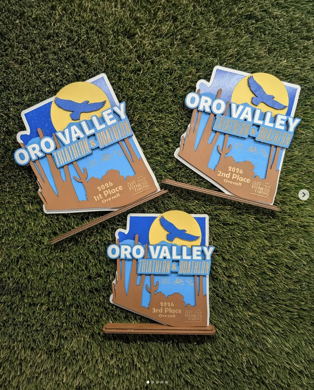
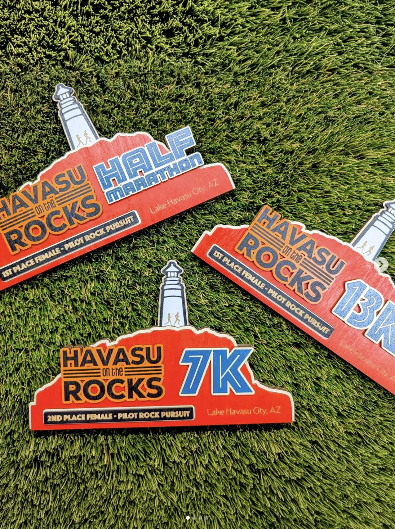
Most of this work is placement awards, which introduces a production problem: a single event might need first through third overall, male and female, plus a dozen age groups. The artwork has to absorb all of that without being redrawn each time.
Building for variants
The system is simple and it’s the reason this scales: the illustration is fixed and unchanging, and one engraved band carries everything variable — placing, gender category, age group, distance. On Havasu that same slot swaps the distance instead of the placing, so a half marathon, a 13K and a 7K are visibly one race family.
Engraving is the right mechanism because it costs nothing in layers. Cutting a new shape for every age group would multiply the stack; burning text into an existing face doesn’t. That’s a production decision that shapes the design — the band exists in the artwork from the start, sized for the longest string it will ever have to hold.
The 7 Line piece is the toughest drawing in this set. It’s a baseball glove catching a ball rendered as the Unisphere, referencing both the Mets and the Queens landmark, and the glove webbing is a lattice of thin cuts that has to stay above kerf width at two different sizes. Seeing it work on both the large stand award and the small hanging medal is the proof the drawing was built right.
One-offs — an award with a run of one
Occasionally the commission isn’t for a race at all, but for a single person’s single achievement. Nothing about the economics works, and it produces the best object in the set.
Making the object the memory
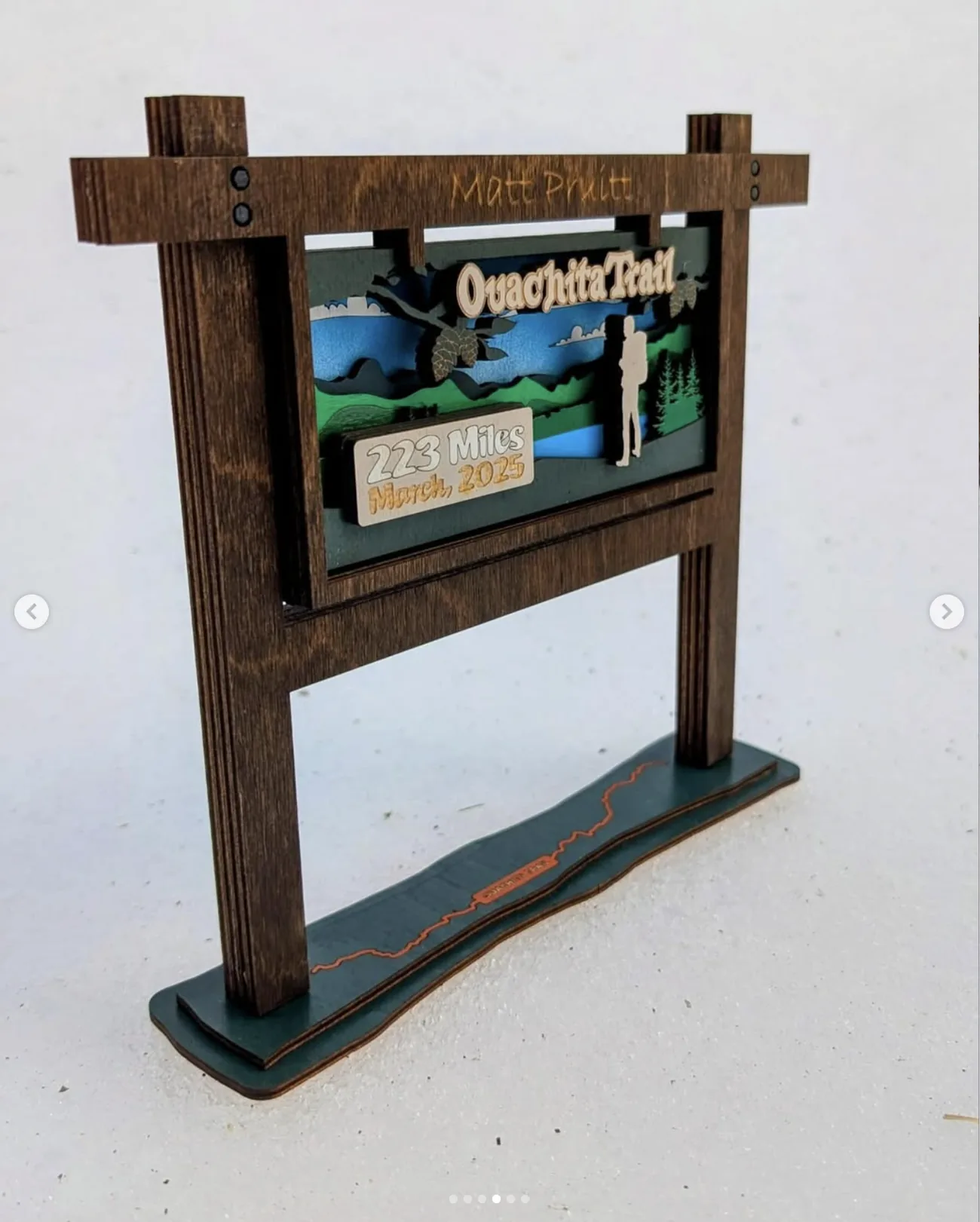
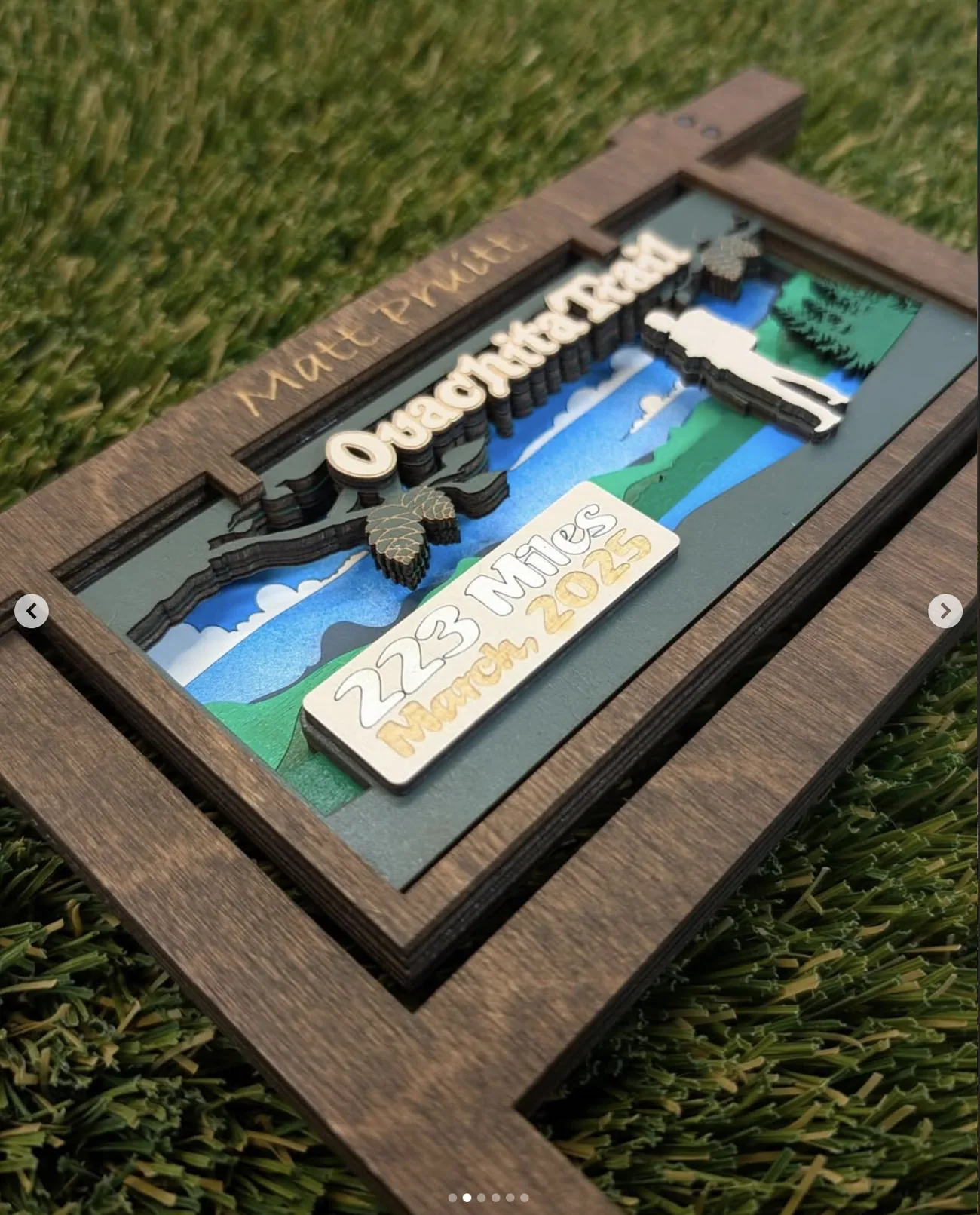
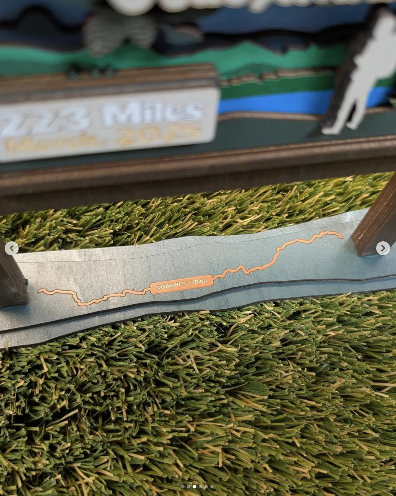
The Ouachita Trail runs 223 miles across Arkansas and Oklahoma. Someone covered it in March 2025, and this trophy exists to mark that. The design decision that carries it is refusing the plaque format entirely: instead of a flat award about a trail, it’s a scale model of a trailhead sign — two posts, a crossbar, a framed panel — so the object is a small version of the thing you stand in front of before you start walking.
Inside the frame, the layered scene builds a landscape in depth: cloud bands, receding ridgelines, pine cones on a branch in the foreground, a hiker silhouette. The recipient’s name is engraved along the top rail where a trail name would be, and the mileage and date sit on a raised plaque as though posted.
The base is the detail I’d point at. It’s cut to a wave profile and carries the actual winding route of the Ouachita Trail inlaid in a contrasting wood, labelled along its length — a map of the whole 223 miles running underneath the sign. Almost nobody looking at the trophy from the front will register it. That’s exactly why it’s there: the person who walked it will find it, and it’s for them.
That’s the argument for this whole client. A die-struck medal is the same object for everyone who crossed the line. These are drawn for one race, one place, sometimes one person — which is why they end up on walls instead of in drawers.
Off the trail
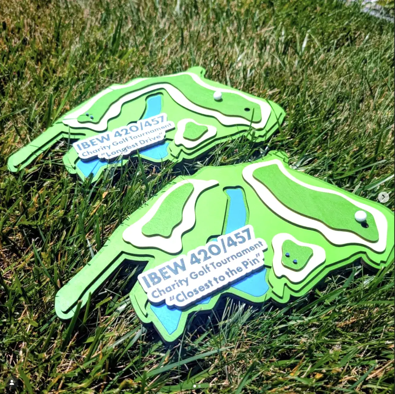
The same thinking transfers cleanly to events that have nothing to do with running. The IBEW charity tournament awards are cut to the plan view of a golf hole — fairway, bunkers, water hazard, green — with a small white ball inlaid at the spot the prize relates to. Longest Drive and Closest to the Pin get the same hole rendered differently, with the ball moved.
It’s the same principle as the Ouachita base: use the geography of the achievement as the shape of the object, rather than putting a picture of a golfer on a rectangle.