Case 07 / WhistlePig Whiskey
A phone call
from a farm
in Vermont
Ongoing product and lifestyle photography for a Shoreham, Vermont rye distillery — core range, limited editions and seasonal campaigns, shot to live on a feed that’s grown past 234,000 followers. The longest-running relationship I have that started with friends from high school.
- Client
- WhistlePig Whiskey
Shoreham, Vermont - Role
- Creative & Art Director
Photography - Scope
- Product & lifestyle
Social-first - Period
- Ongoing
How this one started
Not with a brief. Friends of mine from high school in upstate New York went to work on the WhistlePig farm in Shoreham, Vermont, and eventually introduced me to the marketing team. Every so often since, a new expression comes out and I get the call to shoot it.
I’m including it because it’s the relationship on this site that’s least like a transaction, and because it’s a useful counterweight to the rest of the portfolio. Most of these cases are systems — templates, grids, rules that survive being handed to someone else. This one is the opposite: a small number of frames, made carefully, on a call that comes when it comes.
What the photography has to do
WhistlePig sells rye at a price where the bottle has to feel like an object worth owning, and their audience meets it almost entirely on a phone. That combination sets the terms.
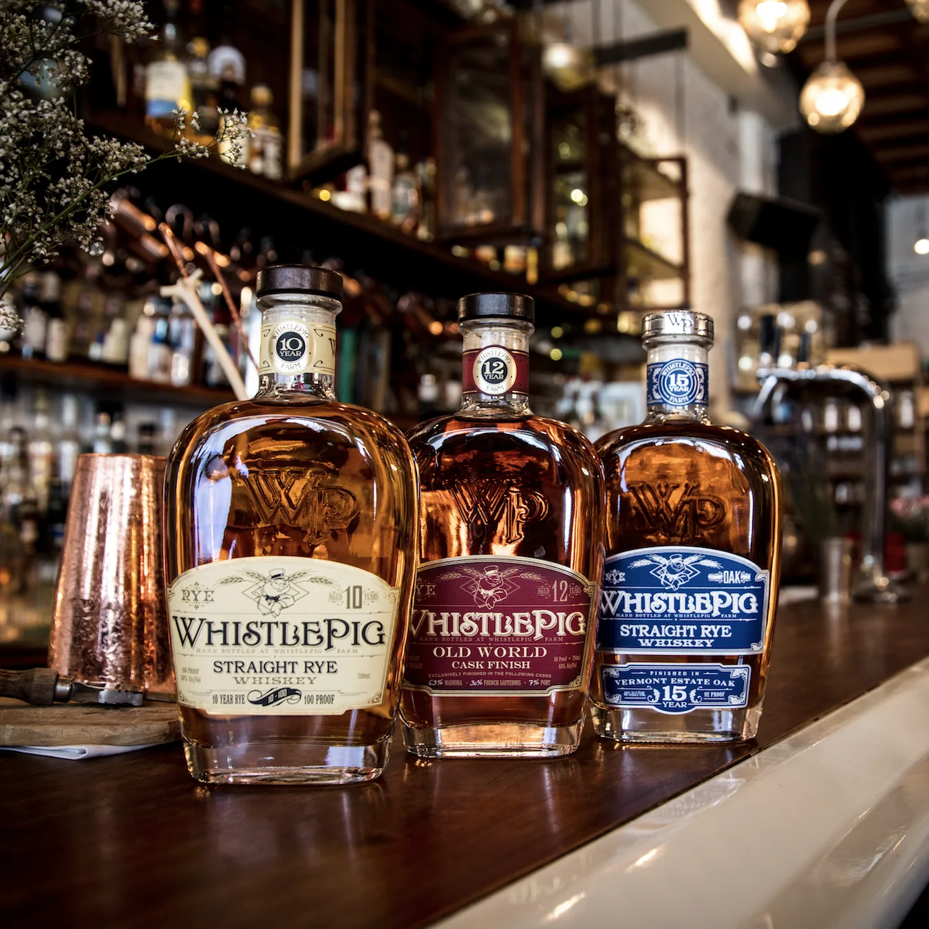
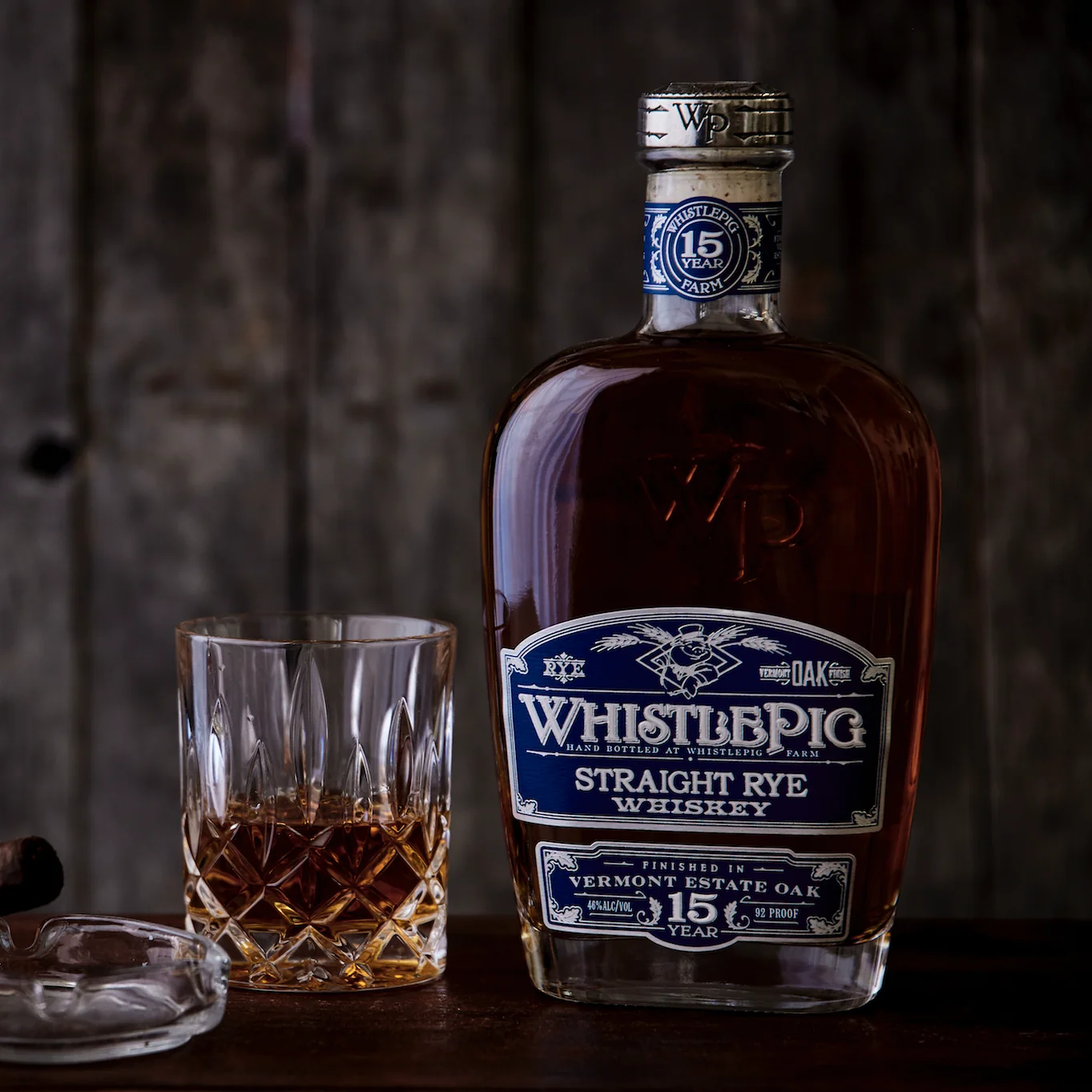
Nothing is shot on a seamless. The core range sits on an actual bar with an actual backbar behind it, thrown far enough out of focus to read as warmth rather than clutter. The 15 Year is on weathered board with a cut crystal glass and a cigar just at the edge of frame. Farmstock is on concrete under hanging bulbs. A catalogue shot would sell the liquid; these are selling the room you’d drink it in, which is what a lifestyle brand on Instagram actually trades in.
The label has to survive being small. WhistlePig’s labels are dense — engraved pig, age statement, cask breakdown, proof, all in fine serif detail. At feed size most of that is gone, so the lighting is built to hold the two things that must read at a thumb’s width: the embossed WP on the shoulder of the glass, and the colour of the label band. Cream is the 10, burgundy the 12, blue the 15. Someone scrolling identifies the expression by colour before they read a single word.
Everything is framed square, and shot to crop. These are made for a grid first, which means the composition has to survive a centre crop and still leave room for a text overlay if the social team wants one. That’s why so many of these have the bottle held off centre with deliberate empty space beside it — the negative space isn’t style, it’s a slot.
What I shoot
- Core range — 10 Year Straight Rye, 12 Year Old World Cask Finish, 15 Year Vermont Estate Oak
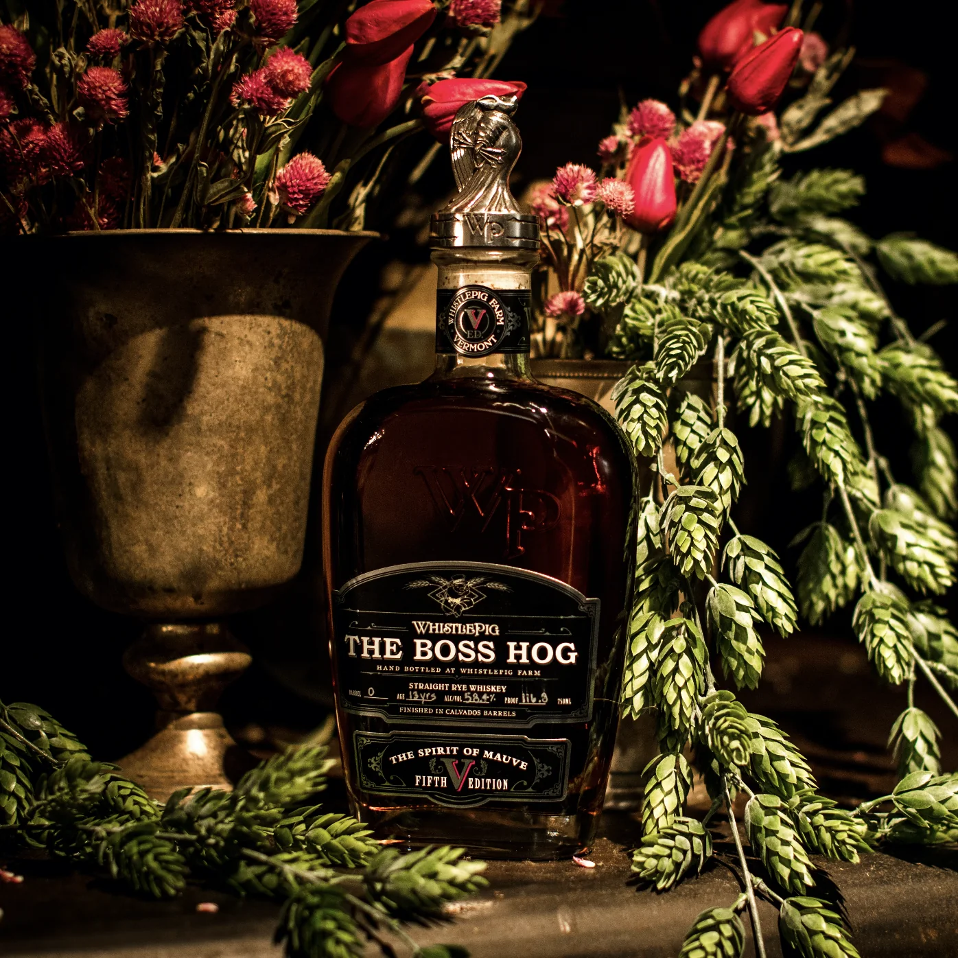
- Limited and single-barrel releases, including The Boss Hog editions
- Farmstock Rye — a three-shot launch series built for paid and organic social
- Seasonal and gifting campaigns: Father’s Day, holiday
- Occasional brand illustration alongside the photography
Where it lands
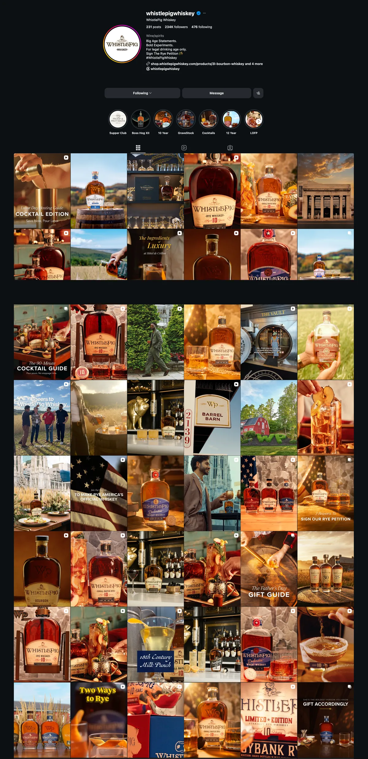
The feed has passed 234,000 followers across 231 posts — a ratio that says the account is built on a small amount of carefully made work rather than volume. Product photography sits in the mix alongside cocktail content, farm footage and campaign posts, and has to hold its own next to all of it.
The core range — three ages, three worlds
The 10, 12 and 15 aren’t variations on a product; they’re three different propositions at three different prices. The photography has to make that legible without a single word of copy, so each one gets its own environment rather than its own angle.
Why they’re dressed differently
The lineup shot puts all three together on a bar because that’s the comparison shot — it exists so someone can see the family and price ladder in a single frame. But shot individually, each expression is aimed at a different moment.
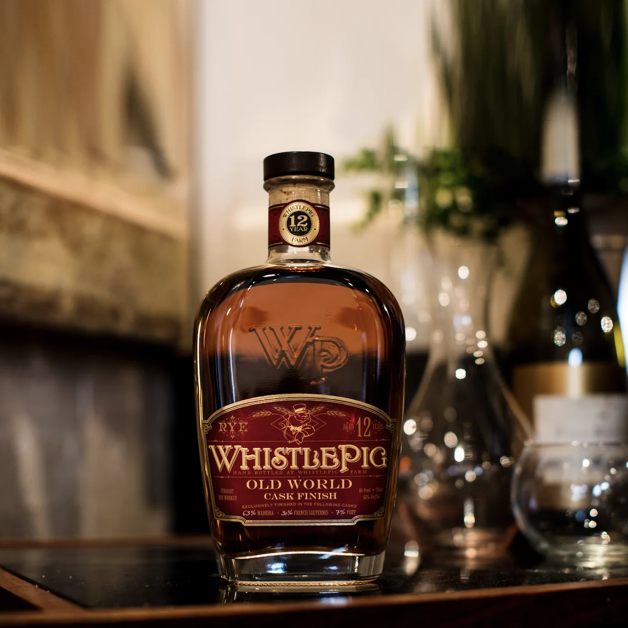
The 12 Year is finished in Madeira, Sauternes and Port casks, so it sits with glassware and greenery and reads toward a table, a dinner, company. The 15 Year is finished in Vermont estate oak and is the contemplative one — so it gets weathered board, a heavy crystal glass already poured, a cigar, and nobody else in the room. Same bottle shape, same brand, completely different evening.
The Boss Hog is the outlier and gets treated as such. It’s an annual limited release with a silver pig stopper and a name that changes each edition — the fifth was “The Spirit of Mauve.” So the set was dressed literally to the name: dried burgundy globe amaranth, red tulips, hop bines trailing across dark stone. When a release has a name that specific, the photograph should answer it rather than ignore it.
Farmstock Rye — a three-shot launch
Farmstock is the one made from rye grown on the farm itself — “Bottled in Barn,” crop No. 002, triple terroir. A launch needs more than one hero image, but a feed also can’t take five near-identical bottle shots in a row. Three, each solving a different placement.
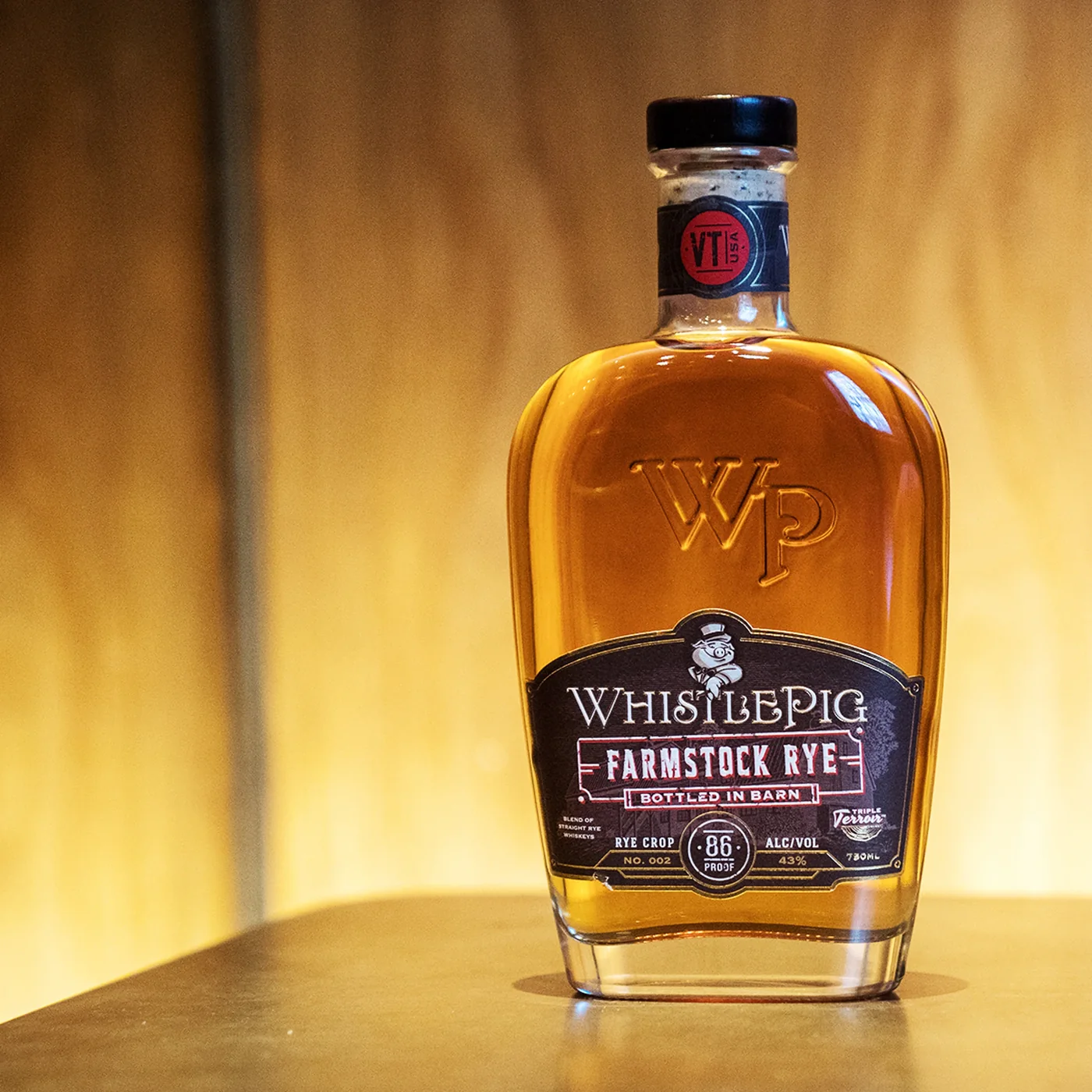
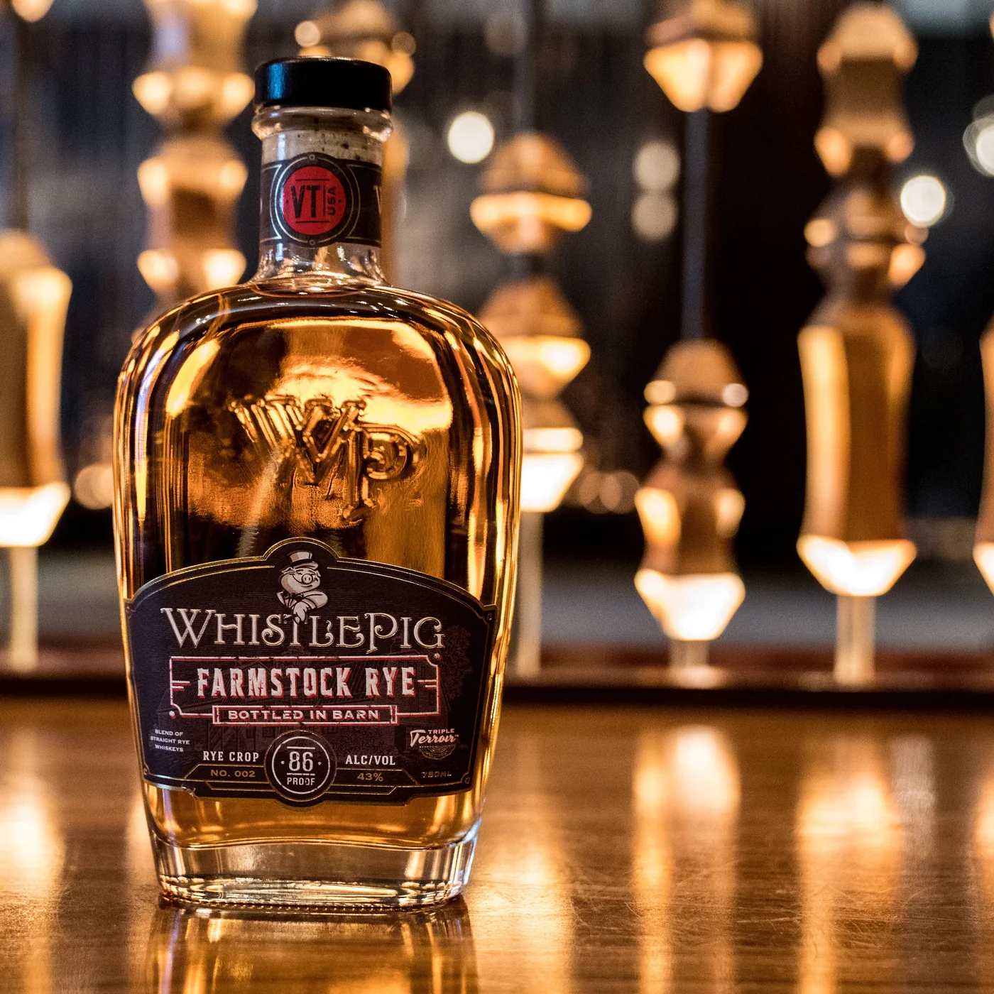
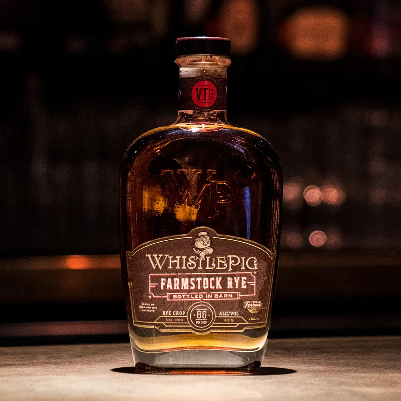
Three shots, three jobs
The file names say FB_IG because that’s what they were built for, and the
three exist because a launch runs in more than one slot. The glow shot is the cleanest
and brightest — it survives being cropped to a story, an ad unit, or a retailer tile,
and it holds up against a white UI. The hanging-lights frame is the scroll-stopper, all
warm bokeh, made to interrupt a feed. The barback shot is the darkest and quietest, and
it’s the one that sits well next to text.
What holds them together is that the bottle is lit identically in all three while the environment changes completely. That’s deliberate: a viewer seeing all three across a week reads one product in three settings rather than three different shoots, which is the difference between a campaign and a content dump.
Seasonal, and the odd job
Not everything is a bottle on a surface. Gifting moments need a person in the frame, and occasionally the ask isn’t photography at all.
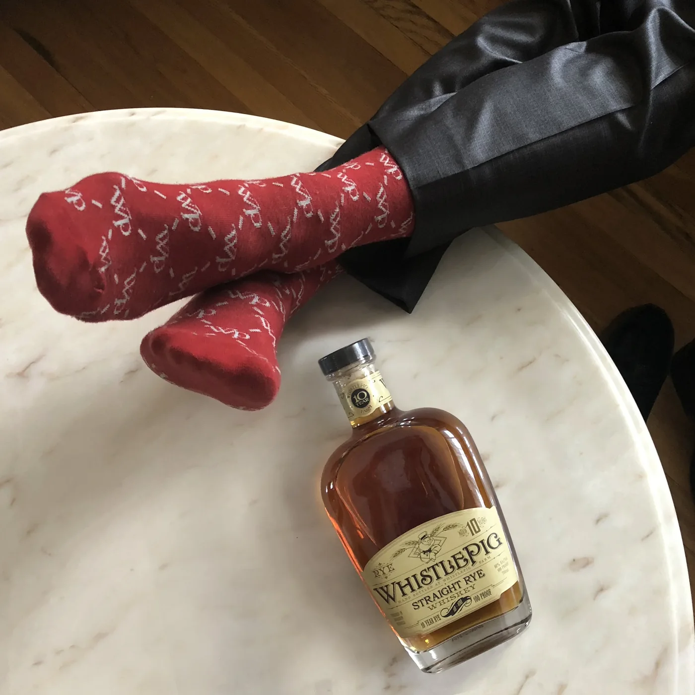
The gifting problem
Father’s Day is the hardest brief in spirits, because the honest version of the message is “buy your dad a bottle,” and everyone runs it. The socks shot sidesteps the cliché by never showing a face, a toast or a gift box. It’s an overhead of somebody’s feet up on a marble table in branded socks with the bottle just within reach — the moment *after* the gift, not the giving of it. It’s also genuinely funny, which most whiskey advertising refuses to be.
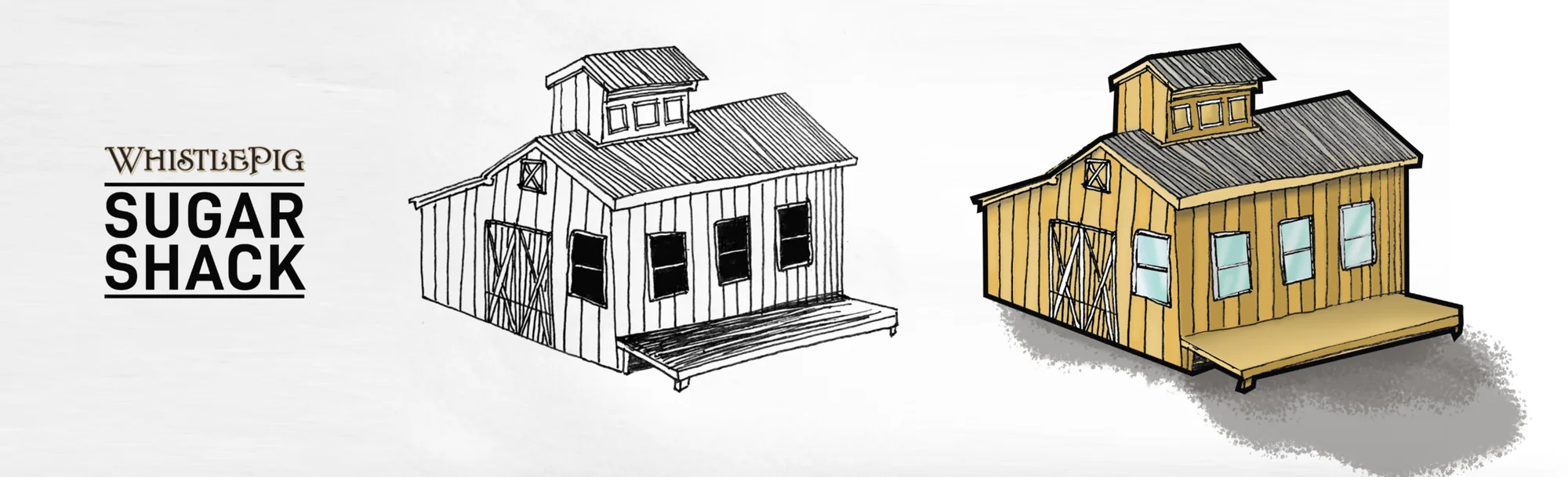
The Sugar Shack drawing is the other kind of ask entirely — a piece of brand illustration for a building on the property, delivered as both a clean ink line version and a coloured one. Providing both states matters more than it sounds: the line version goes on merchandise, signage and anything single-colour, the coloured one goes on web and print. One drawing, two lives, no redraw later.
The grid it all feeds
Every frame above was made to end up here. Seeing the account whole is the only honest way to judge product photography built for social — a shot that looks good alone but breaks the grid has failed at its actual job.
Reading the grid
A few things become obvious only at this scale. The account runs warm almost without exception — amber, oak, candlelight, gold hour — so a cool or clinical product shot would tear a hole in the page even if it were beautiful on its own. That constraint drives the lighting on every frame in this case.
The mix matters too. Bottle photography is maybe a third of what’s here; the rest is cocktail builds, farm footage, the barrel barn, people. Product work has to be good enough to earn its slot against content that’s inherently more engaging, and quiet enough not to look like an advertisement dropped into a lifestyle feed. The tell is that most of these posts carry no overlay type at all — the photograph is expected to work unassisted.
234,000 followers across only 231 posts is the number worth sitting with. That’s an unusually high ratio, and it means the account was built on restraint rather than frequency. For a photographer that’s the ideal client and the harder brief at once: fewer shots, each carrying more weight.