Case 11 / Organic Doctor
A line that
tells the audience
what to do
A campaign platform built to run for two to three years without going stale — anchored on a line that works as both a brand promise and an instruction, so the same three words carry a photography system, a contest mechanic, and every channel from Instagram to a wheatpasted wall.
- Client
- Organic Doctor
Exclusive to CVS - Role
- Creative Director & Art Director

The brief
Organic Doctor is a British organic hair and skincare line sold exclusively through CVS in the US. The brief was awareness, but the real constraint was duration: the client wanted a platform that would run two to three years and stay modular enough to be updated as the range, the seasons and the culture moved. They also wanted contests and sweepstakes — a lot of them — built into the plan rather than bolted on.
The category problem is that organic beauty had converged on one look by then. Kraft tones, botanical line art, a lot of beige sincerity. Everything on the shelf was saying the same thing in the same voice, and the packaging already carried the botanical cues, so the campaign couldn’t just do more of that.
The approach
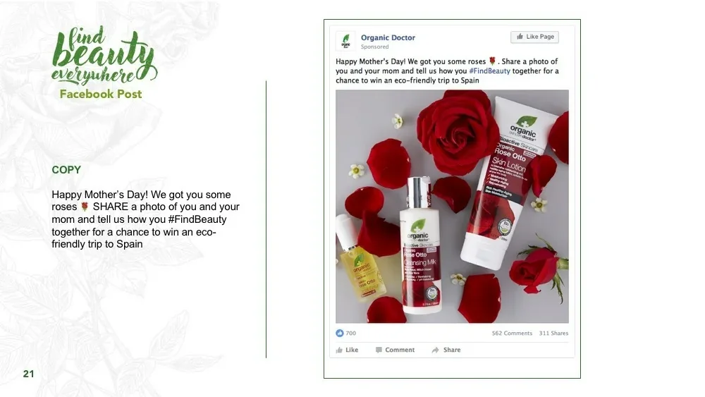
The line is “find beauty everywhere,” and the reason it holds a three-year platform is that it isn’t a claim — it’s an imperative. Most beauty taglines describe the product to you. This one tells the audience to go do something. That single grammatical choice is what lets the same three words function as a brand line on a poster, a caption on a Mother’s Day post, and the rules of a photo contest, without any of them feeling like a stretch.
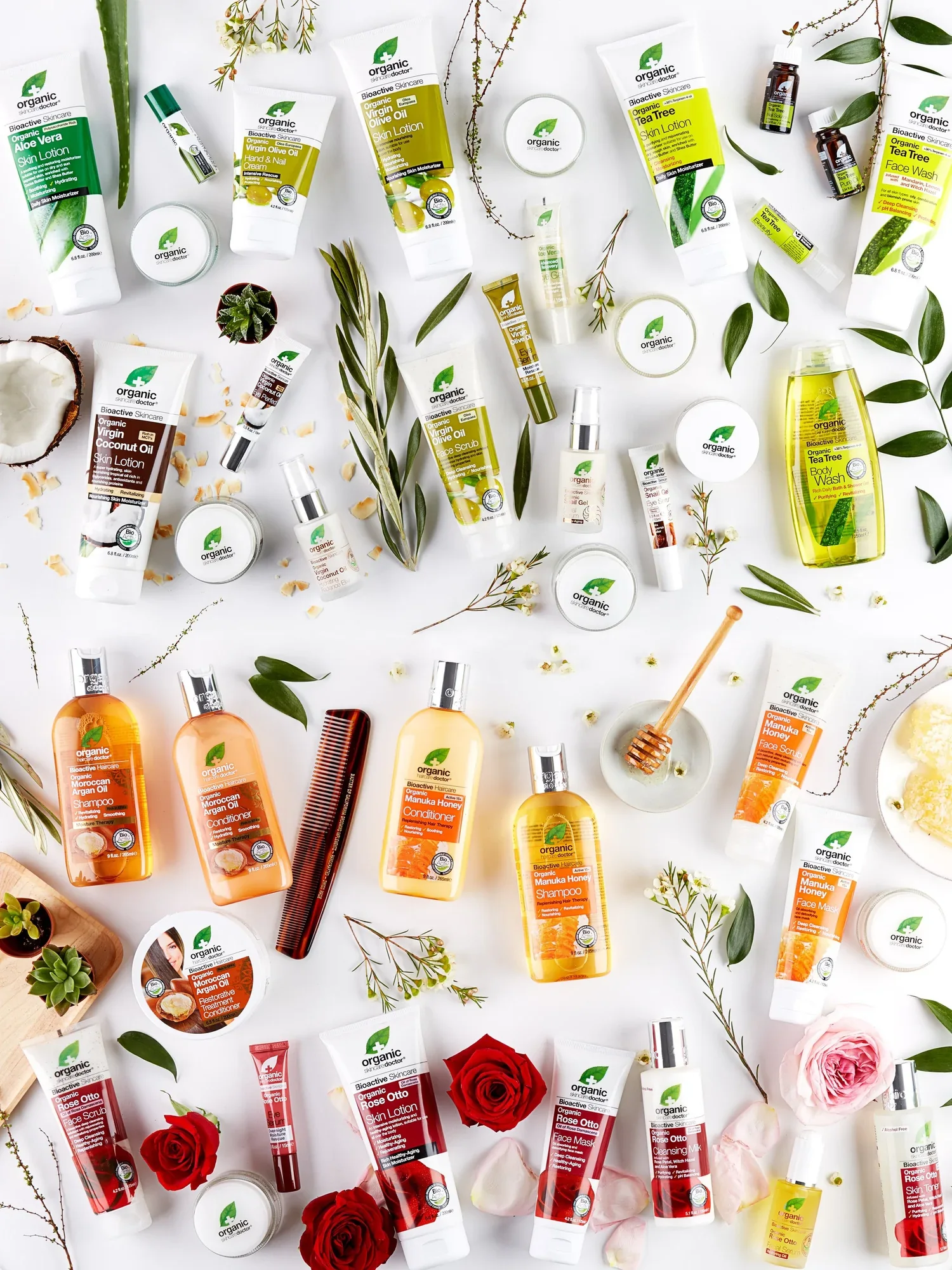
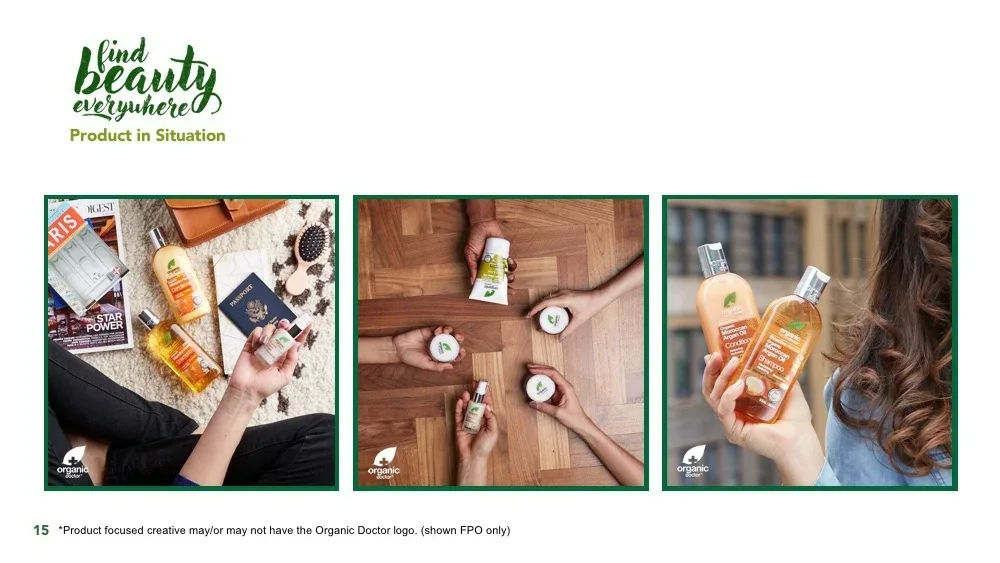
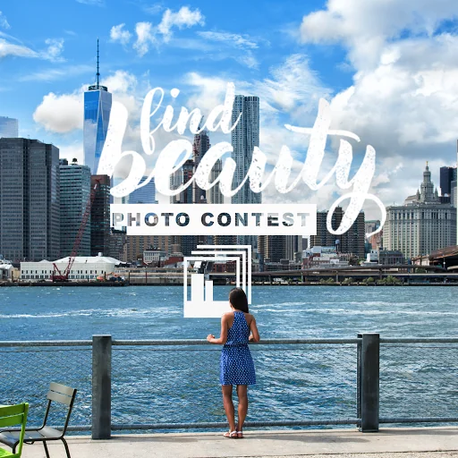
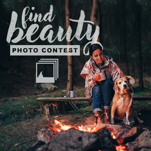
I built the campaign as two photographic layers that never mix. The outer layer is aspirational and user-shaped: waterfalls, city waterfronts, campfires, a rope swing — the kinds of pictures the audience takes themselves, with the hand-lettered script laid into the image so it reads as a caption rather than a headline. The inner layer is the opposite: clinical white ground, product shot overhead, styled only with the actual ingredient. No lifestyle, no models, no props that aren’t in the bottle.
Keeping those layers separate is what makes the system modular. The lifestyle layer can be reshot or crowdsourced every season without touching product photography. The product layer can absorb new SKUs without needing a new campaign. And because each ingredient family already owns a colour — tea tree green, manuka amber, rose otto red, coconut cream, argan gold — a new product launch arrives with its art direction already decided. That’s the mechanism behind “easy to change with the times”: nobody has to invent anything, they just fill a slot.
The hand-lettering carries a rough, chalky texture rather than clean vector edges. On a brand whose entire proposition is that the ingredients are real and unprocessed, a perfectly smooth logotype would have contradicted the product.
What I made
I directed the campaign end to end — the platform and its rules, the photo shoot, and the channel work that came out of it. The shoot covered casting, styling, set and product styling, and produced both photographic layers in one production.
- Campaign platform and identity — lettering, colour system, photographic rules
- Product photography across every ingredient family, plus the full-range hero
- Photo contest series and the sweepstakes mechanics around it
- Organic social for Instagram and Facebook, including animated grid takeovers
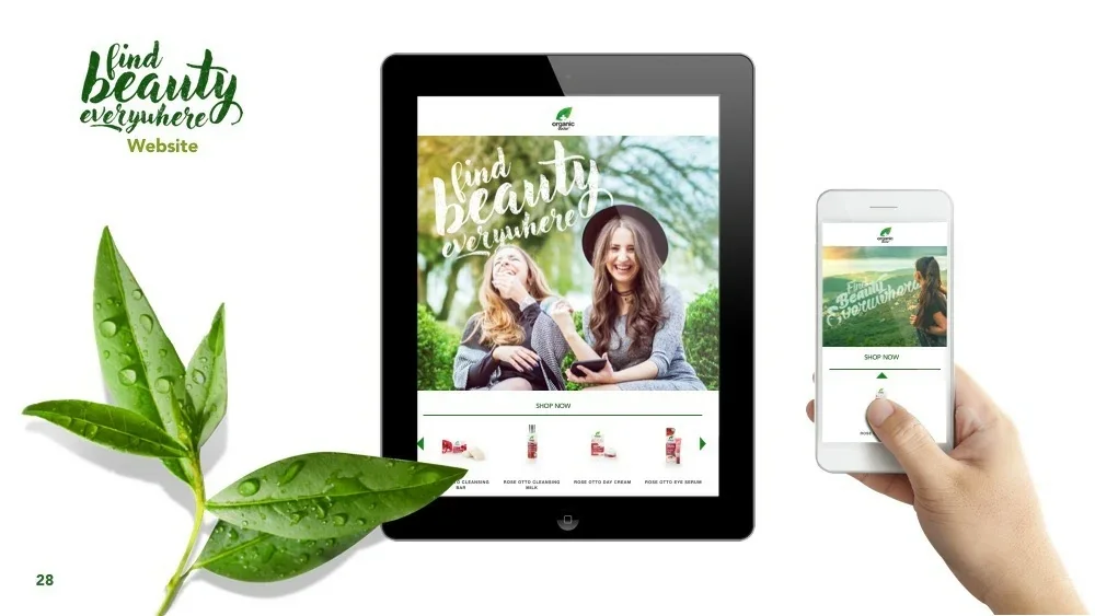
- Website hero and responsive treatment
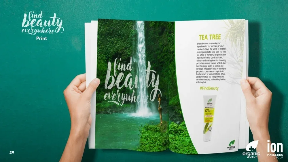
- Print — magazine spreads pairing the lifestyle image with ingredient stories
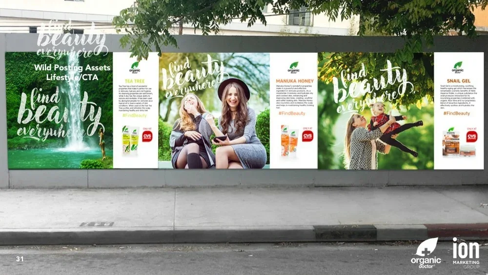
- Out-of-home wild posting sequences carrying the CVS retail call to action
Where it landed
Sales rose 7%.
A platform designed to last three years, in a category that reinvents itself every twelve months.
Product photography
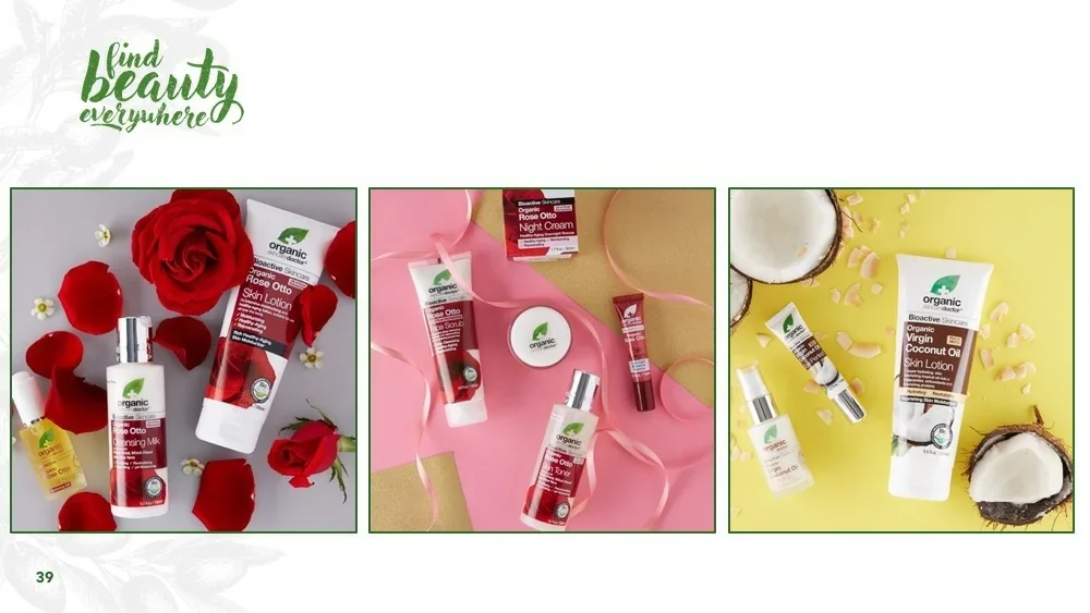
Shot overhead on white, styled with nothing but the ingredient itself — real roses for Rose Otto, cracked coconut for Virgin Coconut Oil, honeycomb and a dipper for Manuka. The prop is the proof. It’s the least fashionable way to shoot beauty product and the most credible.
The photo contest
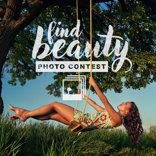
The mechanic that turns the tagline into a activity. If the line instructs people to find beauty everywhere, the contest simply asks them to prove they did — which means the campaign generates its own future lifestyle photography instead of commissioning it. A stacked-photo icon sits under the lockup on every asset, changing to match the scene behind it.

Print, web & out of home
Where the two photographic layers finally meet on one surface. The print spread and the wild posting sequence use the same construction: lifestyle image on the left carrying the line, ingredient story and product on the right carrying the reason to buy — and, outdoors, the CVS lockup that tells you where.
Social
The grid was designed as a composition rather than as a queue of posts — the waterfall hero anchors the centre and the ingredient sets alternate around it, so the profile reads as one image before anyone taps into a single post.