Case 12 / Daniel Gale Sotheby’s International Realty
A campaign
where the ad
is the product
A concept platform for putting Daniel Gale’s real estate advisors in front of prospects — social, transit screens, and a booking app — built as one modular kit so every branch and every advisor gets their own version without a new design each time.
- Client
- Daniel Gale Sotheby’s
International Realty - Role
- Art Director
- Stage
- Concept — preliminary

The brief
Daniel Gale Sotheby’s needed awareness for its advisors — not for its listings. In residential real estate the inventory is public and identical across every brokerage; what differs is who walks you through it. The positioning the client wanted to land was ease, familiarity and something built around the individual client rather than around the transaction.
The remit covered three channels that behave nothing alike: social, out-of-home on transit screens, and a connect-with-an-advisor app. Each has a different dwell time — a thumb-scroll, a platform wait, a deliberate booking session — and the concept had to hold across all three.
The approach
The line I built the work around is “Centered on You.” It does double duty, which is why it survives across three channels. To a prospect it’s a promise about service. Internally it’s a description of the layout: the advisor is literally at the centre of every frame, and the property behind them is the variable.
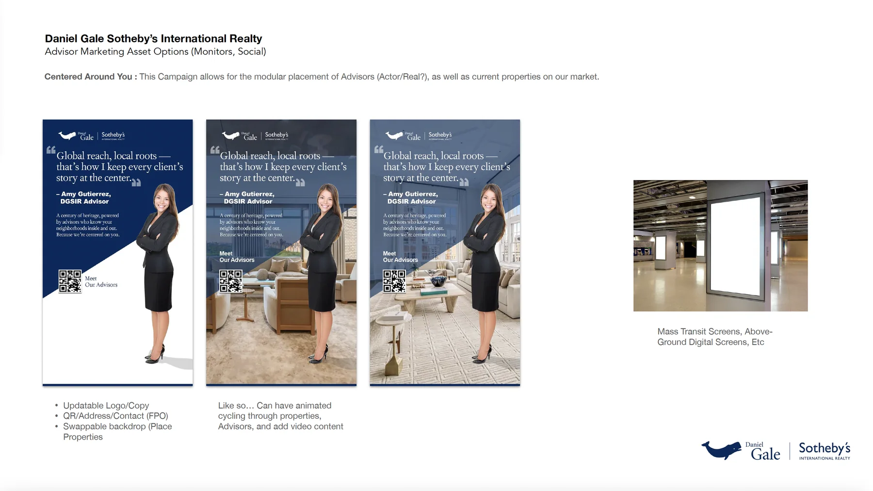
Rather than designing finished ads, I designed a modular kit. Every element is a slot — advisor photo, advisor quote, property backdrop, branch name, QR destination. One layout, populated differently, produces a Brooklyn asset and a Nassau asset and a Queens asset without anyone opening the source file. For a brokerage with dozens of branches and hundreds of advisors, that’s the difference between a campaign that ships and one that dies in production.
The device that makes the kit hold together is the diagonal cut. The advisor is masked out and stood at the right of frame; a diagonal edge separates the brand navy carrying the quote from the photographic space behind. Because the cut is angled rather than a straight column split, it reads as intentional composition rather than a template — and it works whether the backdrop is a flat navy field, a furnished living room, or a bright interior with windows.
The quotes are set in a serif and given real quotation marks at display size, so they read as testimony rather than headline copy. That was deliberate: advisors speaking in their own voice is the entire point of the campaign, and a sans-serif headline would have flattened it back into advertising.
What I made
Concept work across all three channels, presented as annotated options rather than finished comps — each asset marked up to show which elements swap, so the client could see the system rather than just the example.
- Social post templates with headline, caption and quote variants written out
- Out-of-home panels in three backdrop treatments, sized for transit screens
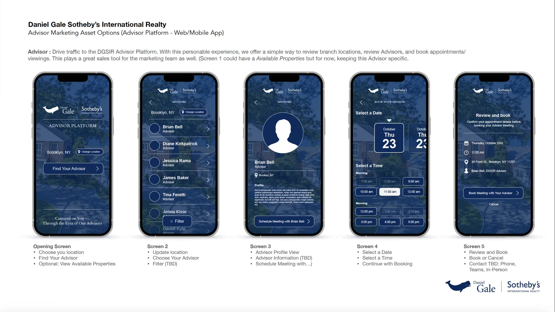
- A five-screen advisor booking flow, from location through to confirmed appointment
I wrote the campaign copy alongside the design — the tagline, the three advisor quotes, and the captions that pair with them. The quotes are the load-bearing element and they had to sound like advisors, not like a brand.
Where it landed
This is preliminary concept work, presented for direction rather than production. The annotated TBDs are deliberate — the deck was built to open a conversation about casting, branch variation and photography sourcing, not to close one.
Out of home — transit screens
Vertical format, read at distance, by someone waiting. The three treatments are the same layout with the backdrop swapped from flat navy through to full property photography — a range that lets the same panel run as static print or as an animated screen cycling through current listings.
Advisor Platform — web & mobile
Where the campaign stops being advertising and becomes a tool. Five screens take a prospect from “which branch am I near” to a confirmed appointment with a named advisor at a real address — and the same flow doubles as a sales instrument for the marketing team.
The interface decision
Every screen sits on a photographed property under a heavy navy wash. That’s unusual for a booking flow — most would use flat white for legibility — but it keeps the app inside the same visual world as the panel on the platform wall the prospect just scanned. The wash is doing brand work and contrast work at once, which is why it had to be that dark.
The flow deliberately ends on a confirmation screen listing the date, time, street address and advisor name together. In a category where the anxiety is “who am I about to meet and where,” that screen is the payoff for the whole campaign — and it’s the moment “centered on you” has to actually be true.
Social — advisor posts
Presented in situ as a LinkedIn post rather than as a flat square, because the surrounding chrome is part of the design problem: the caption above the image does half the persuading, and the “Meet our Advisors” call to action sits in the link preview bar, not in the artwork.