Case 03 / Citizens — TCS NYC Marathon
I designed
the singlet,
then wore it
Citizens Bank won lead sponsorship of the TCS New York City Marathon for 2023 and still holds it. I built the launch creative — sponsorship lockups, the announcement spot for subway, bus, taxi and billboard, vehicle wraps, print, and the Team Citizens race singlet. Then I ran the thing in 3:19.
- Client
- Citizens
Official Bank of the TCS NYC Marathon - Role
- Creative & Art Director
- Scope
- Identity, broadcast, OOH
Print, apparel - Year
- 2023 — sponsorship ongoing
The brief
Citizens had just won lead sponsorship of the largest marathon in the world, and needed to announce it. Sponsorship launches are a specific kind of problem: the bank isn’t selling a product, it’s buying a place in something people already love — and if that lands wrong it reads as a corporation renting an institution.
The work had to run across the whole city on race weekend. Subway, bus interiors, taxi tops, billboards, the race program, wrapped vehicles, and apparel worn by actual runners. One idea, a dozen surfaces, wildly different reading distances.
The approach
Make the bank a participant, not a logo. The line I built everything on — “Ready to go the distance” — deliberately doesn’t claim the marathon. It’s a statement about support that works for the runner, the volunteer, the person on the barrier at mile 18, and the bank. The spot copy makes that explicit: whether you’re running or rolling, cheering or volunteering, we’re here for every minute and mile. Wheelchair athletes and volunteers are named in the first thirty seconds, not implied.
The dot is the through-line. Every surface carries a halftone field of green dots that fades in and out. It reads differently depending on where you meet it — crowd from a distance, distance markers along a route, pixels on a screen, the perforation of a technical running fabric up close. That ambiguity is why it works across a thirty-second spot, a bus flank and a garment without ever being explained.
Black and white for the city, green for the brand. The announcement spot is built entirely from monochrome footage — Verrazzano, the bridges, crowds, feet, wheels — with the green copy and dot overlays sitting on top. New York gets the grit and the texture; Citizens gets the colour. Nobody has to be told which is which.
What I made
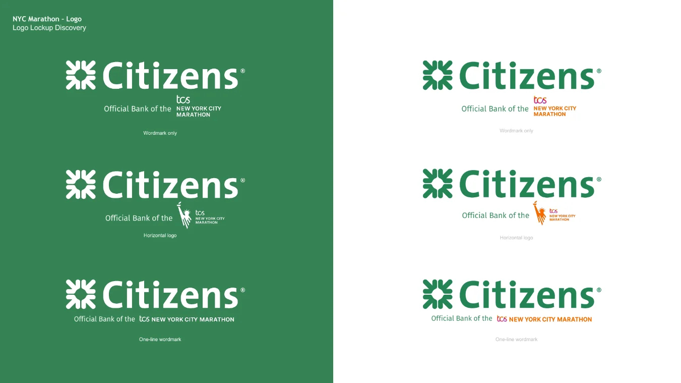
- Co-branded sponsorship lockup system — wordmark, horizontal and one-line variants, reversed and positive
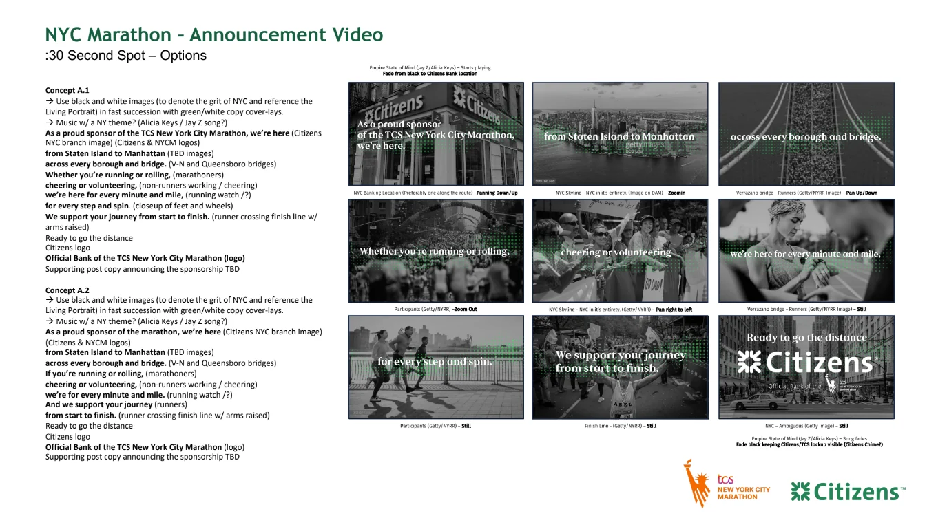
- :30 announcement spot, storyboarded in two concepts, for subway, bus, taxi and billboard
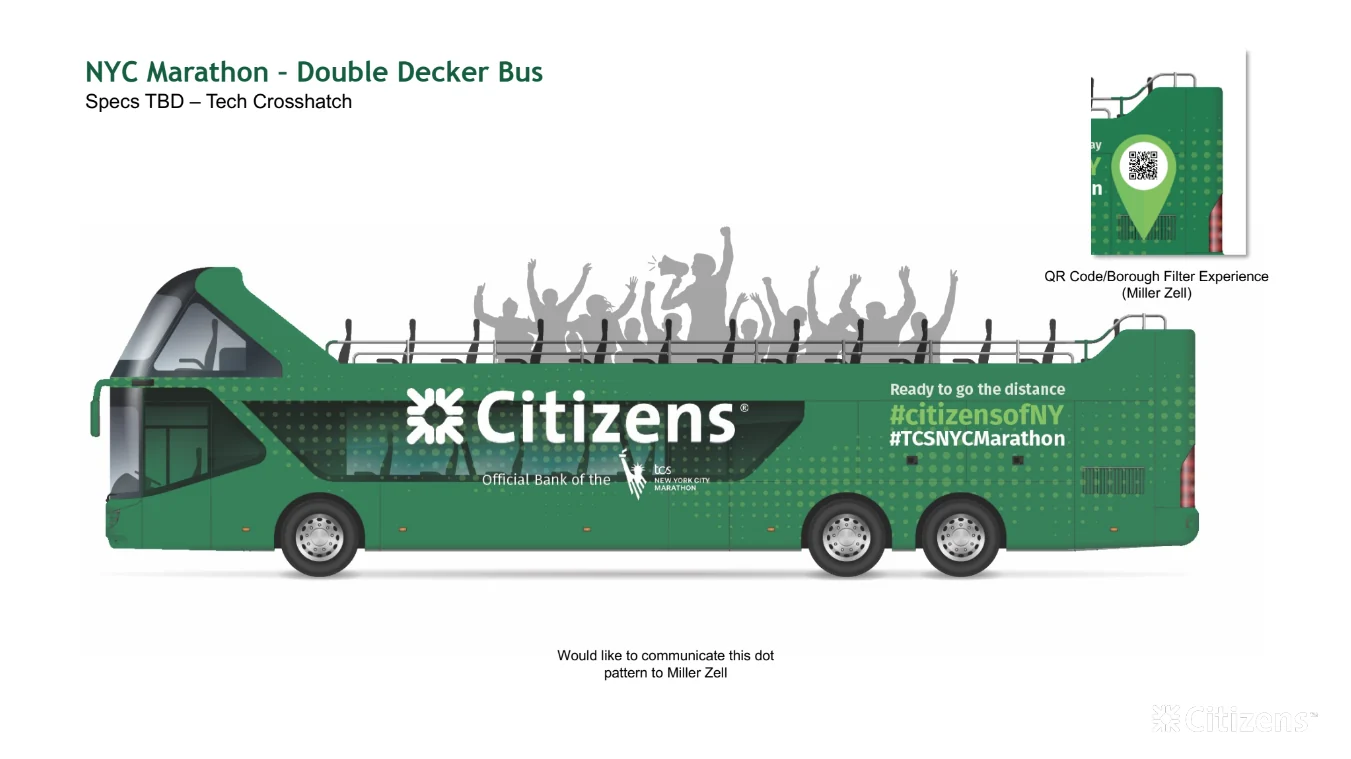
- Double decker bus wrap, with a QR-driven borough filter experience
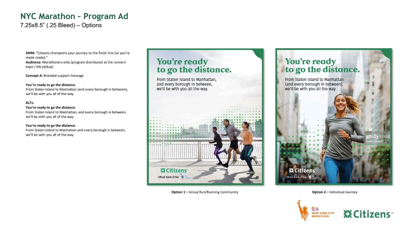
- Race program advertising, 7.25 × 8.5˝, in two audience directions
- Team Citizens race singlet, produced with New Balance
Across the video, wraps and apparel I worked with production partners on execution.
Where it landed
The sponsorship launched for the 2023 race and Citizens still holds it, which is the quiet endorsement — launch creative that survives into subsequent years usually means the platform was built right rather than just decorated well.
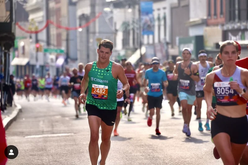
And then there’s the part I can vouch for personally: I ran the 2023 TCS New York City Marathon under Team Citizens, in the singlet I designed, and finished in 3:19.
The lockup — two brands, one signature
Before anything else could be designed, the co-branded signature had to be resolved. This is the least glamorous part of a sponsorship launch and the one that everything downstream depends on, because it appears on every single surface at every single size.
Three variants, and why
The marathon’s identity has two parts — the orange Statue of Liberty runner and the tcs new york city marathon wordmark — and they don’t behave the same way. The runner mark is beautiful and completely illegible below a certain size. So the system splits by available space rather than by preference.
The stacked wordmark-only version drops the runner entirely and is for small applications where the icon would turn to mud. The horizontal version keeps the runner and is the primary, for anywhere with room. The one-line version compresses everything to a single baseline, for narrow bands — the bottom of a bus flank, a footer, a garment hem.
The board is split green-left, white-right on purpose. A lockup that works reversed out of the Citizens green often fails positive on white, and vice versa — the marathon wordmark in particular changes weight noticeably between the two. Presenting both states side by side meant the client approved something that actually worked everywhere, rather than approving a nice-looking board and discovering the problem in production.
The announcement — :30 across the city
A thirty-second spot built to run in subway cars, on bus and taxi screens and on billboards — which means it had to work silently, in motion, on a screen someone is looking at for maybe four seconds while holding a pole.
Built to be read, not heard
Transit screens play muted. So the spot is written as a piece of typography that happens to move: every line of the script appears on screen, and the edit is paced to reading speed rather than to the music. The track is there for the placements that do have sound, but the spot loses nothing without it.
The route through the city is the structure. It opens on a Citizens branch — ideally one along the course — then moves Staten Island to Manhattan, across the bridges, through the crowd, to the finish. That’s the marathon’s own geography, so a New Yorker follows it without narration. Camera moves are specified under every frame: pan down, zoom in, pan right to left. On a four-second glance, direction of movement does as much work as content.
The copy sequence is the part I’d defend hardest. Whether you’re running or rolling / cheering or volunteering / we’re here for every minute and mile. Wheelchair athletes and volunteers get named early and specifically, not folded into a generic “everyone.” In a city where the marathon genuinely belongs to the people on the barriers, that distinction is the difference between a sponsor being welcomed and being tolerated.
Two concepts were storyboarded side by side with nearly identical visuals and a different copy order, so the client was choosing a rhythm rather than a look — the fastest way to a decision when the visual direction is already agreed.
Out of home & print
The same idea at two extremes of reading distance: a forty-foot bus seen from across an avenue, and a program ad held at arm’s length by someone who has just picked up their bib.
The bus
The double decker is the most fun surface in the set and the one with the strangest constraint: it has an open top deck full of actual people. Rather than treat that as a problem, the layout draws them in — grey silhouettes of a cheering crowd, arms up, sit along the top edge of the artwork where real passengers will be. Parked on the route with people aboard, the drawn crowd and the real one merge.
Below that, the flank is solid Citizens green carrying the wordmark and the sponsorship lockup, with the dot field dissolving toward the rear where the hashtags sit. The dot pattern needed to be communicated as a spec to the fabricator rather than just supplied as artwork — at bus scale a halftone that isn’t specified properly turns into moiré or mud. A QR panel at the rear opened a borough filter experience, so the bus was also a thing you could interact with rather than only look at.
The program ad
Distributed at the expo and bib pickup, so the audience is exclusively people who are running in two days — no persuasion needed, and no room for a sales message. The headline is simply “You’re ready to go the distance,” which reframes the campaign line as reassurance aimed directly at the reader.
Two options were shown for a reason. The group version says the marathon is a community you’re joining; the individual version says it’s a thing you personally trained for. Both are true, and which one is right depends on how the brand wants to sit with a nervous runner the night before. Presenting them as a genuine fork rather than a preferred option and a decoy is how you get a real answer.
Team Citizens — the singlet
The only piece in this campaign that someone has to wear for three hours while doing the hardest physical thing they’ll do that year. Different rules entirely.
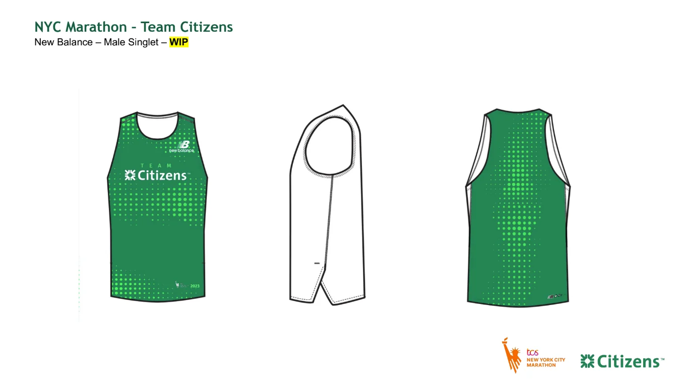
Designing something that gets worn, not viewed
A garment breaks most of the assumptions a print layout is built on. It moves, it stretches, it gets soaked, and a bib gets safety-pinned across the middle of your composition — so the chest logo has to sit high enough to survive that, which is the single most important measurement on the whole piece.
The dot pattern gets reworked rather than reused. Sublimated onto technical fabric it distorts across the body, so the density is graded — tighter through the chest and upper back where the fabric is relatively stable, opening up toward the hem where it moves most. Produced with New Balance, with the marathon logo and the year at the hem, which is the part that makes it a keepsake rather than a uniform.
The field test was involuntary and thorough: I ran the 2023 TCS New York City Marathon in it and finished in 3:19. Green holds up at distance in November sun, the dots read as texture rather than noise on a moving body, and the chest lockup clears a pinned bib. I would not have known any of that from a flat.
Highly recommended, if you’re going to run 26.2 — design the shirt first. You pay much closer attention to seam placement when you know you’ll be inside it at mile 22.